Make your next Healthcare office look polished and finished by simply adding the right art in the right places!
Art is the small piece that plays a big role in the look and feel of a space. Your art will need to support your office environment in how it looks, but also by how it is placed.
In this part of the art blog series, we will discuss selecting pieces of art and where to install them.
First, What Piece of Art Works for this Space?
Selection
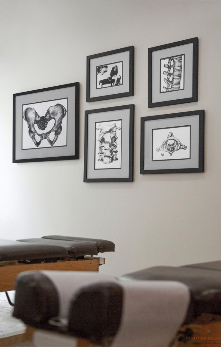
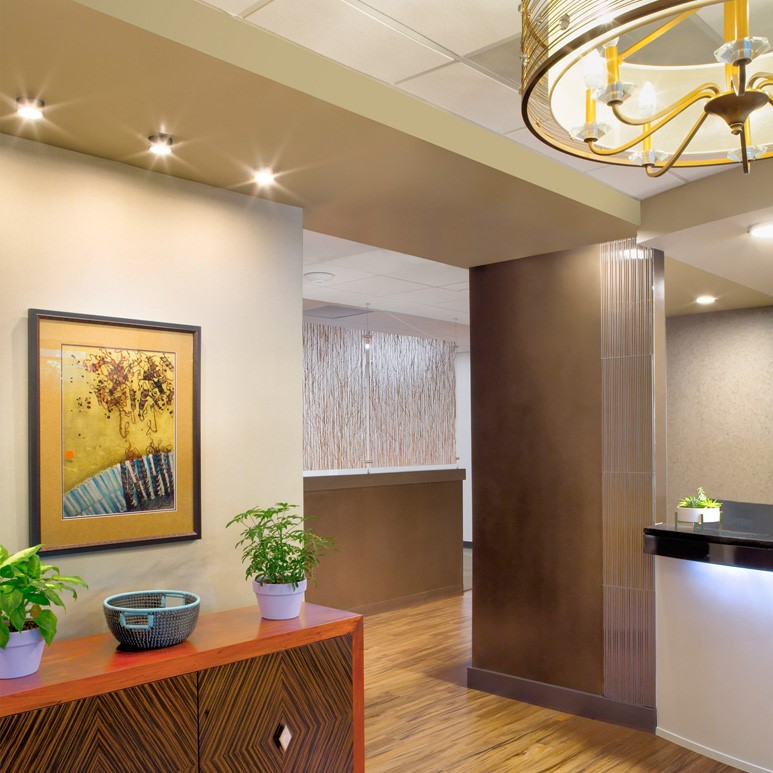
Selecting artwork to complement your space can be approached in a few ways. Once you know the theme of each zone of your office, one common approach is to select artwork that blends with the colors of the furnishings and surrounding finishes. Another approach is to select artwork that is the highlight or accent by using vibrant colors or high contrasts.
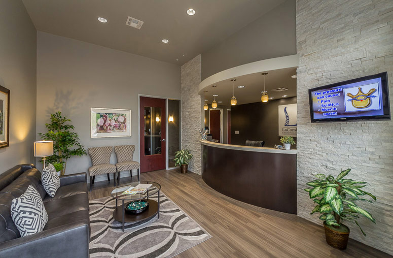
Size and proportion play important roles in selecting your artwork as well. Art must be in proportion to the room and the items within the room. Common errors in art selection are art that is too small or too large, or the several art pieces together are spread out too far apart without a rhythm or good composition.
You can change the proportion of a poster/print by matting and framing it, increasing the size of something that otherwise would be too small. Using a series of small pieces grouped together can create a feel of one large piece. Such as, if you need a large horizontal piece, find an artist series of two, three or four pieces that can be mounted side by side with about 3 to 8 inches apart, depending on the size of the actual item. This will read as one piece of art.
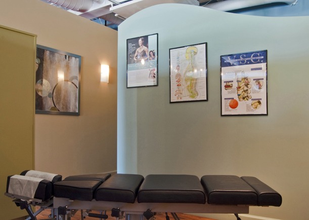
Second, There’s a “Right” Way to Hang Art?
Installation
Hanging art at the wrong height is probably the biggest mistake we see. Artwork should be hung at common eye level. By industry standards, the common eye level is 60 inches “on center” above the finished floor. This means that you measure 60” above the floor and the center of your artwork should align with that mark at 60 inches. There is actually a range that varies from 54” to 64” based on circumstances and design intent. There are some instances when you can hang artwork below common eye level, such as a very tall piece that goes up almost to the ceiling. Also, by changing the common eye level mark higher or lower, you can direct people, in a sense, to sit or stand. If you desire people to stand, raise the common eye level; if you desire people to sit, lower it. But be intentional about it.
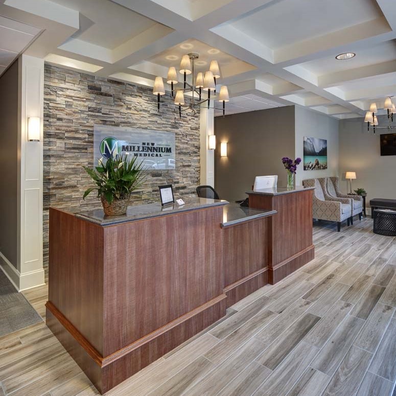
Any professional that hangs art always hangs art by two points. Artwork with “O” or “D” rings on each side of the frame can be very strategic to position. Wire hanging can be a little easier to hang and position. The wire is held in place with two hooks spread apart enough so it helps to balance the picture when you need to adjust it or align it.
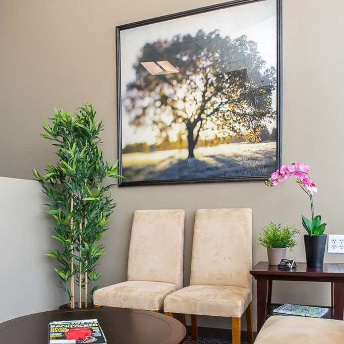
If you do have to hang a picture with a single hook in the middle, one trick is to use tape as a kind of anchor. Roll tape to form a sticky ball, attach the tape at the bottom left or bottom right corner frame and then adhere it to the wall. This will help fix it in place and keep it from moving every time the wind blows. When pictures are not level and always need adjusting, especially after cleaning, they create an untidy, unkempt look – much like people with untied shoes.
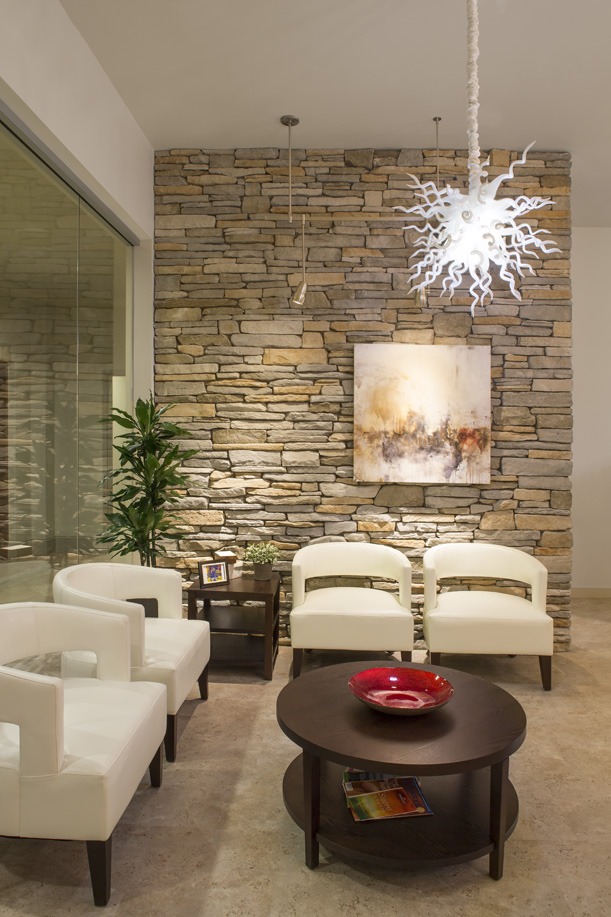
The finishing touches will put the icing on the cake on the space and image you desire.
Looking for more help?
CrossFields specializes in creating your office to represent your desired image and creating a welcoming culture. We save you time, money and frustration by guiding you through the complicated design process. Contact us to learn more about how we can “Bring Your Vision to Life!”


