What You Need to Know Before Picking a Swatch
Staring at a wall of paint chips wondering what color to paint your office? You’re not alone.
It seems simple until you realize how much it affects your space, your patients, and your brand.
Color is not just a finishing touch. It’s a foundational tool for shaping first impressions, influencing mood, and reinforcing the identity of your practice.
Done well, it builds trust. Done poorly, it creates confusion or discomfort.
Before you grab a gallon of paint or rely on your favorite Pinterest board, let’s walk through what actually works.
Color Is Infinite. That’s Why It’s So Easy to Get Wrong
The average human eye can detect over one million colors. That’s a staggering amount of nuance, especially once you factor in lighting, gloss level, and surrounding finishes.
A color that looks warm and welcoming in natural daylight may turn cold under LED lighting. A neutral that feels clean in one space can look sterile in another.
This is where most people get overwhelmed or default to safe choices that make no impact. Or worse, they force a bold color into a space that doesn’t support it, creating visual noise and dissonance.
Start With Who You’re Designing For
This decision isn’t about what color you personally like. It’s about what your ideal patient needs to feel about you when they walk through the door.
Are you serving high-performing executives who expect a polished, modern environment? Or are you creating a calming space for patients dealing with chronic conditions or anxiety? Maybe your practice supports women through functional wellness or hormones, and your goal is to make them feel seen and nurtured.
Color helps establish an emotional tone before a single word is spoken.
So the real question isn’t “What color do I like?” It’s “What do I want this space to communicate?”
Color is a powerful design tool, but it doesn’t live in isolation. Choosing the right one requires context, not guesswork.
What About My Logo? Isn’t That My Brand?
Your brand is the impression people have of your business. It’s the gut feeling they get when they walk into your office, scroll your website, or hear your name. It’s not just your logo, fonts, or colors (though those are tools). It’s the consistent message you communicate through your space, your team, your services, and your tone.
In a healthcare setting, your brand is how patients feel in your care. It reflects your values, your approach to healing, and your unique point of view. Design just helps make it visible.
If you have a brand guide or defined logo, let it influence your interior color palette, but don’t let it dominate. Your palette should complement and support your brand, not overpower it.
Don’t make the mistake of matching your wall paint to your logo color. That intense teal or coral might work beautifully in a logo or on your website, but it was designed to be an intense small focused expression. Used strategically, it creates visual pop. Spread across an entire wall, it becomes overwhelming.
That light blue may look sharp in print, but on the wall it can feel more like a child’s bedroom than the confident office you’ve built.
Instead, use brand colors as accents or in accessories like art, textiles, or signage.
What About the Psychology of Color?
Yes, color influences emotion.
It’s well documented that people make a subconscious judgment about a person, environment, or product within 90 seconds. Up to 62 percent of that assessment is based on color alone.¹
Color psychology is real. But it’s nuanced. We explore more about color’s emotional impact and visual tone in this article on customizing your healthcare office colors.
- Blue is universally liked and associated with calm, trust, and clarity.
- Green promotes relaxation and renewal, which is why it’s so common in healthcare.
- Earth tones ground the space and promote stability.
- Red and orange stimulate energy but can be overstimulating in large doses.
- Whites and grays create clarity or neutrality, but if not carefully chosen, they can feel cold or unfinished.
Want to be all of these things at once? Be careful. Layering too many statement colors without a plan creates confusion instead of clarity.
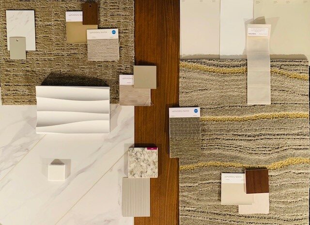
This is where your “finish palette” comes in—color, texture, and material working in harmony.
If You Want to Attract This Type of Patient,
Use This Type of Palette
Every palette sends a message. These examples align color selection with patient expectations.
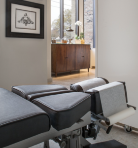
The Wellness-Focused Holistic Patient
- Values: Calm energy, clean living, natural healing
- Palette: Sage, olive, warm taupe, soft whites, and light wood tones
- These colors support a grounded, authentic atmosphere.
The High-Performance Executive Patient
- Values: Efficiency, discretion, high standards
- Palette: Deep navy, warm gray, greige, espresso accents, and minimal contrast
- The design should feel polished, structured, and understated.
The Family-Centered Patient Base
- Values: Comfort, clarity, and approachability
- Palette: Soft blue, warm beige, blush accents, and welcoming neutrals
- This style feels accessible without feeling generic.
The Aesthetic or Self-Care Patient
- Values: Style, transformation, visual sophistication
- Palette: Blush, ivory, soft charcoal, gold tones, and clean contrast
- This environment reflects confidence and attention to detail.
The Senior Wellness Patient
- Values: Simplicity, comfort, emotional safety
- Palette: Sage green, cream, muted blues, and low-glare finishes
- The goal is clarity without stimulation.
If your practice serves a variety of patients, you can establish a base palette that reflects your brand and then use accents to adapt individual areas without compromising consistency.

Common Mistakes That Lead to Regret
Let’s avoid these.
- Picking paint too early
If you haven’t selected flooring, cabinetry, or lighting, don’t lock in a wall color. You’ll box yourself into a palette that fights the rest of your finishes. Since paint color is infinite, it should be the last item chosen. - Going too bold without balance
Accent walls can be impactful, but they need context. Without it, they distract rather than delight. For example, matching your paint to your logo (see above). - Overusing white or gray
Neutral is safe. Safe often equals forgettable. The right neutral needs warmth, contrast, or layering to feel intentional. - Ignoring light
The same color will look different in natural daylight, warm LED, or fluorescents. Always test in your space under real lighting.
Why Lighting Belongs in This Conversation
Color is a byproduct of light. Your fixtures, your daylight, and even the Kelvin temperature of your bulbs all influence how your wall color actually looks.
The same paint can appear totally different depending on the light source. That’s why it’s so important to test samples in your actual space under your actual lighting conditions. For more ideas on how to make lighting and color work together, read this guide on creating big impact with low cost using color and lighting.
And it’s why we never recommend selecting paint until all other finishes and lighting are finalized. Otherwise, you’re building your design around a variable that’s guaranteed to shift.

Ready to Take the Next Step?
If you’re in the early planning stages, this blog gave you a solid foundation. But your office deserves more than educated guesses.
We specialize in helping healthcare professionals design high-performing spaces that reflect their brand, attract the right patients, and support real growth.
Want full-service guidance from start to finish?
Schedule a free 60-minute discovery call
Prefer a curated design solution without a full engagement?
Explore our Designed For You package
¹ Source: Singh, S. (2006). Impact of color on marketing. Management Decision, 44(6), 783–789.