In the spirit of National Nutrition Month, we’ve rounded up our favorite ways you can display your retail product in your office.
From a design perspective, there are a few options to display your retail that will not only blend with your design but also attract patients’ eyes and increase sales! Many of our clients focus not only on creating proper alignment for their patients but also on educating them on the importance of getting proper nutrition and taking the right supplements. The hardest part about having these retail items is putting them on display in a way that compliments your office design! Here are CrossFields’ favorite ways to do this.
 This doctor has custom built-ins that look like bookcases on either side of his front door. These bookcases finish off the look of the space, and all the retail items to be seen by anyone coming and going into the office. Additionally, the bookcases are located right outside the door of his consulting office, creating easy viewing by patients as they walk into their appointments.
  This same doctor also has a “store” for the supply of weight loss products, which is across the hall from the front desk. It has a locking door, which is monitored by the CA’s. The product is displayed on an adjustable slat-wall shelving system, which is finished in black so that the product really stands out. Track lighting is used to provide ample lighting all around the room.

 You can also combine your retail display with the check-in/check-out iPad stations, as seen here. These were built into the design of the display and function well since the retail is located adjacent to the front desk. Don’t forget to incorporate a station that is also ADA-compliant! If you are low on floor space, consider doing wall-mounted shelving. In this office, we suspended glass shelves inside the interior windows, as we had enough space to secure them. It is also right next to the front desk, so patients checking in or out will see the product.
  A common way to consolidate space is to have retail and hospitality in the same area, as seen in the photo below. We displayed this doctor’s retail displayed in glass shelving and glass-front cabinets right over the hospitality station. So, when patients are getting a glass of water or coffee, they will see the product displayed. There is ample storage below as well for the product.
 This doctor needed ample storage and display for his own product and other product that he sells. He needed it to be easily viewed and accessed by patients and set up more like a store. We recommended black bookcases and located them across from the front desk and hot seats. All patients waiting for an adjustment or checking in at the front desk would see his product. And it is stocked with enough product that he doesn’t have to refill it often, as he has a high-capacity office.

 If your shelving is solid (not glass), use track lighting to highlight your displays.
Location
Our first philosophy is to get your retail products up front and center in your office like one would in a retail store. Products should be easily viewed by patients in your waiting area. An added bonus would be to get it by any exterior windows/storefront doors so that people walking by can see it. Having the retail in sight when the patient enters can help to increase your overall sales. And, having it displayed in a way that is organized and clean will also help it be more appealing.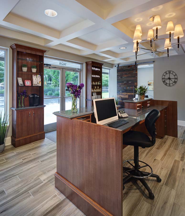 This doctor has custom built-ins that look like bookcases on either side of his front door. These bookcases finish off the look of the space, and all the retail items to be seen by anyone coming and going into the office. Additionally, the bookcases are located right outside the door of his consulting office, creating easy viewing by patients as they walk into their appointments.
 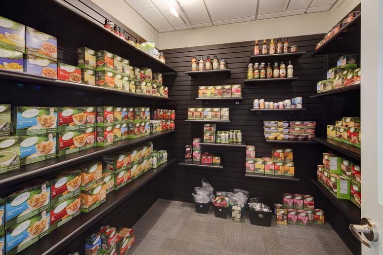 This same doctor also has a “store” for the supply of weight loss products, which is across the hall from the front desk. It has a locking door, which is monitored by the CA’s. The product is displayed on an adjustable slat-wall shelving system, which is finished in black so that the product really stands out. Track lighting is used to provide ample lighting all around the room.
Easily Seen by Front Desk
Second, it is important to keep the retail (and store, if part of your practice) in full view of the employees at your front desk, in case patients have questions. Or if a patient is checking out, the employee can easily reference and point to a retail item when needed.Storage
Depending on how much you need to display and how much storage you have in your office, you may need to have storage cabinets under the display. Most often we see doctors display one of each type (in empty containers), and then keep the storage under the display or in a storage area near the front desk. Be sure you plan for enough storage in your office; not only for retail, but also for holiday decorations cleaning, and office supplies.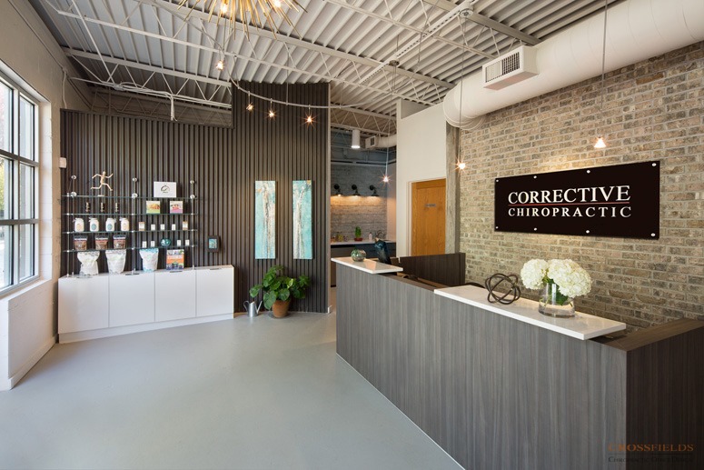
The Finished Look
If you are building out another custom “millwork” piece in your office (such as a custom front desk, or consult desk), have your retail display custom-built as well. We recommend finishing it in the same finish as the front desk so that it is cohesive. It is also cheaper to do it all at once since you have a millworker/contractor in there already. Or, if it’s appropriate to the look you want, you can finish the retail in a complementary finish to add interest and impact.Space Saving
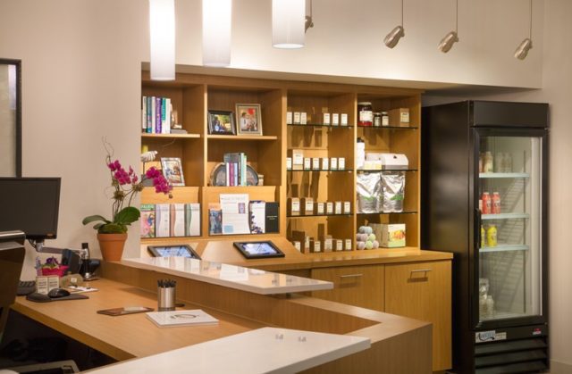 You can also combine your retail display with the check-in/check-out iPad stations, as seen here. These were built into the design of the display and function well since the retail is located adjacent to the front desk. Don’t forget to incorporate a station that is also ADA-compliant! If you are low on floor space, consider doing wall-mounted shelving. In this office, we suspended glass shelves inside the interior windows, as we had enough space to secure them. It is also right next to the front desk, so patients checking in or out will see the product.
 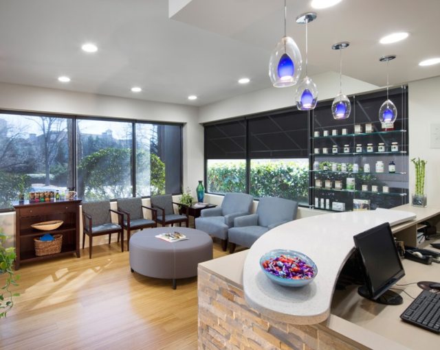 A common way to consolidate space is to have retail and hospitality in the same area, as seen in the photo below. We displayed this doctor’s retail displayed in glass shelving and glass-front cabinets right over the hospitality station. So, when patients are getting a glass of water or coffee, they will see the product displayed. There is ample storage below as well for the product.
Budget Friendly
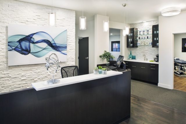
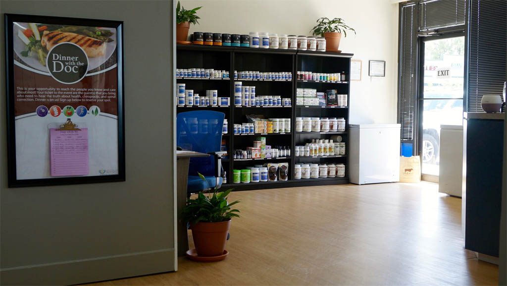
A few great budget-friendly options that we love are for you to purchase an appropriate furniture piece for your display. The one in the photo below is a combination of retail and hospitality. It has retail storage and display below the counter and is located across from the waiting, and is seen from the front desk. The finish and style of the furniture piece fit in with the look of the rest of the office.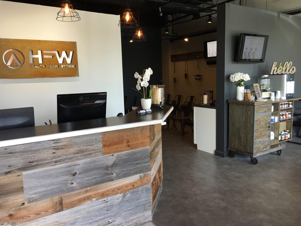 This doctor needed ample storage and display for his own product and other product that he sells. He needed it to be easily viewed and accessed by patients and set up more like a store. We recommended black bookcases and located them across from the front desk and hot seats. All patients waiting for an adjustment or checking in at the front desk would see his product. And it is stocked with enough product that he doesn’t have to refill it often, as he has a high-capacity office.
Lighting Your Displays
Lighting is a huge part of your retail display. You want to have it lit well at all times. Track lighting is a great way to light your product, and have flexibility. If you are commissioning a tall built-in (like a bookcase) or displaying it in an overhead cabinet, be sure to add lighting inside the cabinet. Use glass shelves instead of plastic laminate or wood to help the light flow down through the displays.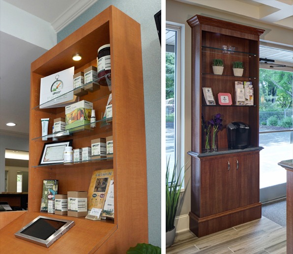 If your shelving is solid (not glass), use track lighting to highlight your displays.

