Integral Health Studio
Client: Dr. Howard Krisel
Location: Atlanta, GA
Type: Remodel
Size: 1480 Net SF
Year: 2015
Services: Corrective Chiropractic, Passive Therapy, Brain Training, Massage
CHALLENGE
Dr. Howard Krisel, DC & Dr. Hamilton Wetzel, DC had been steadily growing their practice and needed more room to achieve their goals. Buying a space would avoid ever increasing lease payments and reap the benefits of ownership. With the assistance of a real estate professional, an older office condo in an established business development was located. It was on a very active road less than 3 miles from their currently leased location. The building offered additional square footage, but the increased square footage was recognized over three separate levels and the space was dated with small closed rooms that did not have a clear translation to their desired practice.
SOLUTION
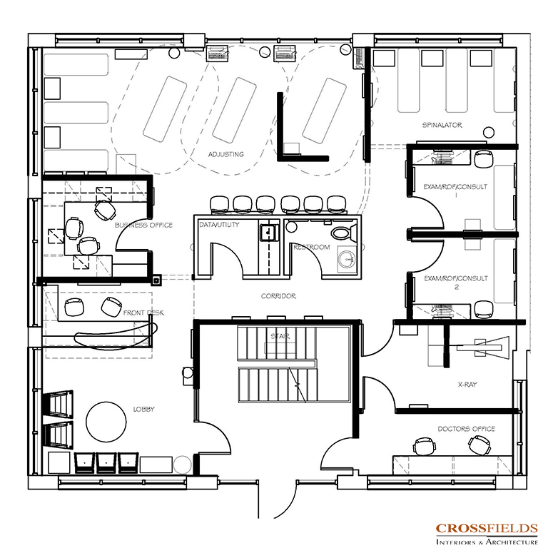
CrossFields’ first step was to determine the type of functions they desired day-one and how these functions would likely expand in the future. In addition, it was necessary to understand which functions could be separated from each other, so that the building’s three-level configuration could be utilized effectively. Once this was thoroughly discussed and analyzed, a precise arrangement of services, functions, and flow was used to develop a space plan for the first two levels of the building. Since only the first and second levels of the building would be needed day-one, it was determined that the building’s third level could be used to create lease revenue from another tenant of their choice. Also, since the building had a central lobby with independent access stairs to each level, this further supported the viability of the solution.
To minimize the impact of renovation, avoid undue code upgrades, and structural re-work concerns, a very selective approach to demolition and wall/ceiling reconfiguration was determined as the best cost effective and time considerate approach.
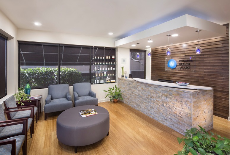
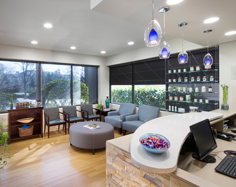
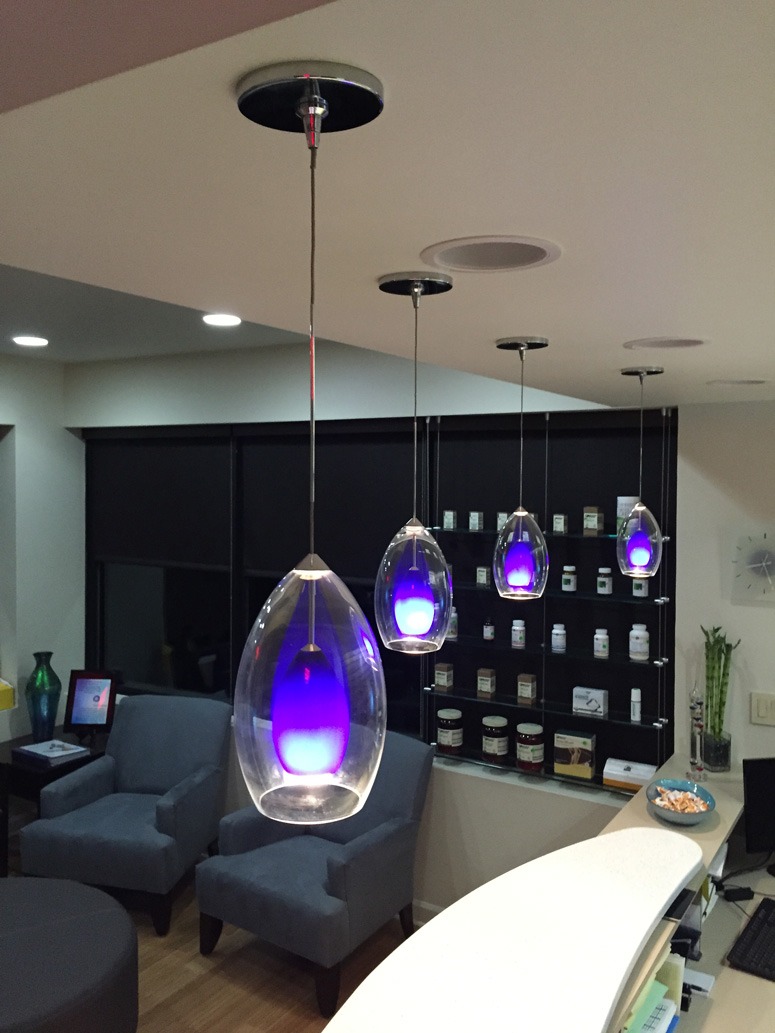
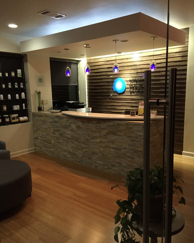
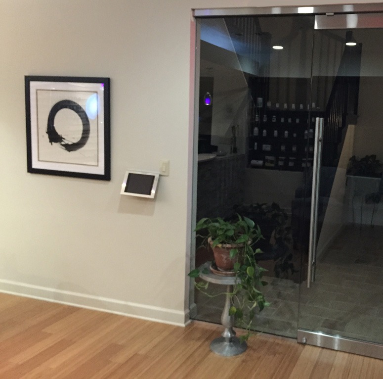
The initial impact for the patient was created by visually combining the existing entry lobby with the main level lobby space. This was accomplished by removing a non-structural wall and creating a large frameless glass door opening and window from the building lobby to the office lobby. The ceiling in the office lobby was raised, resulting in a sense of a larger lobby. To create the vision of a natural health oasis, arriving patients are greeted at a stone clad front reception desk with the backdrop of a unique textured walnut wood wall.
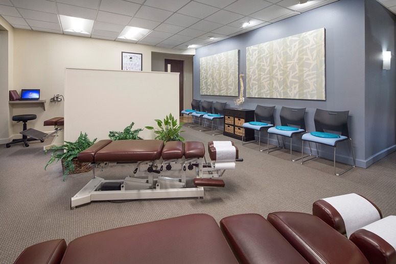
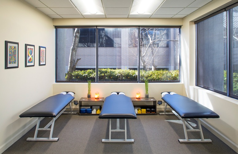
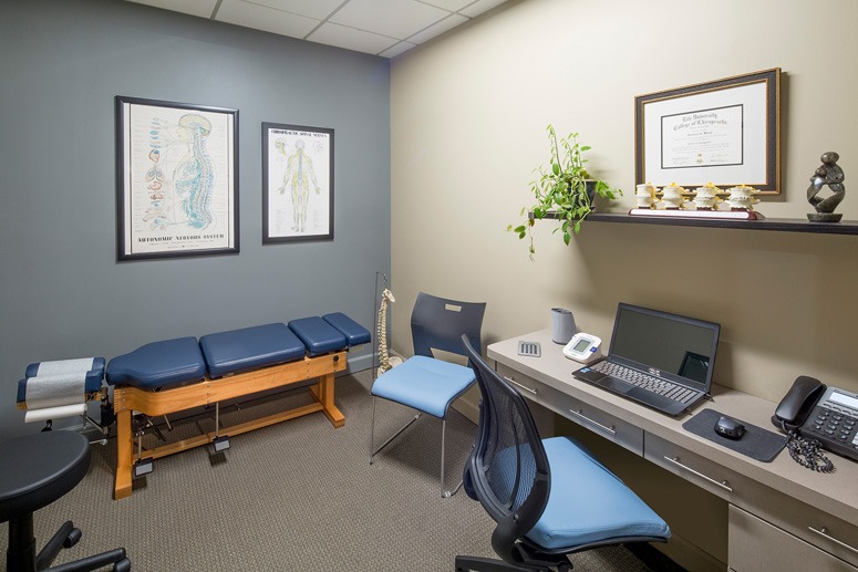
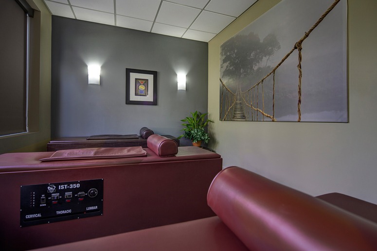
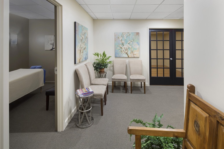
The balance of space requirements were accomplished by opening up other non-structural walls and utilizing floor finishes, paint colors, and selected accent areas to direct patients, provide visual impact and support patient learning. This resulted in a renovated environment that demonstrated a functional and impressive and inviting appeal for their patients.
SERVICES PROVIDED
Turn-Key Design and Construction, including complete Interior Architectural and Engineering Design and Furnishings Art and Accessories Selection, Procurement and Installation.
See What Our Clients Have Said
- All
- Chiropractic
- Integrative
- Neurology
- Rehab & PT
- wellness
Harbour Medical Centers
Spa Matrix
Wolter Chiropractic & Wellness
Family Chiropractic Center for Wellness
Hayes Chiropractic
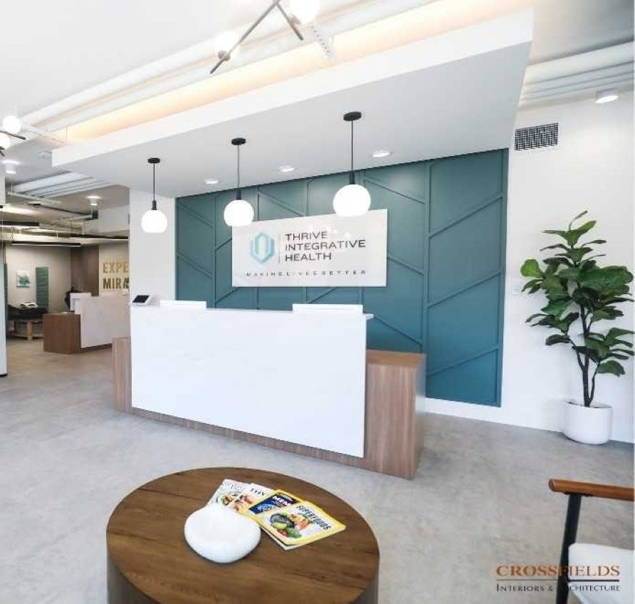
Thrive Integrative Health
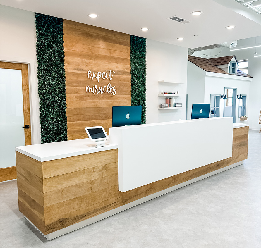
Cumming Family Chiropractic
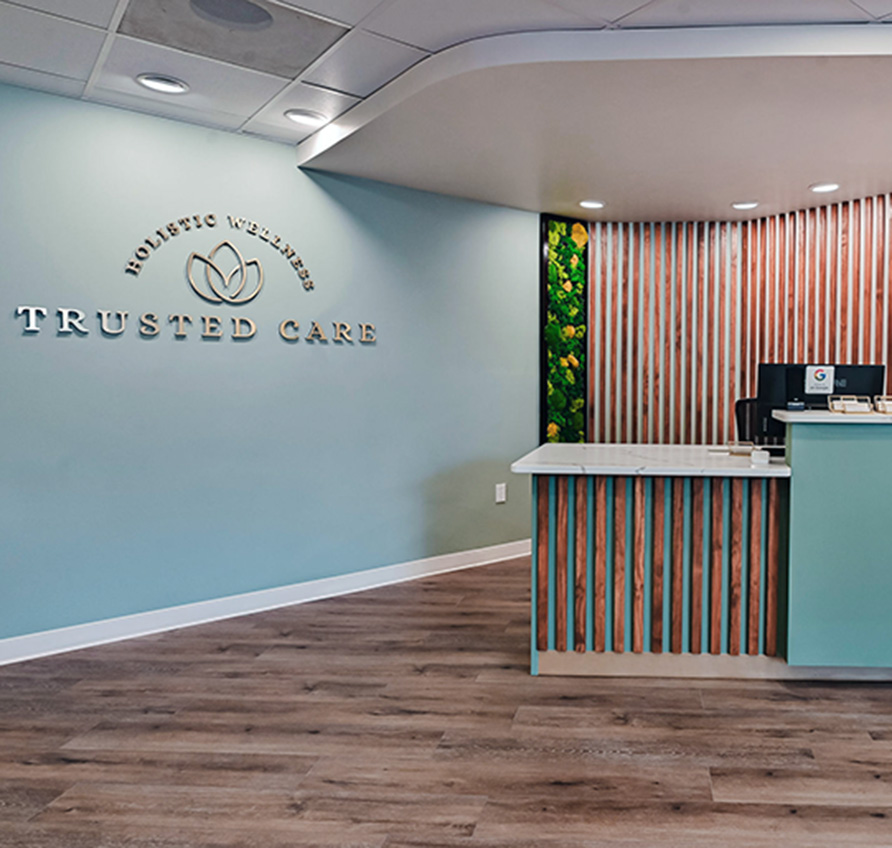
Trusted Care Holistic Wellness
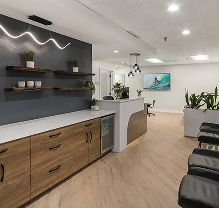
Lakeside Spine and Wellness
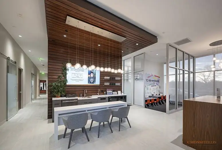
Chiropractic Lifestyle Studio
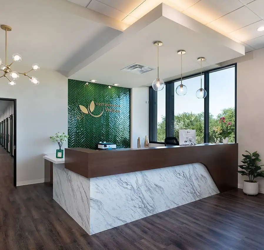
West University Wellness
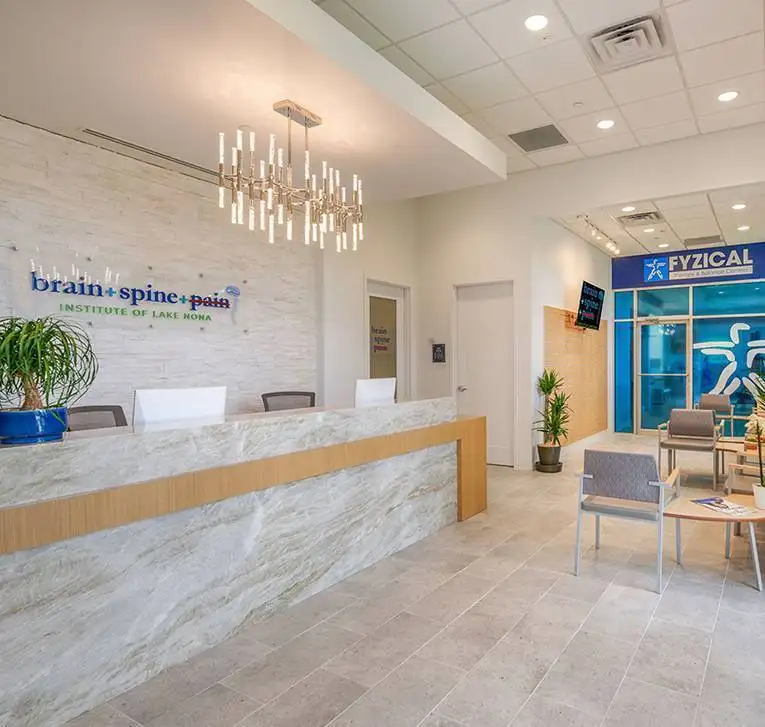
Brain + Spine + Pain Institute Of Lake Nona
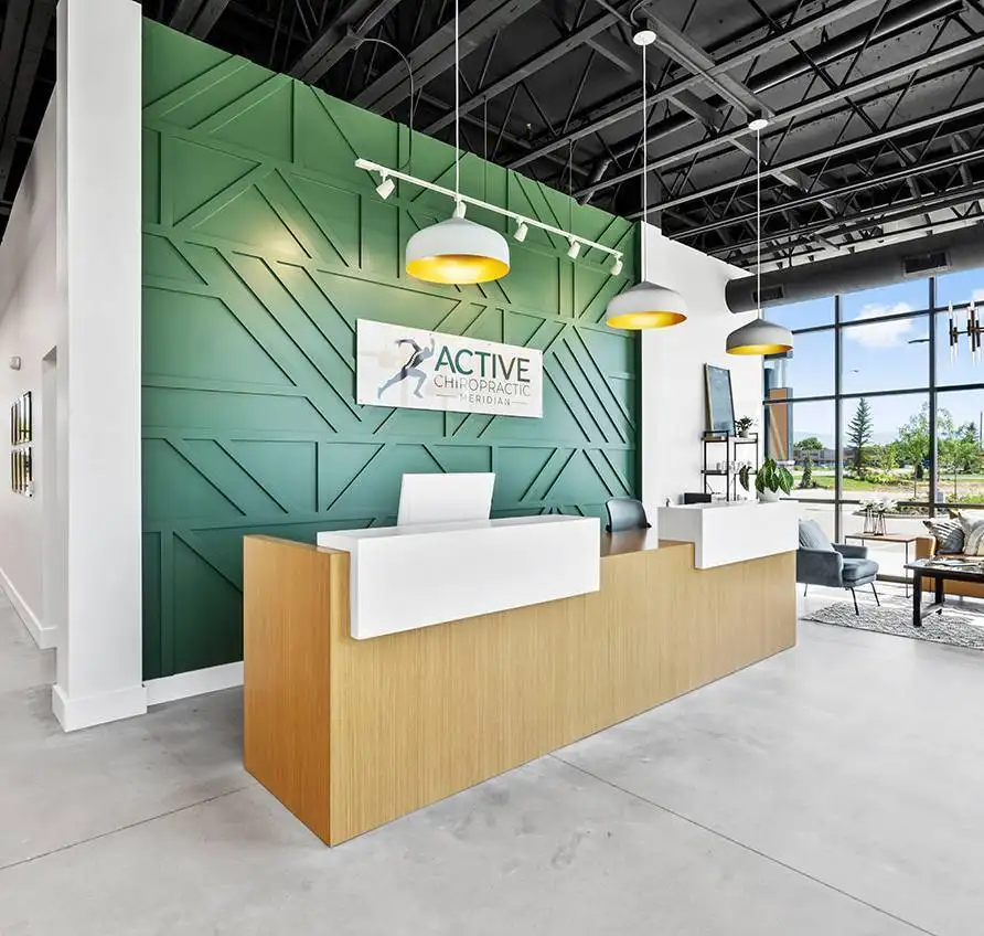
Active Chiropractic
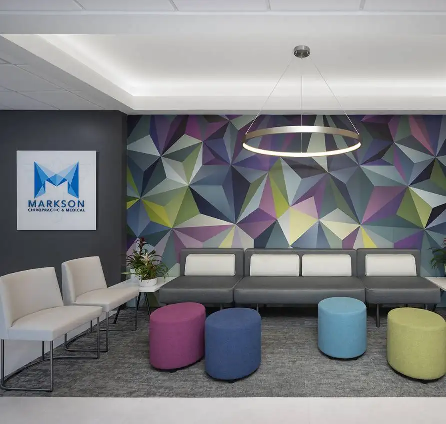
Markson Chiropractic & Wellness
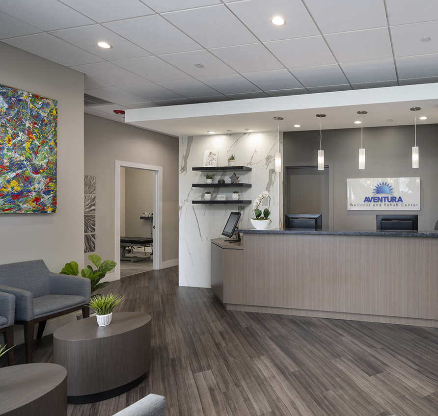
Aventura Wellness & Rehab Center
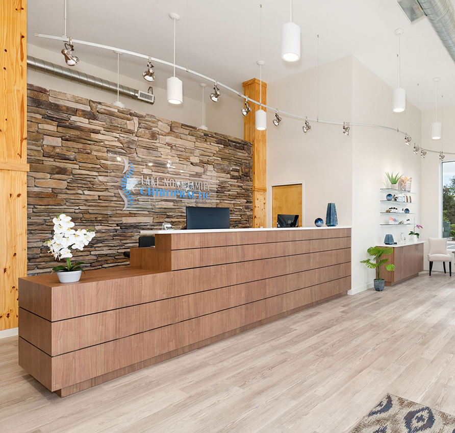
Lake Nona Chiropractic + Functional Health & Weight Loss
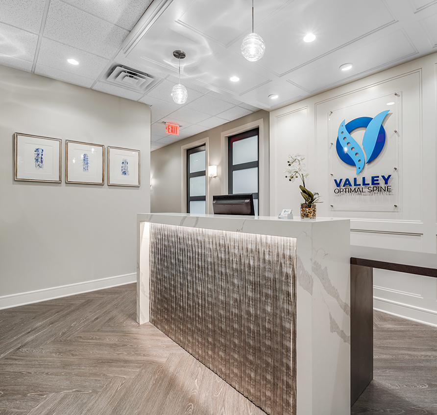
Valley Optimal Spine
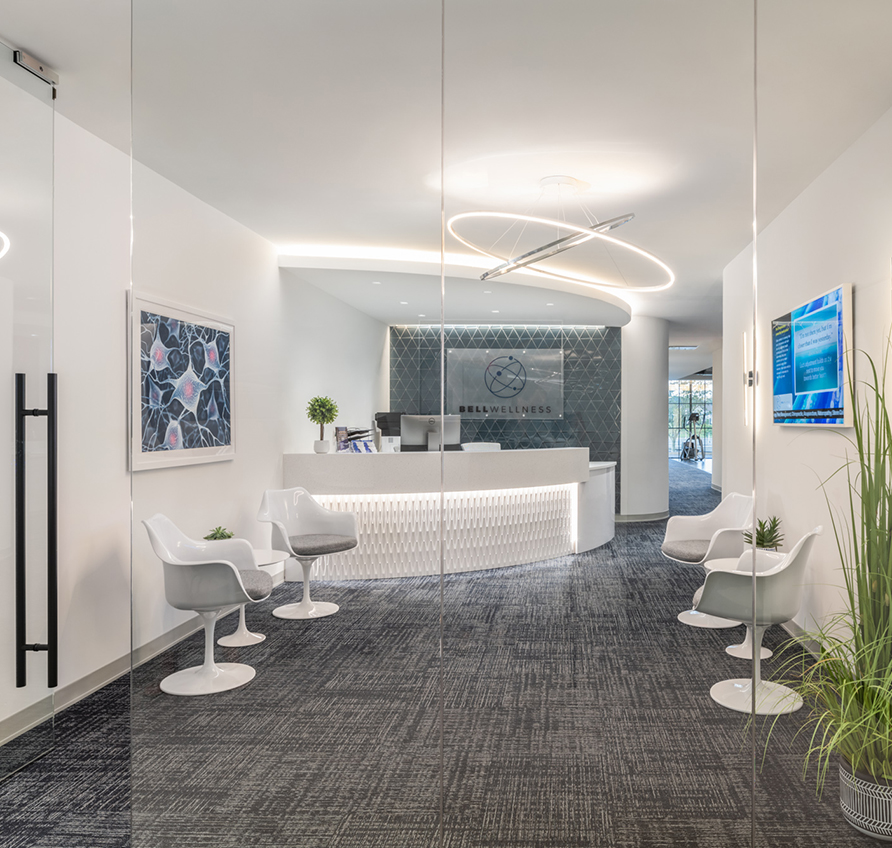
Bell Wellness
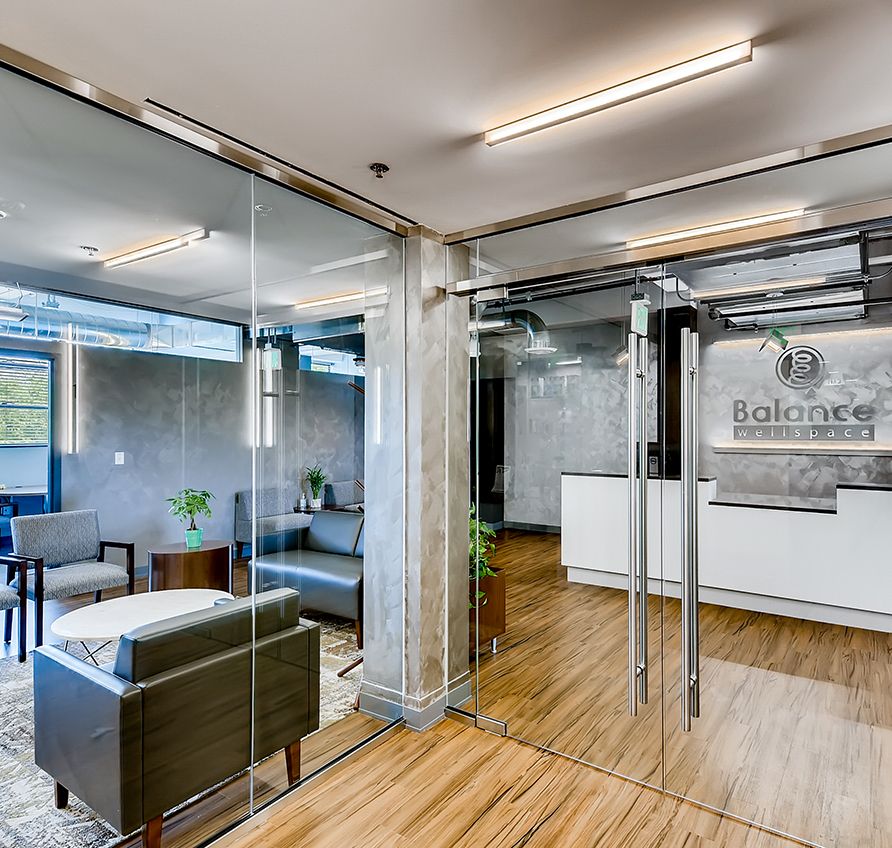
Balance Wellspace – Denver
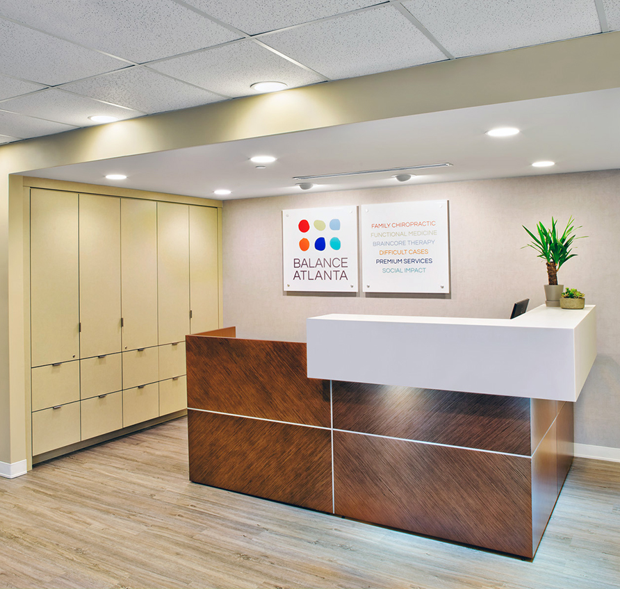
Balance Atlanta Family Chiropractic
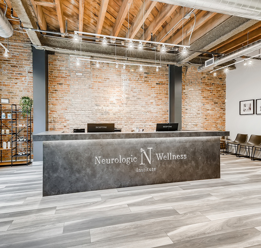
The Neurologic Wellness Institute – Chicago
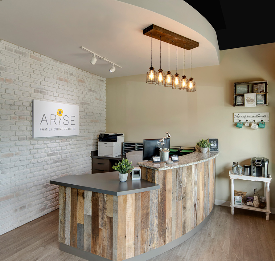
Arise Family Chiropractic
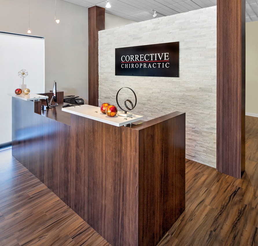
Corrective Chiropractic Woodstock
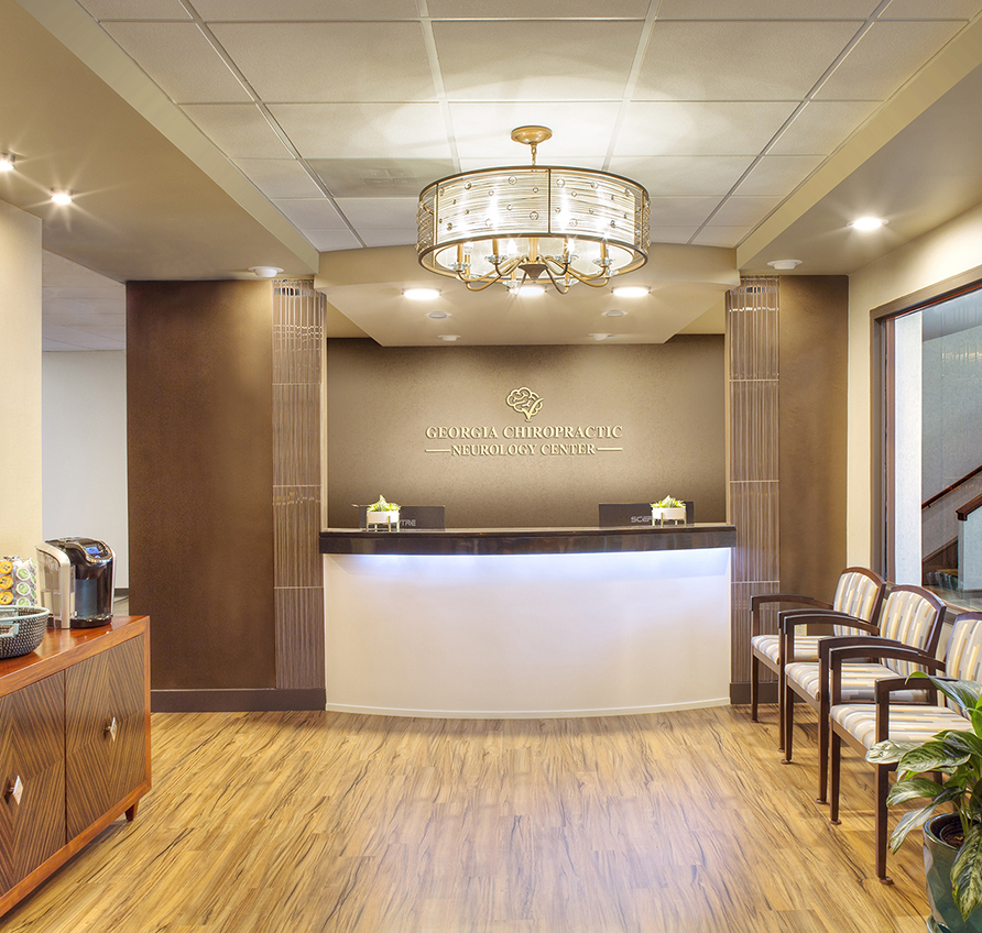
Georgia Chiropractic Neurology Center
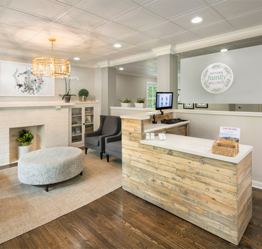
Midtown Family Wellness
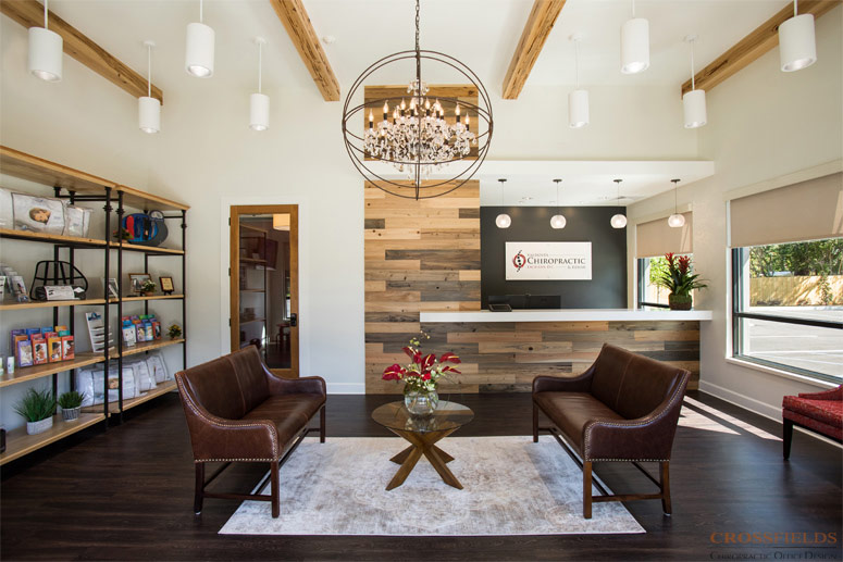
Valdosta Chiropractic
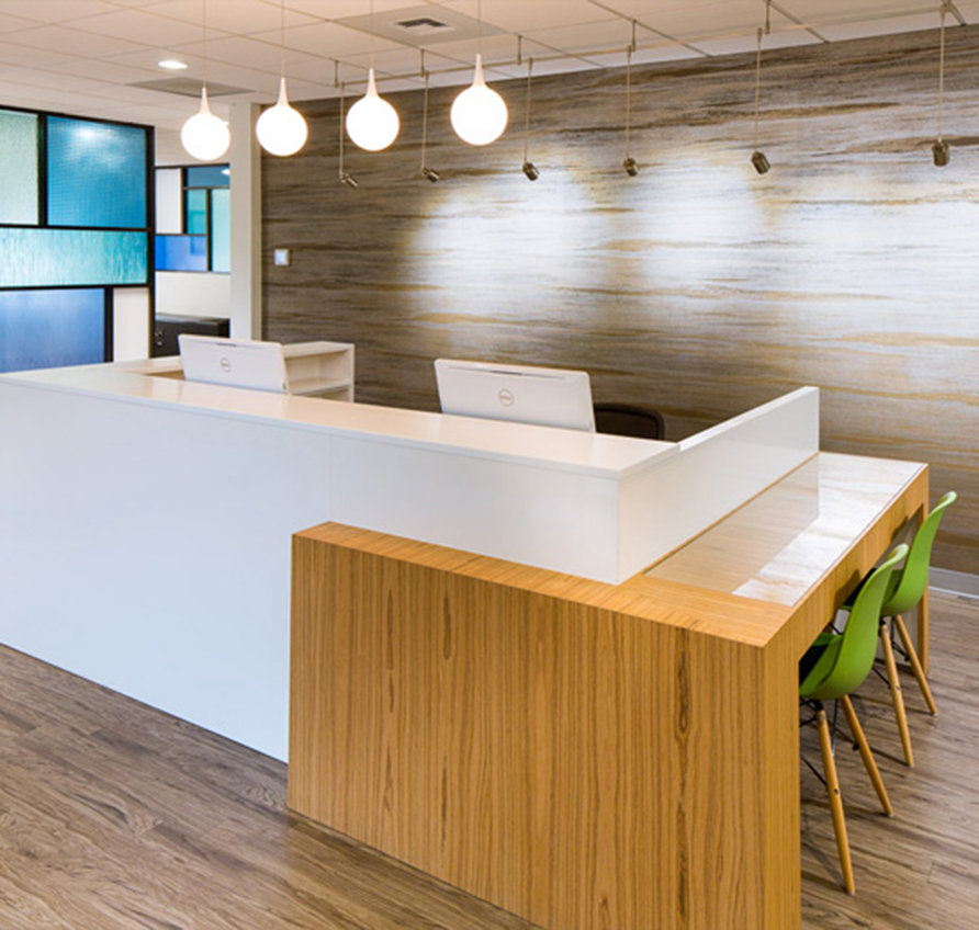
Bellevue Pain Institute
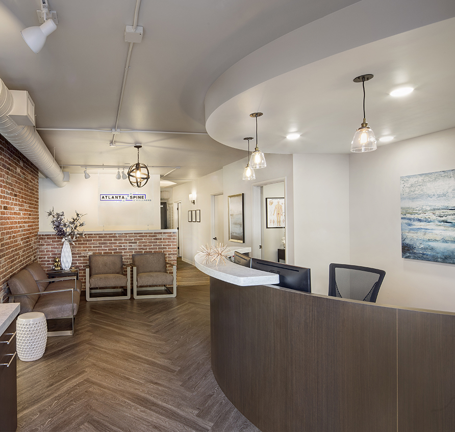
Atlanta Spine & Wellness
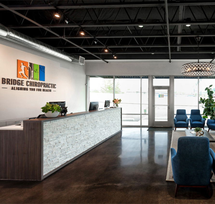
Bridge Chiropractic
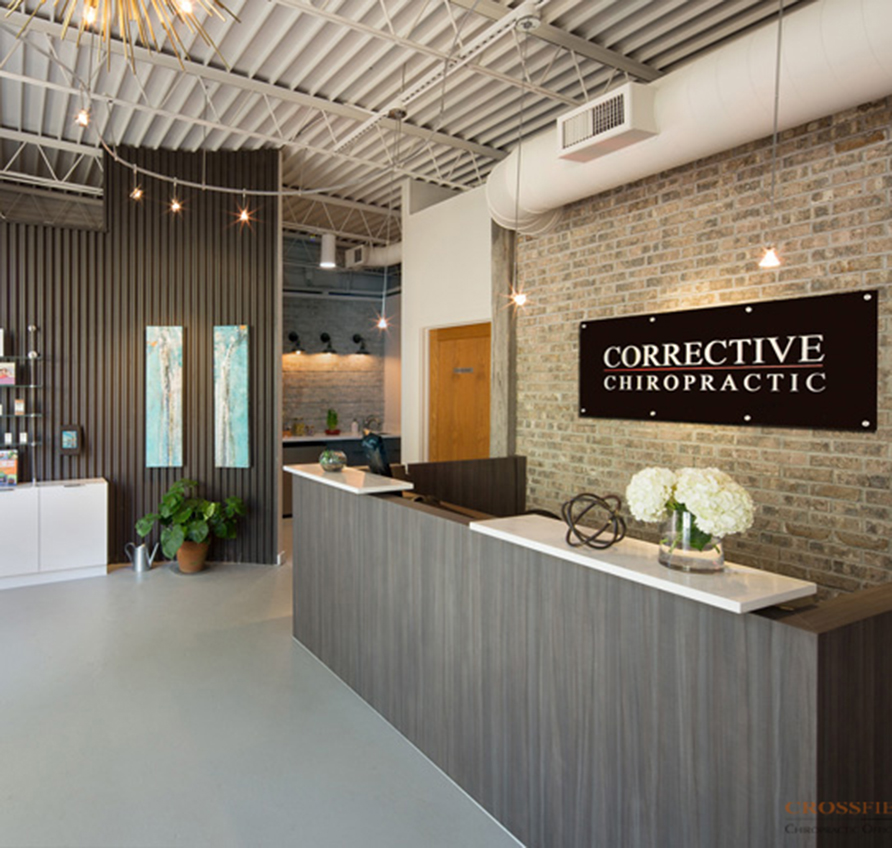
Corrective Chiropractic Decatur
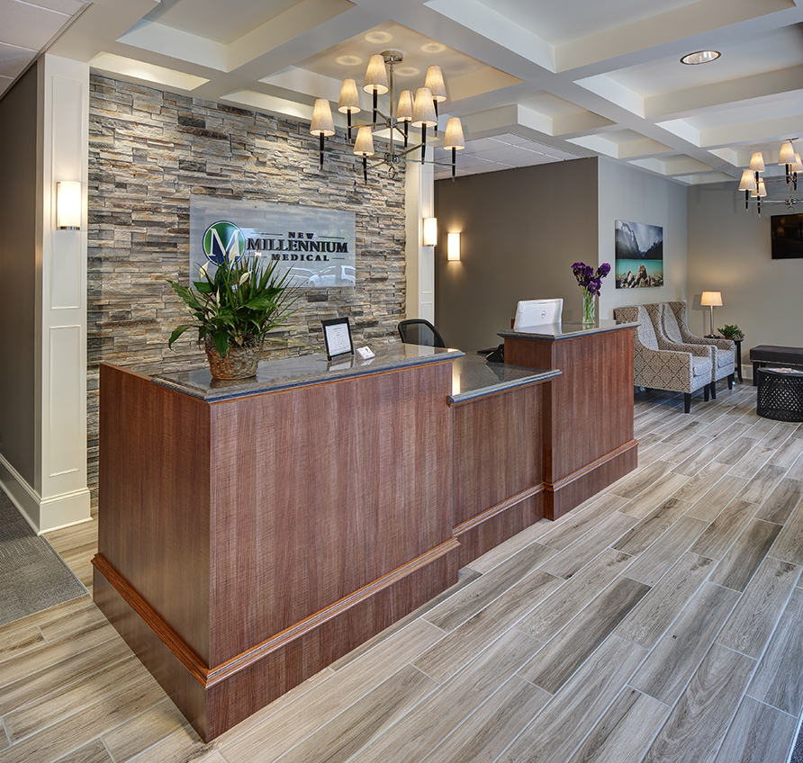
New Millennium Medical
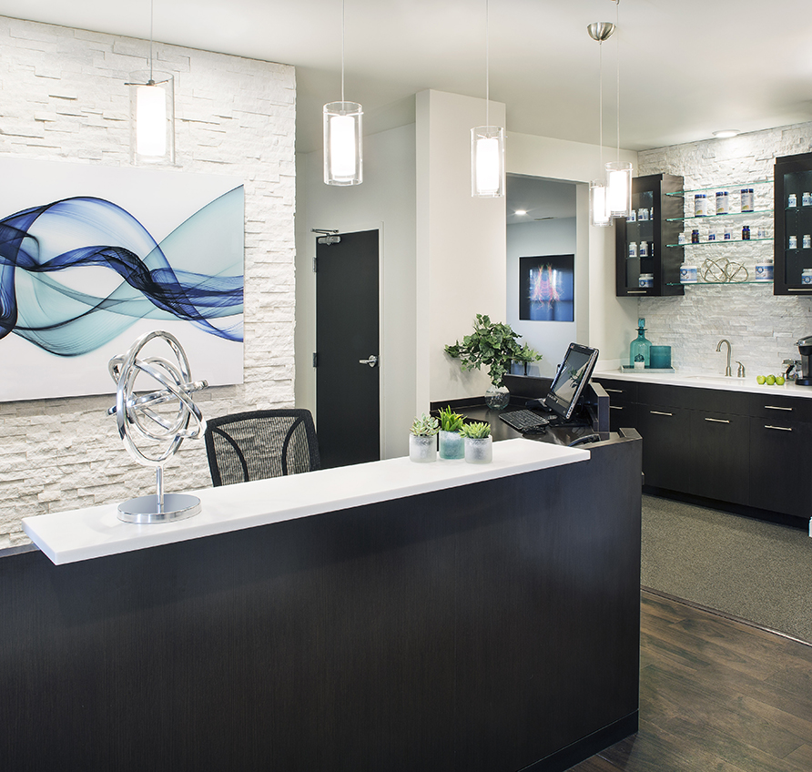
SpineCare
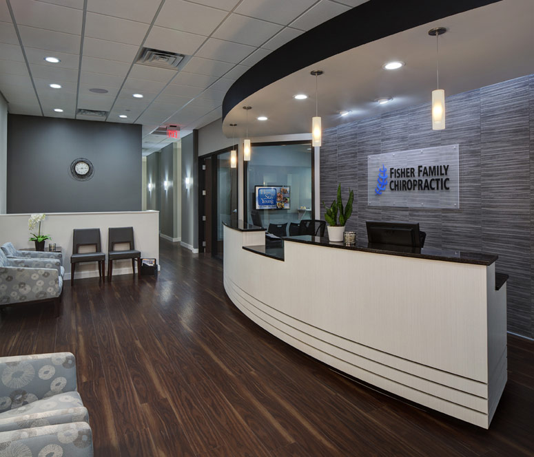
Fisher Family Chiropractic
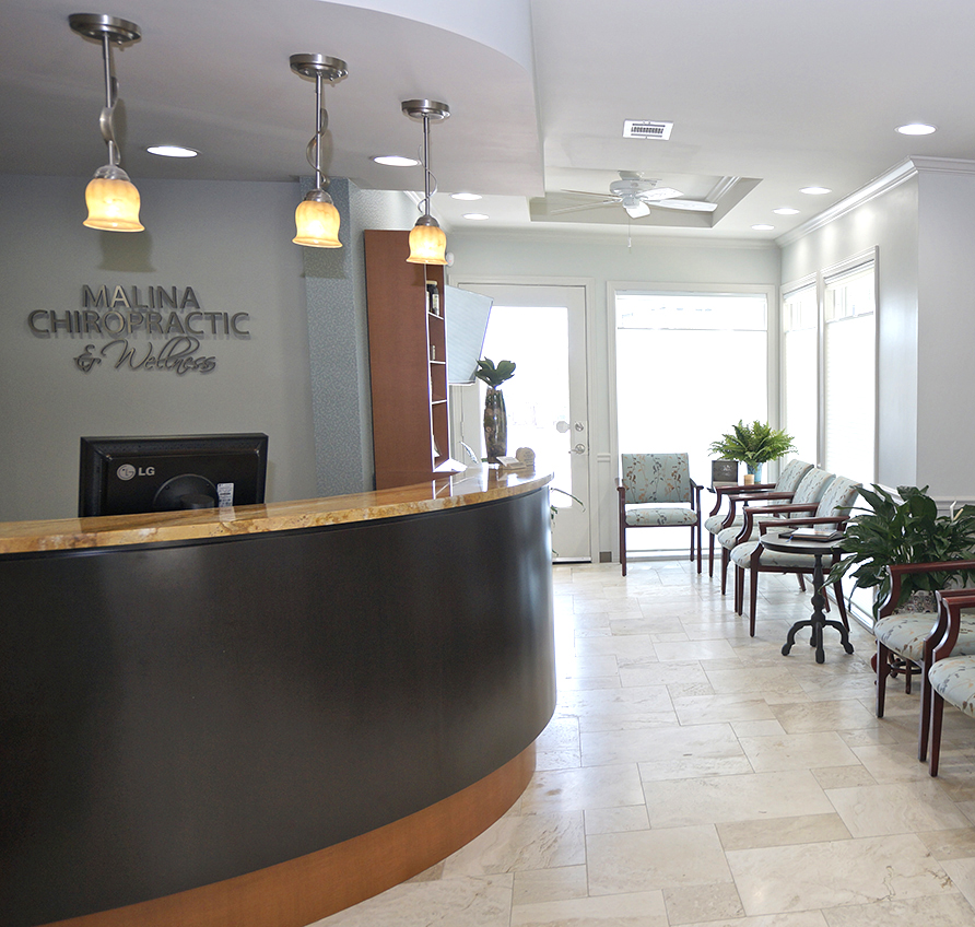
Malina Chiropractic & Wellness
Williamson County Chiropractic
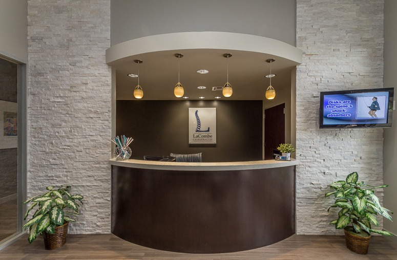
LaCombe Chiropractic
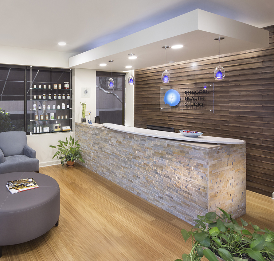
Integral Health Studio
Chiropractic Community Outreach Center – Life University
Corrective Chiropractic
Wyoming Valley Spine & Nerve
Carrick Brain Center
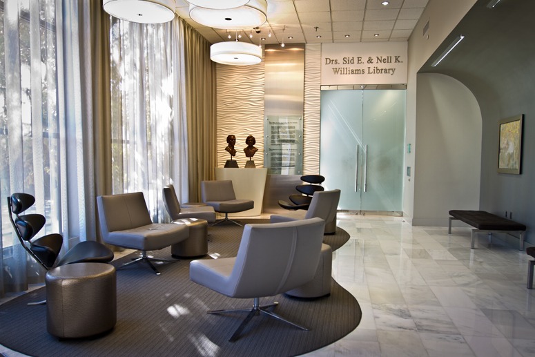
Williams Library & Life Enrollment
Cohen Chiropractic
