West University Wellness
Client: Dr. Caroline Long
Location: Bellaire (Houston), TX
Type: Gray Box
Size: 2933 Net SF
Year: 2022
Services: Pediatric & Pregnancy, Active Physical Therapy, Passive Therapy, Functional Medicine, Massage, Acupuncture
BUSINESS GOALS AND CHALLENGE
Since opening in 2004, West University Wellness was in the same location for 17 years. The practice was located on the first floor of a retail strip center in an upscale community of Houston known as West University. Dr. Caroline Long had grown a successful practice. Along with a staff of five doctors, experienced in pregnancy and pediatric Chiropractic, all ICPA certified, West University Wellness is one of the largest clinics in Texas with this designation. They love treating families of all shapes, colors, and sizes from the youngest, one-day-old patient, to the oldest, a 106-year-old patient. They also provide high-quality ancillary services such as massage therapy, physical therapy, acupuncture, nutritional counseling, cupping, pelvic floor restoration, reiki, yoga, decompression, and much more.
Dr. Long saw change during the pandemic and her once thriving retail center was “kind of dying”. As her lease was coming up, she knew this was a good time to consider other options. She no longer felt she needed ground-floor retail space, but still wanted something in a vibrant shopping center. She found a rebuilt, up-and-coming shopping center about two miles away. The ground-level retail/restaurant was becoming an energetic environment that would bring a wave of returning and new clients to her Chiropractic office. The space was raw with a full side of exterior windows. And, importantly, the second floor was served by second floor parking deck to make it easy on her patients. Dr. Long knew this was her opportunity to build a new clinic and achieve the things she wanted in a new space.
The elevation of their environment was important to the team as they were a cash practice, and they were going to be increasing their prices. They wanted their patients to experience the quality space that represented their high quality of care and their BRAND.
When they decided to move to the new shopping center she had heard through her network “if you want your space to look like a million bucks – CrossFields is the office design team for you.”
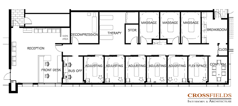
The goals were to create a vibrant welcoming space that was also efficient. She had been studying our educational resources and resonated with the idea that their lobby needed to be the “wow” factor – your first impression environment that invited people in with enough space for education and community. Also studying our floor plans, Dr. Long came to us with an idea of her floor plan that needed to be validated and built upon.
SOLUTION
CrossFields started by working very closely with Dr. Long and her staff to analyze, validate and perfect their proposed floor plan and layout. We sought to understand their goals and designed a custom layout that translated perfectly into their wellness office space. Dr. Long had requests to maintain the casual, comfortable environment of the office that nurtures a clientele of families and children.
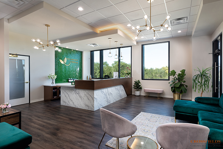
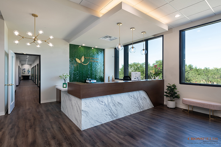
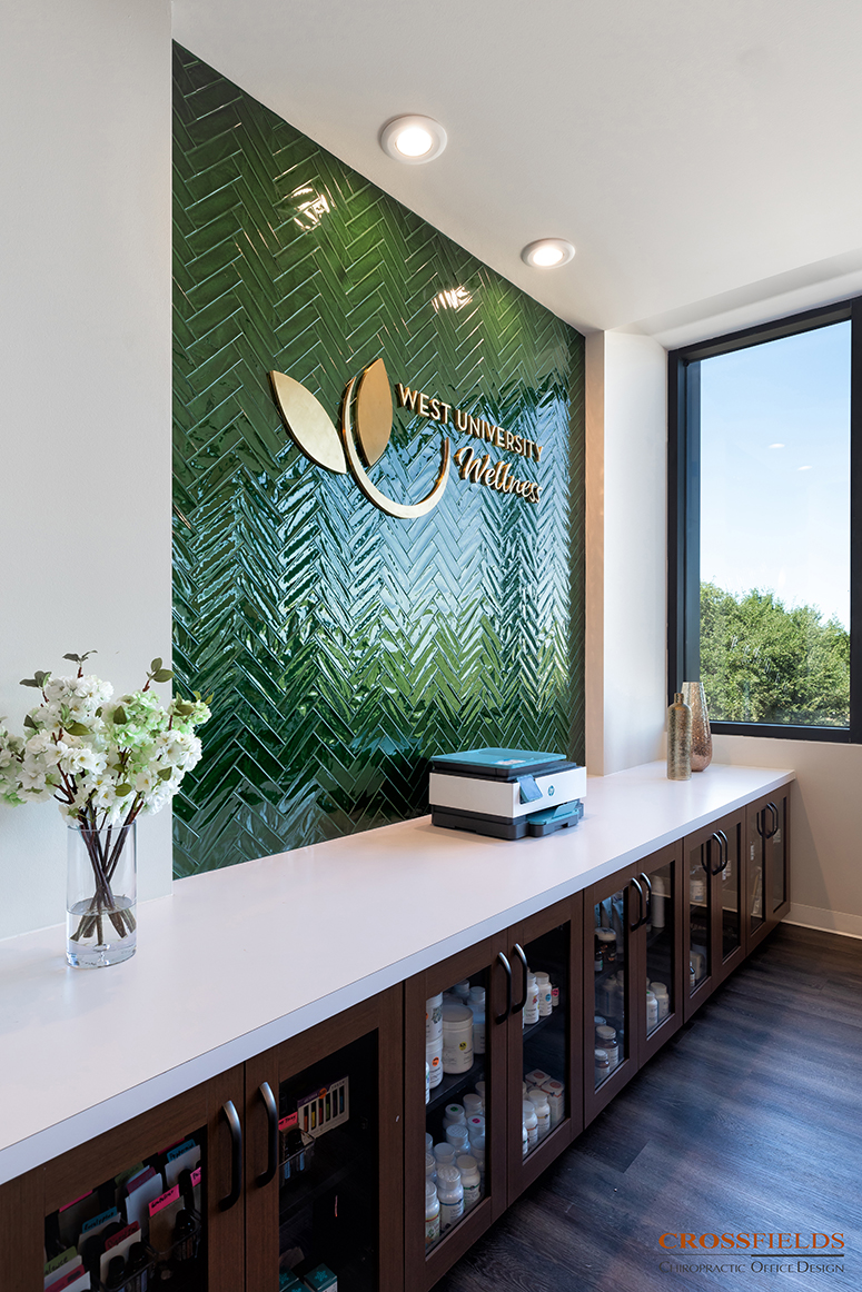
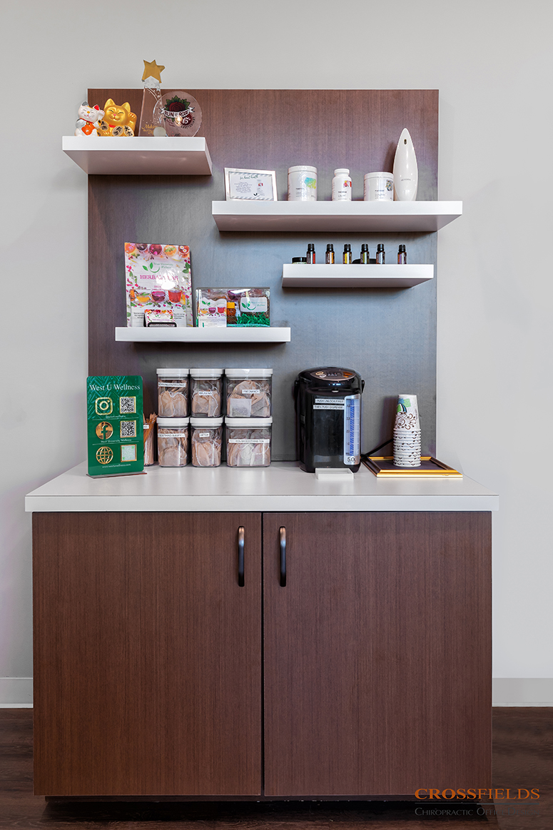
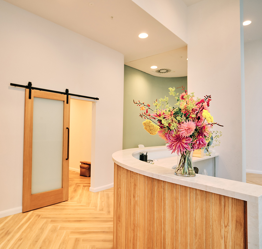
We approached the design and layout of the front of the office to create the key welcoming environment desired, utilizing the bright natural light entering the space from the large storefront location. An important requirement was to provide a dedicated space for kids to play and relax as parents were receiving services. The overall effect was that of a living room rather than a doctor’s lobby. The storage needs of the staff were addressed in the design and layout of their front desk and new retail display, so everything was tucked away “out of sight” to help maintain the feel of a living room.
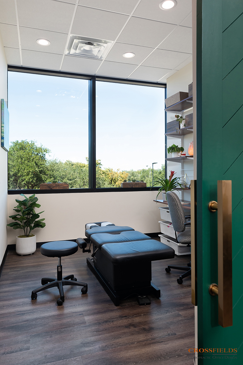
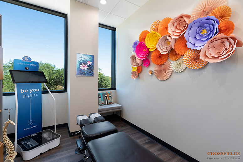
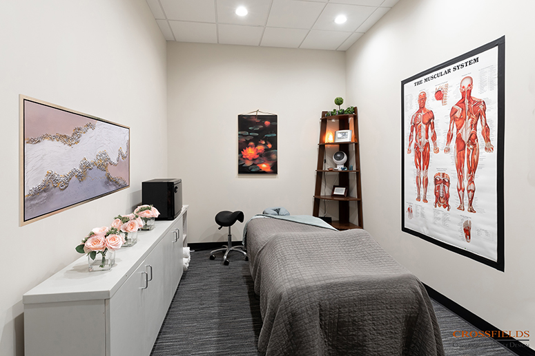
Equally sized closed treatment rooms, for massage, adjusting, and/or exam, were key in the layout, giving her flexibility to grow. It was important to Dr. Long to address the need for a touch down hand washing station centralized in the office corridor for doctor and patient use. It has become known as the hydration station. We provided a washing sink and adequate storage in the center of the treatment spaces.
The raw space allowed for high ceilings, especially in the lobby. We used creative ceiling treatments to create a wow factor while also hiding the HVAC. The large expansive windows, across the entire length of the space were maximized in the lobby as well as the key treatment rooms, creating a wonderful healing and natural energy.
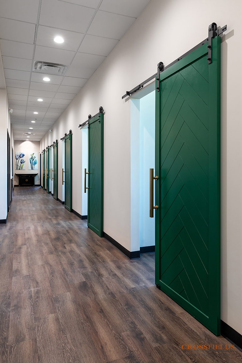
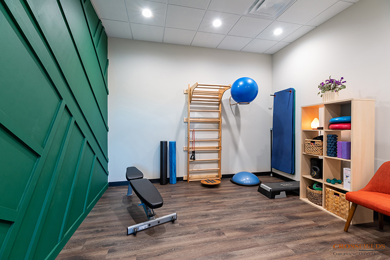
For the aesthetics, we focused on the brand palette. The deep emerald green was set as an accent against the neutral white walls and the medium grey warm wood flooring and details. This accent was strategically used in key area, such as the back wall of the front desk, the rhythmic barn doors down the hall, and the comfy sofas. The feminine touch of pink is found in the lobby and some art to resonate with their ideal client.
Her patients say, “It feels like home, like your old space, but fancier”.
TESTIMONIAL
“I didn’t know what I was doing [all those] years ago… I don’t have a design eye. I’m not a designer…. My brain doesn’t work that way. But I knew that I needed to find somebody who did work that way who did specialize like [CrossFields does].”
“I was trying to run a practice and busy seeing patients. I didn’t slow down to have this happen. I tried to fit in all the design stuff at night or on my afternoons off. I couldn’t have done it If I didn’t have a designer and I didn’t have a team to work with to source things for me and make suggestions. I didn’t have that time, nor do I have that talent.”
CrossFields helped with the architecture and architectural details, “getting the permits and the MEP plans. I didn’t even know what MEP stood for, but you guys suggested things that I never would have thought of and I’m grateful for that.”
Dr. Caroline Long, DC, West University Wellness – Bellaire, TX
See What Our Clients Have Said
- All
- Chiropractic
- Integrative
- Neurology
- Rehab & PT
- wellness
Island Wellness
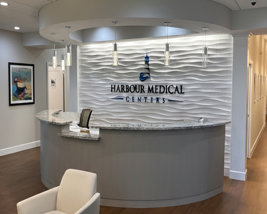
Harbour Medical Centers
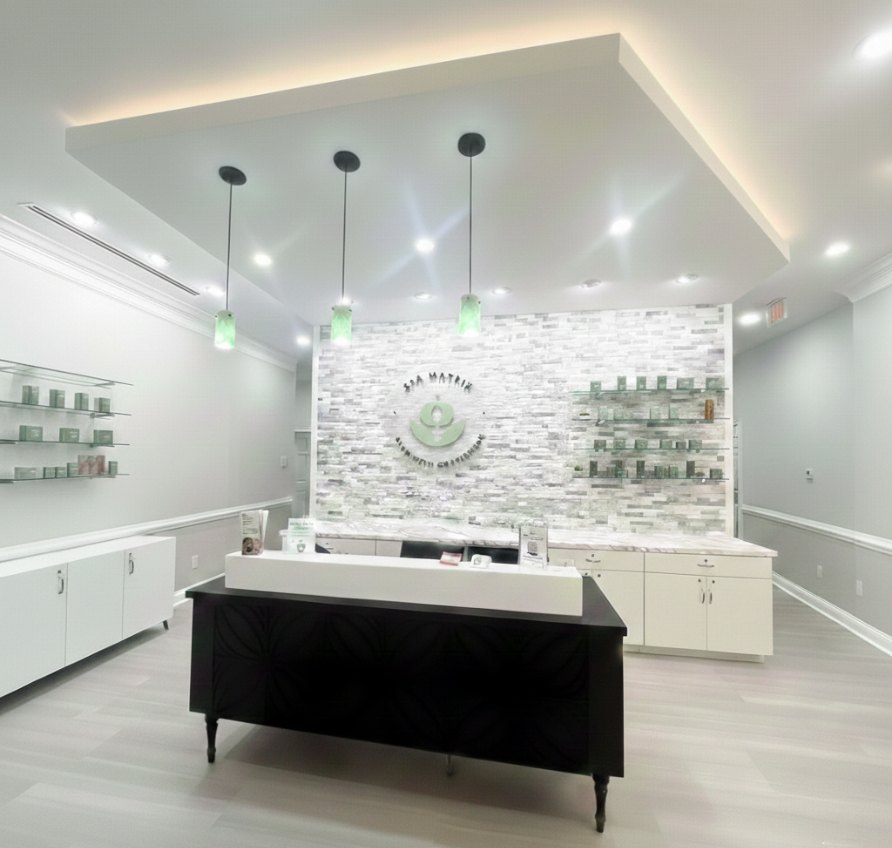
Spa Matrix
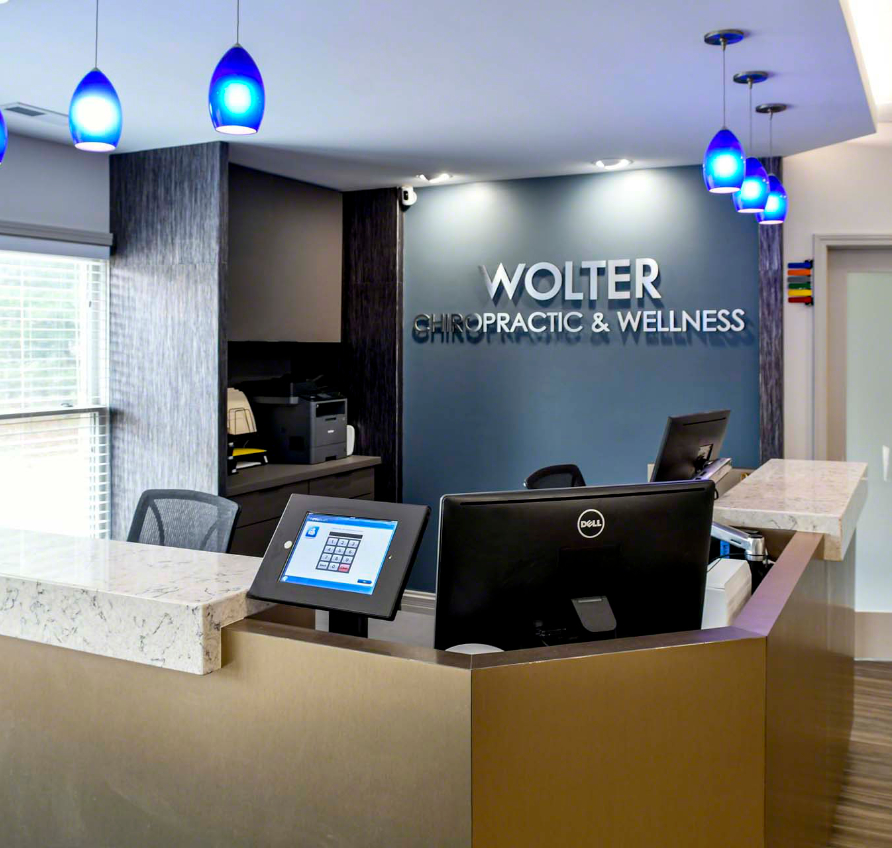
Wolter Chiropractic & Wellness
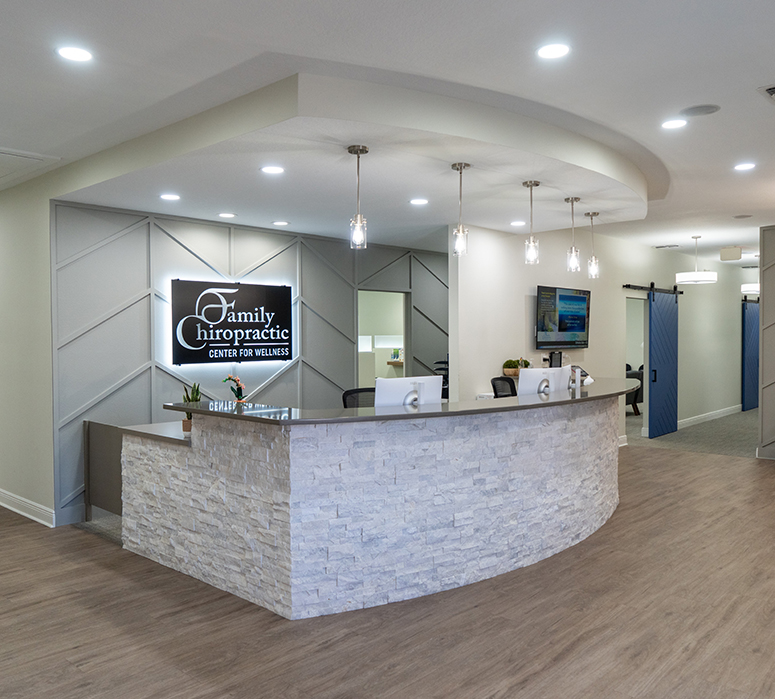
Family Chiropractic Center for Wellness
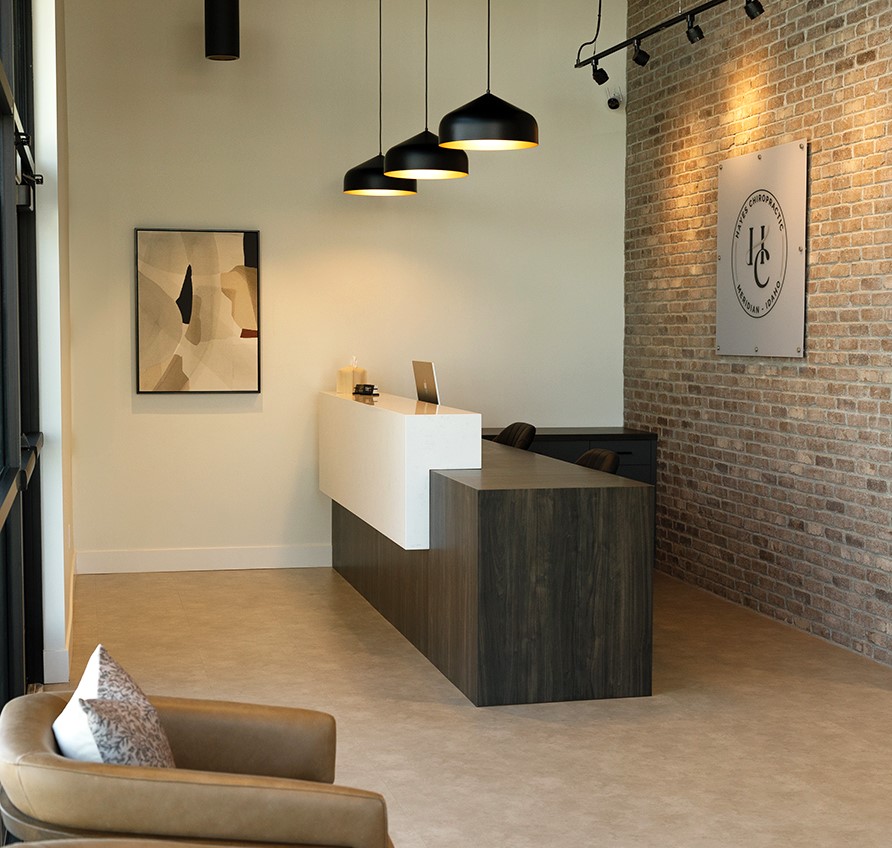
Hayes Chiropractic
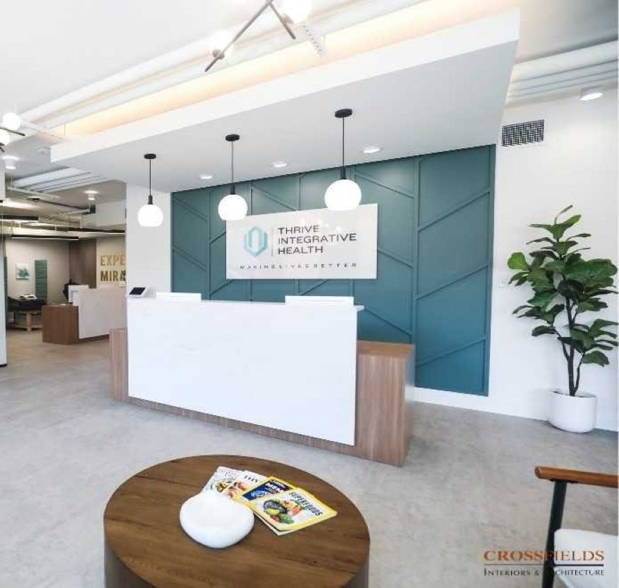
Thrive Integrative Health
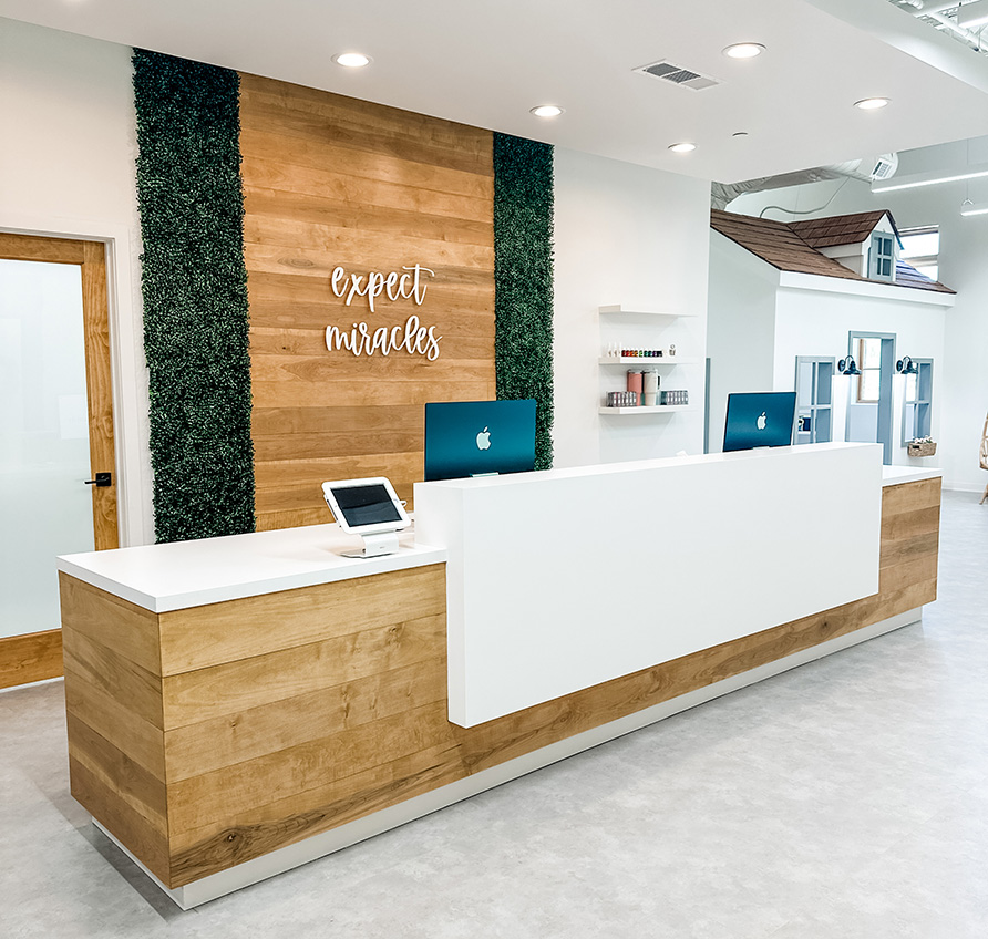
Cumming Family Chiropractic
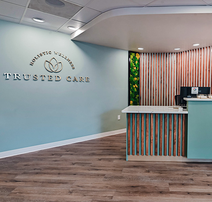
Trusted Care Holistic Wellness
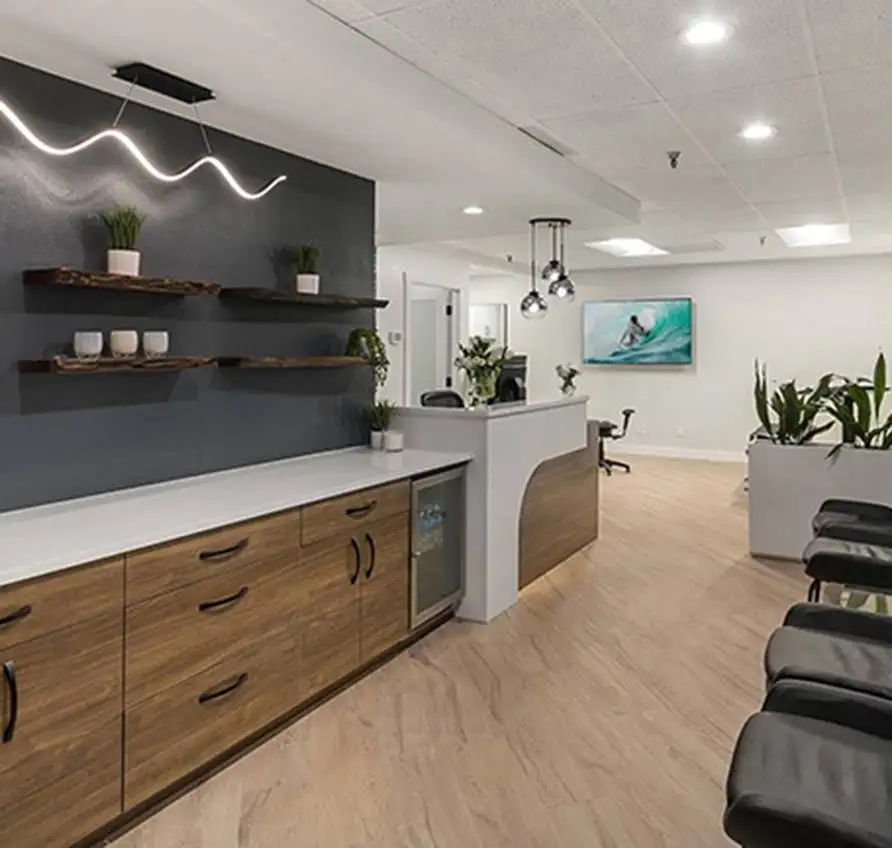
Lakeside Spine and Wellness
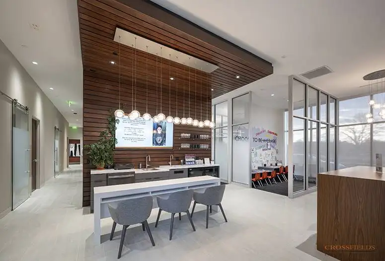
Chiropractic Lifestyle Studio
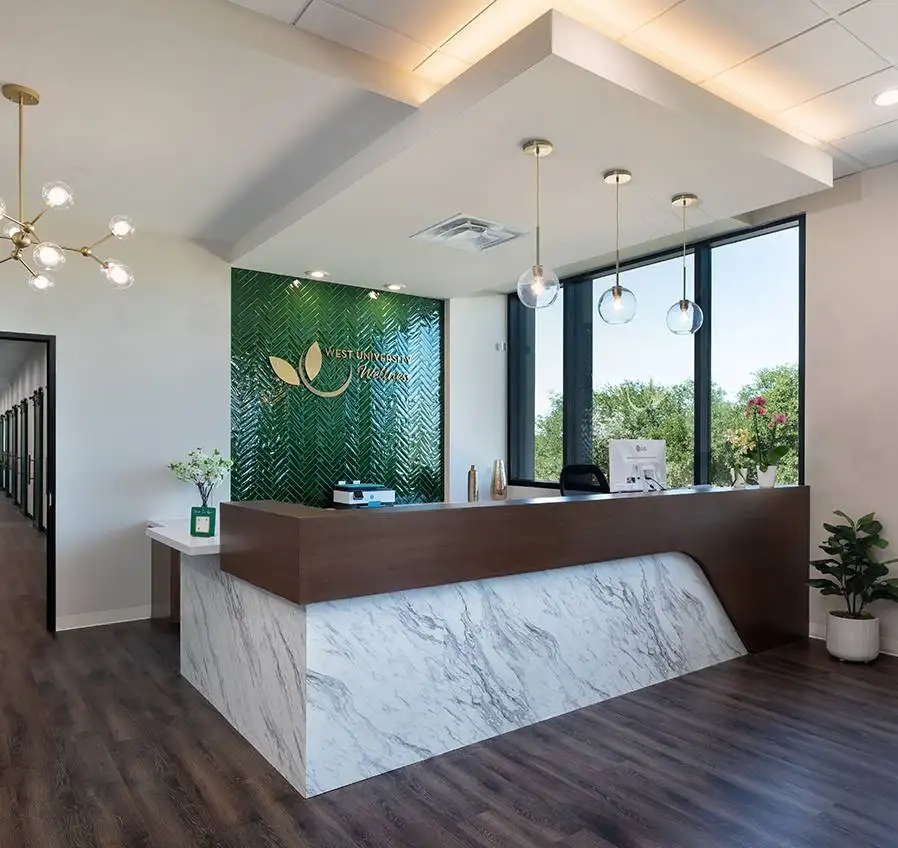
West University Wellness
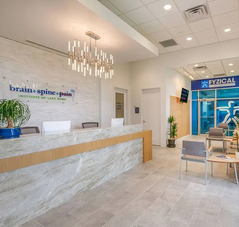
Brain + Spine + Pain Institute Of Lake Nona
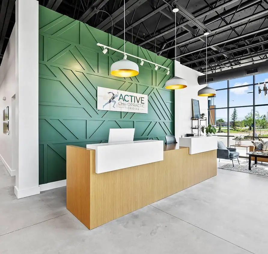
Active Chiropractic
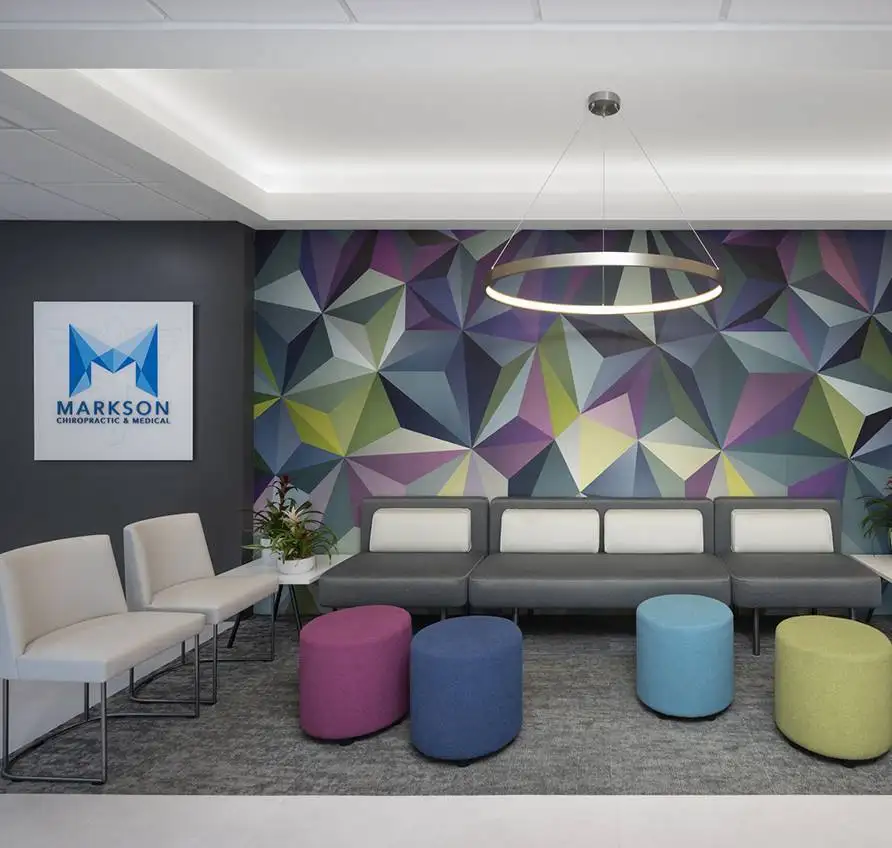
Markson Chiropractic & Wellness
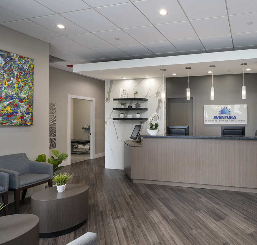
Aventura Wellness & Rehab Center
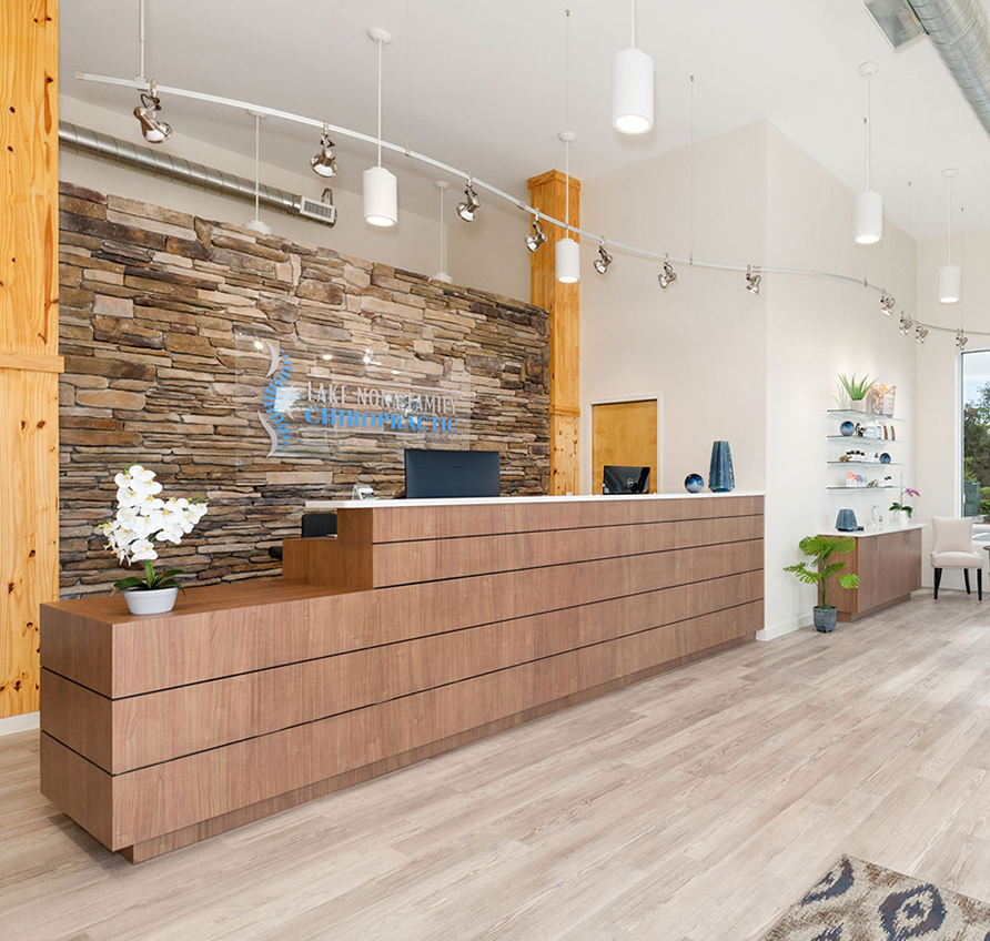
Lake Nona Chiropractic + Functional Health & Weight Loss
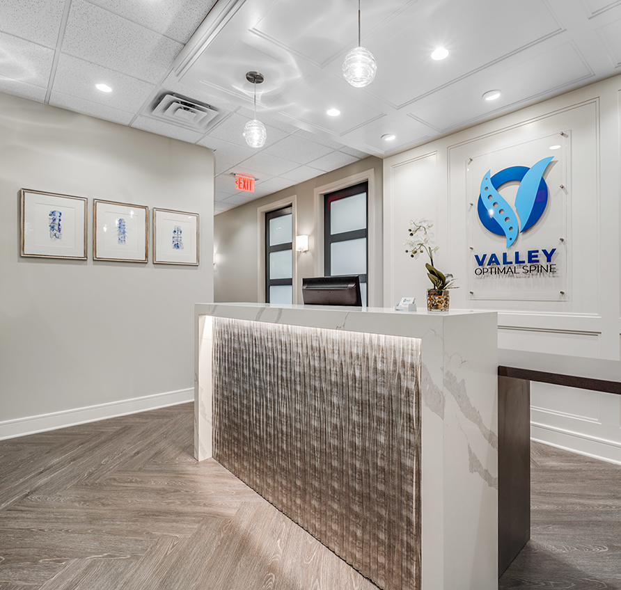
Valley Optimal Spine
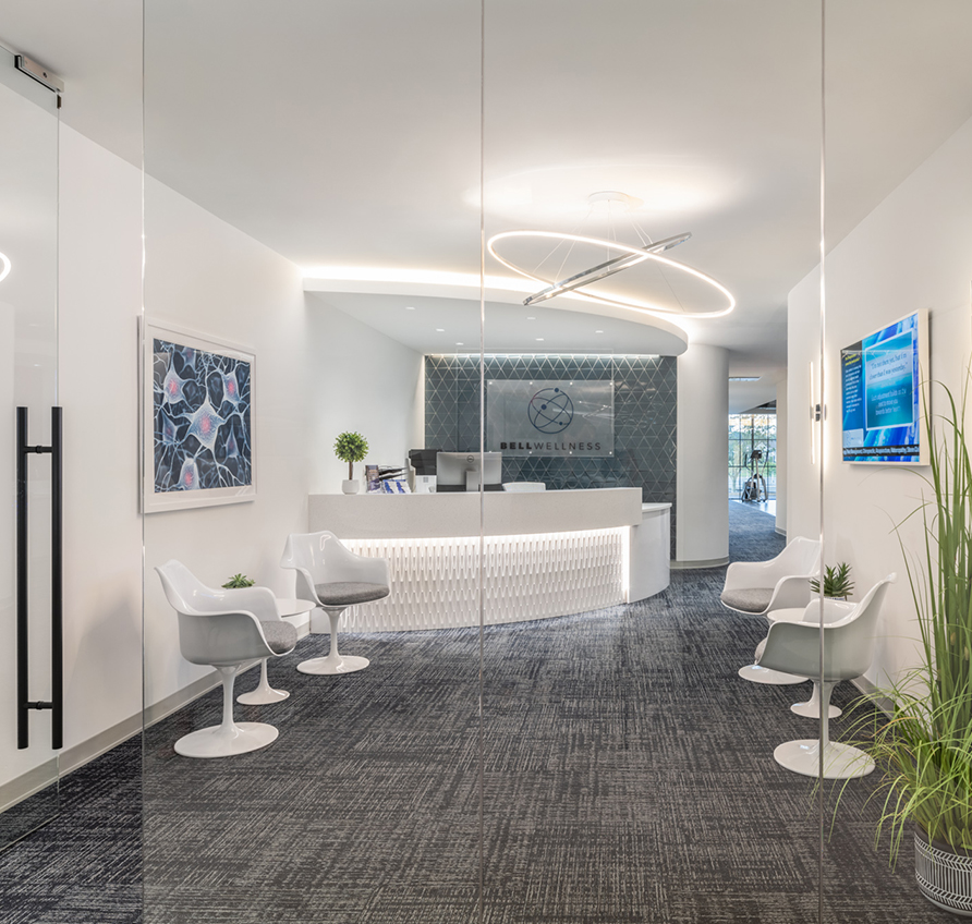
Bell Wellness
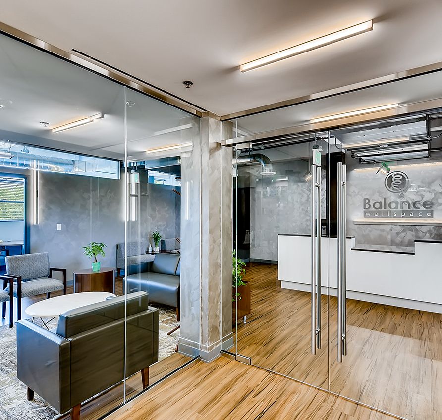
Balance Wellspace – Denver
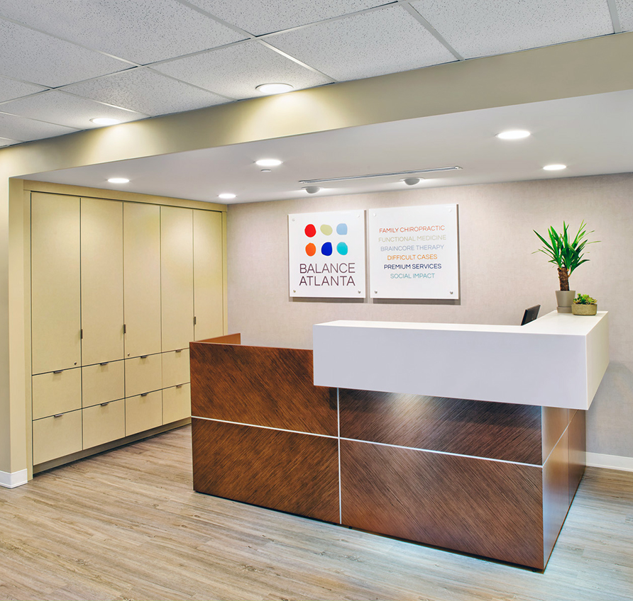
Balance Atlanta Family Chiropractic
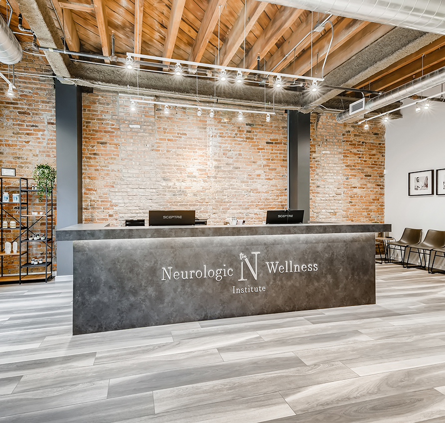
The Neurologic Wellness Institute – Chicago
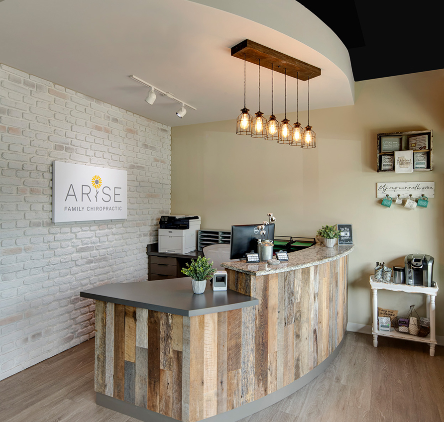
Arise Family Chiropractic
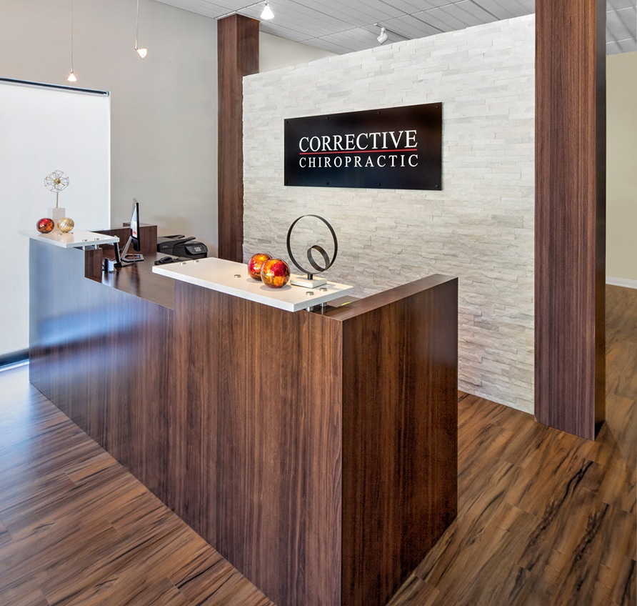
Corrective Chiropractic Woodstock
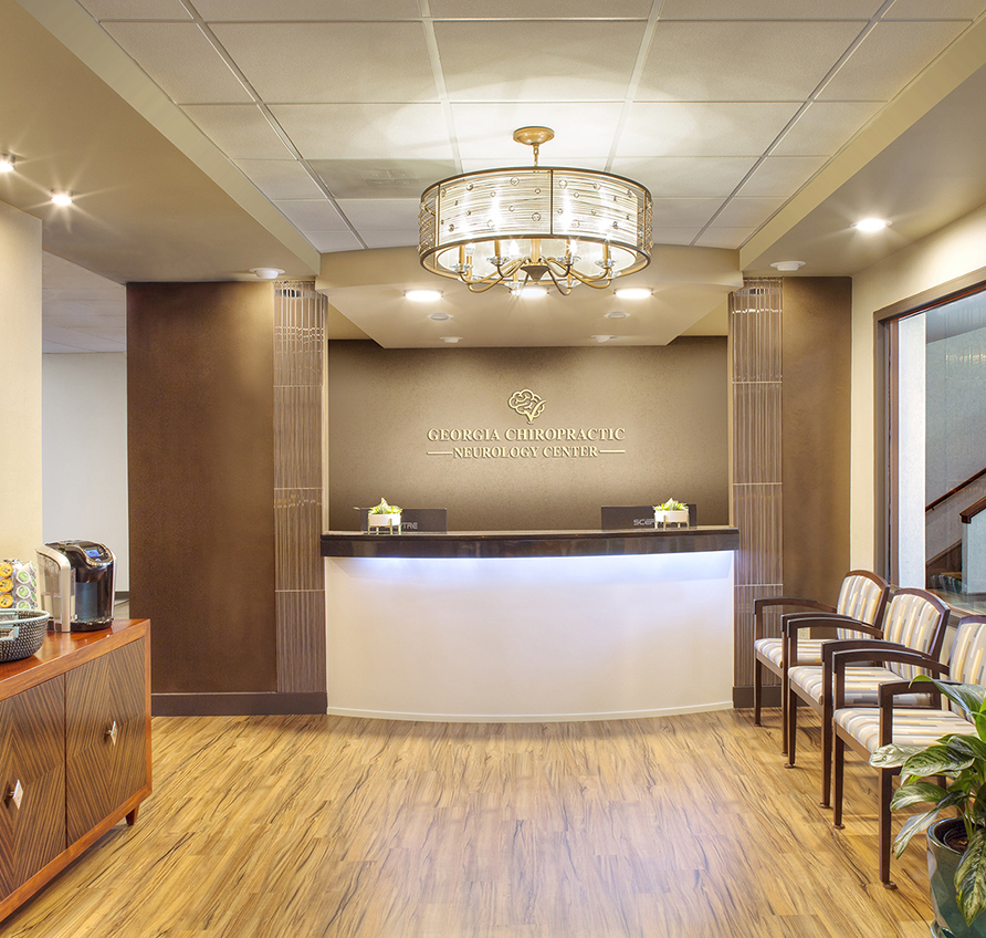
Georgia Chiropractic Neurology Center
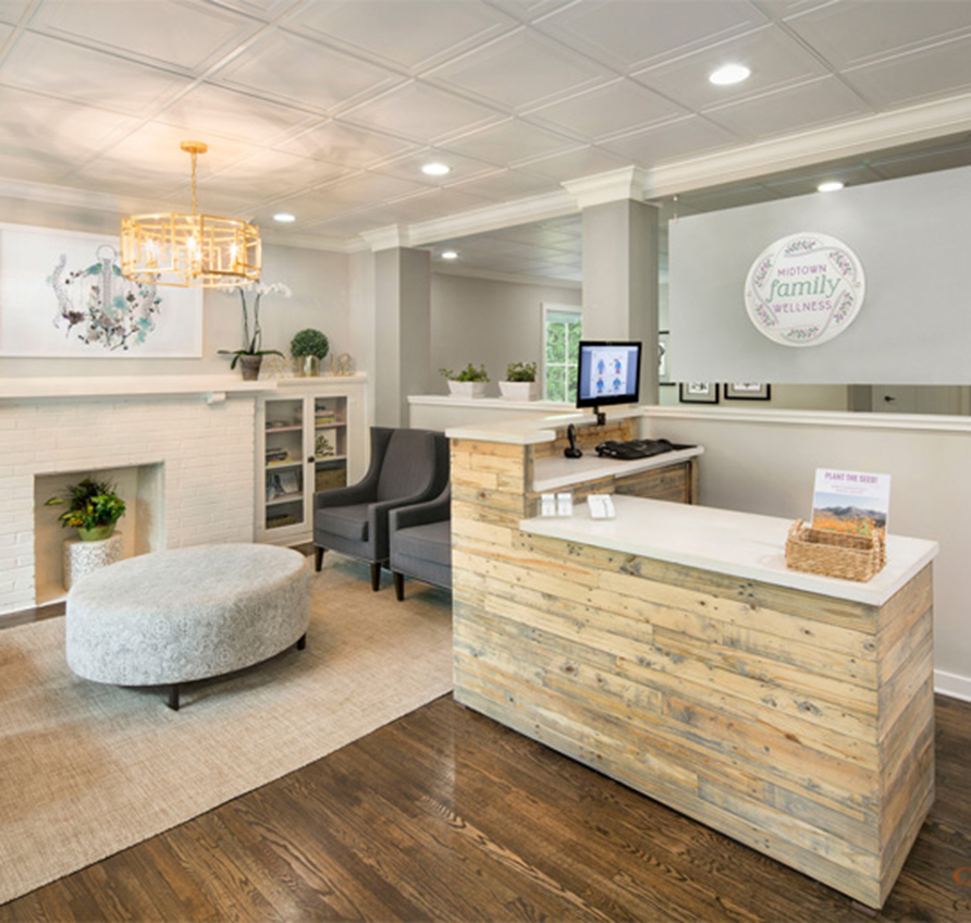
Midtown Family Wellness
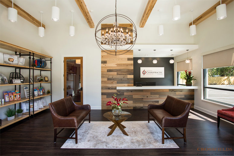
Valdosta Chiropractic
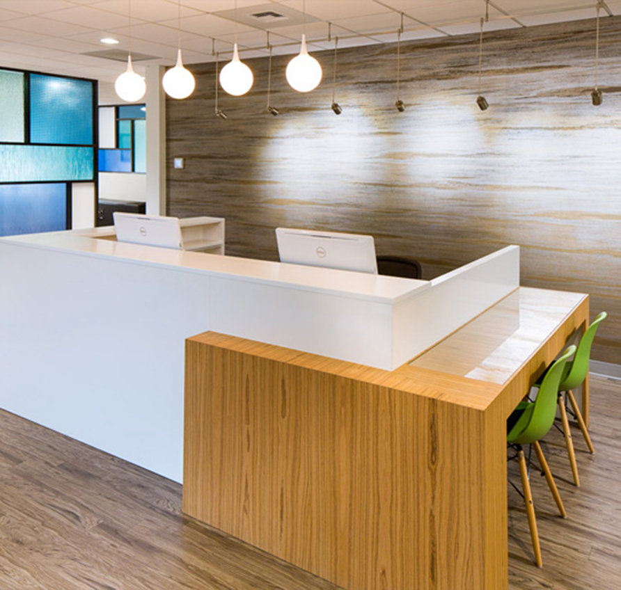
Bellevue Pain Institute
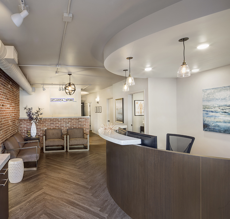
Atlanta Spine & Wellness
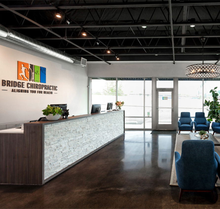
Bridge Chiropractic
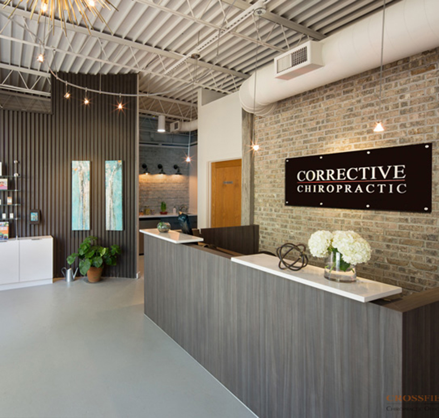
Corrective Chiropractic Decatur
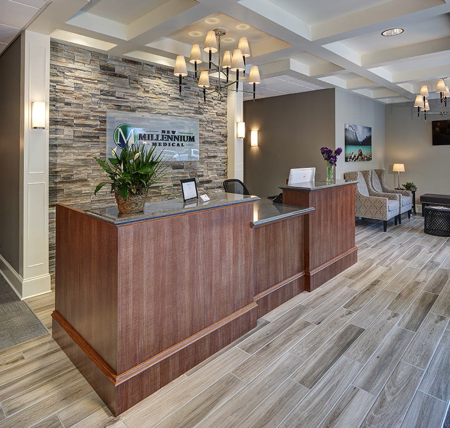
New Millennium Medical
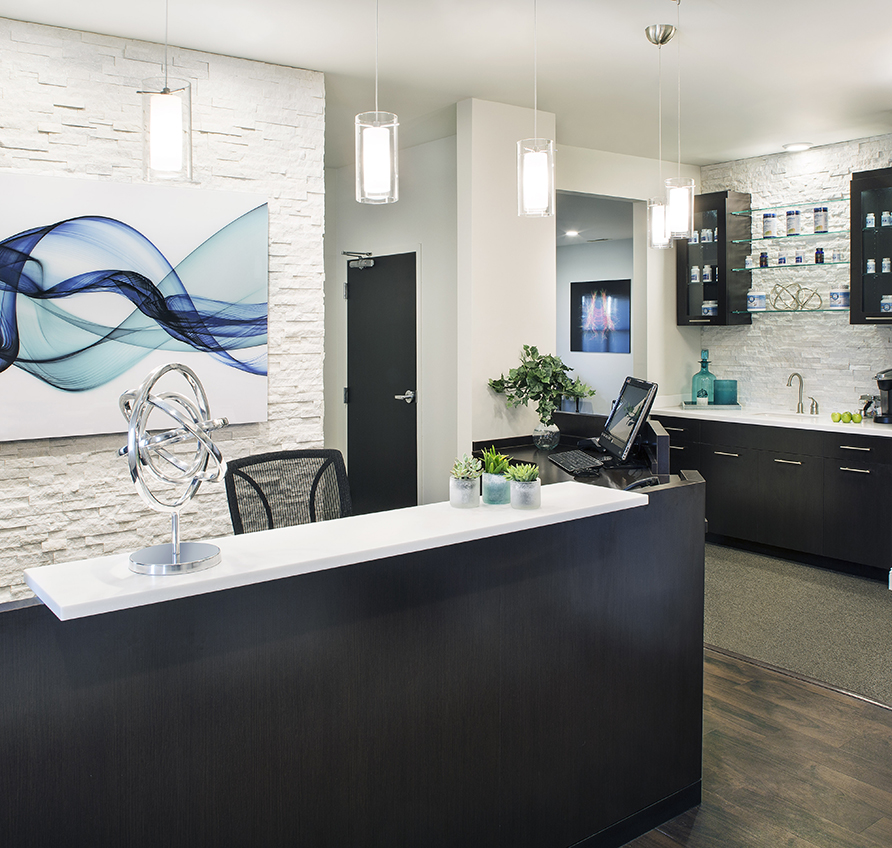
SpineCare
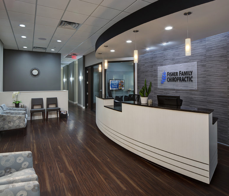
Fisher Family Chiropractic
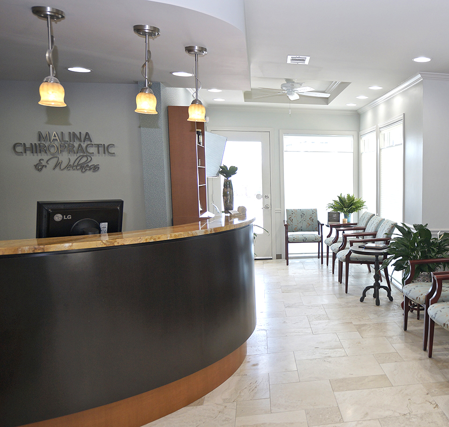
Malina Chiropractic & Wellness
Williamson County Chiropractic
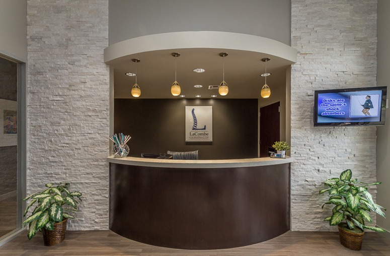
LaCombe Chiropractic
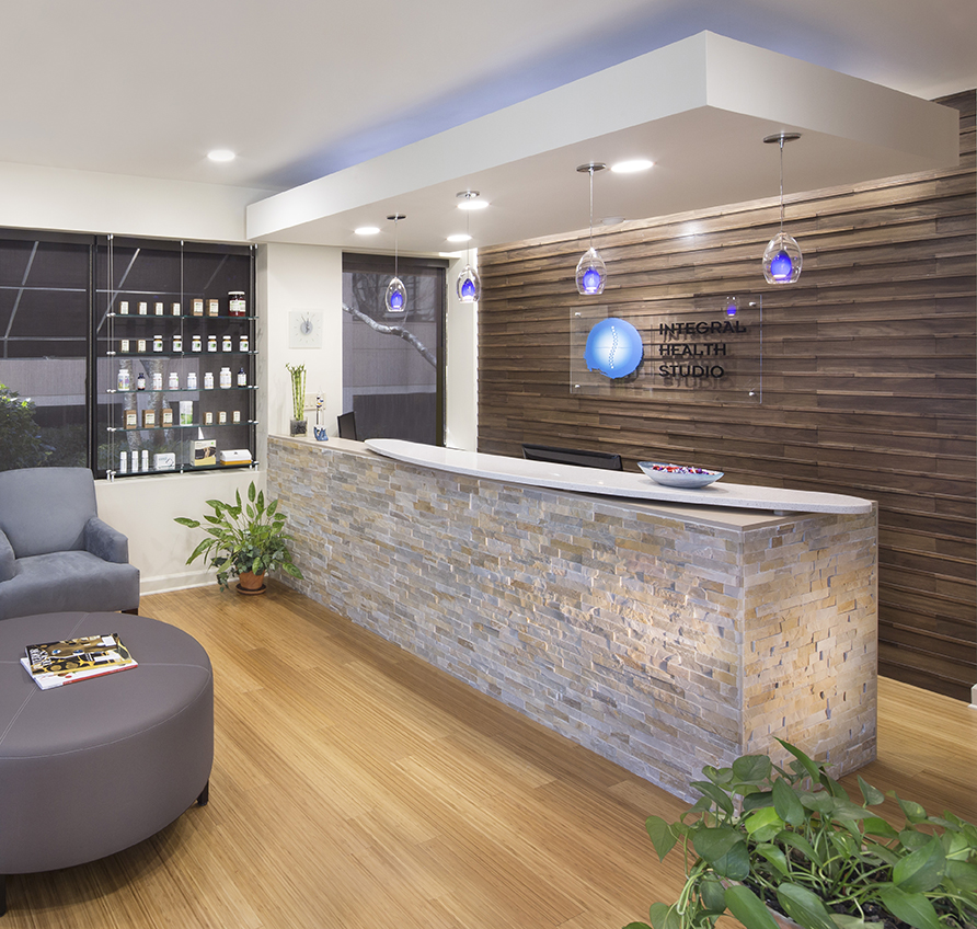
Integral Health Studio
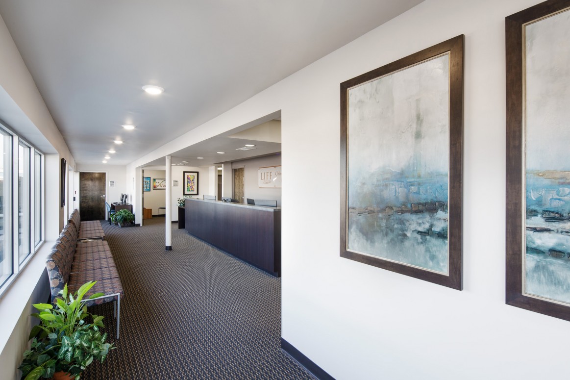
Chiropractic Community Outreach Center – Life University
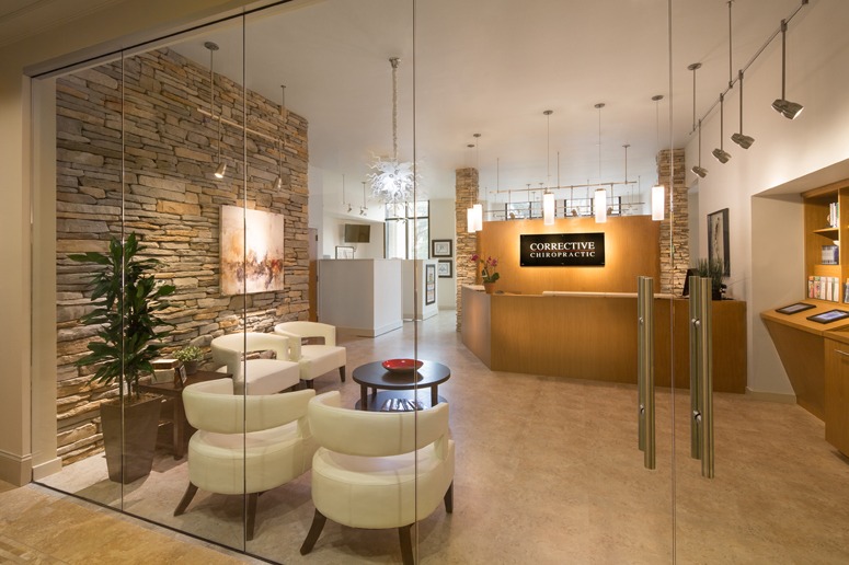
Corrective Chiropractic
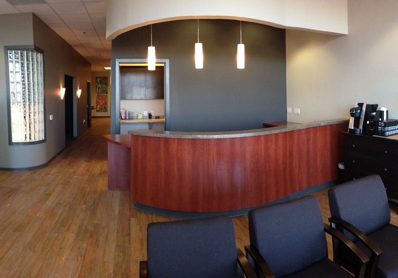
Wyoming Valley Spine & Nerve
Carrick Brain Center
Williams Library & Life Enrollment
