Bellevue Pain Institute
Client: Dr. Kevin Polzin
Location: Bellevue (Seattle), WA
Type: Remodel
Size: 3107 Net SF
Year: 2017
Services: General or Pain & PI, Corrective Chiropractic, Regenerative Medicine, Neuropathy, Active Physical Therapy, Passive Therapy
CHALLENGE
Dr. Kevin Polzin and his wife and business partner, Christina, were moving office locations and had the goal to create a legacy brand – “a high-end space that becomes known as the destination for wellness and pain management in the area.” Building upon the well-established practice of over 25 years, their goal was to increase their rehab, chiropractic, and functional medicine services.
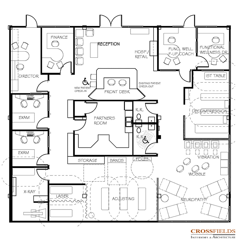
To meet their expanded services and volume goals, they needed more space with a great flow, which would maximize their investment, in conjunction they needed a well-designed image to meet their brand vision.
The Polzin’s knew that the design of their space had to reflect an image that supported their high end service fee. They felt that in their current space, although the patients enjoyed their staff and care, they were losing potential customers due to the “look of the space”. Their goal was that the functionality, design, and flow were seamless which they knew would promote the value of care offered and to lead to more patient conversions.
Time was of the essences because they had already signed the lease. They were also working with a dedicated budget that needed to be appropriated conservatively to meet their planned ROI. Dr. Polzin had built multiple practices over the years, and Christina had vast experience in building high end restaurants so they understood the value of bringing in experts to save time and money. Therefore, they sought out CrossFields to bring a new level of expertise for this flagship project.
SOLUTION
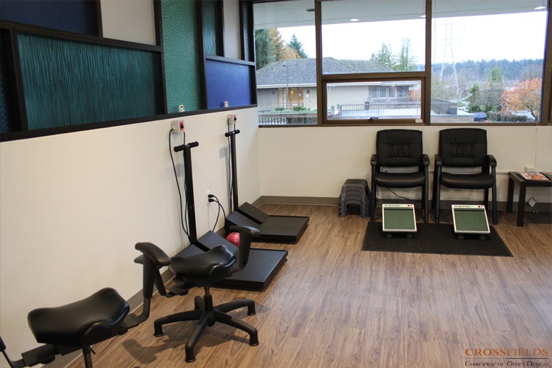
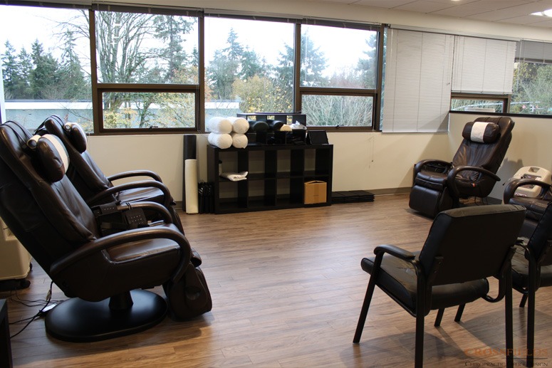
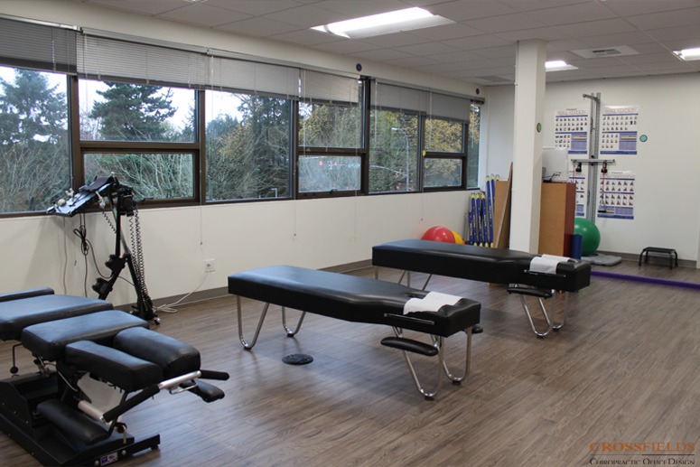
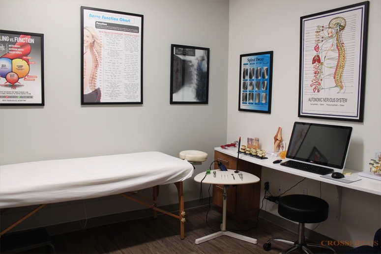
Working with a previously occupied space which had a central core of restrooms and plumbing, CrossFields began extensive space planning ideas with the Polzin’s. The key functional goals for the space were open flow and flexibility. They decided to use the central core, for both cost and time savings, as the staff business office, creating a circular flow around the core for the progression of services. This also allowed open spaces against the three exterior walls which were full of windows, bringing in inviting and healing natural light to flow through the space. The floor space in the smaller exam rooms was maximized by custom built-in counters. The multiple doors to the front were maintained, to allow separate service offerings as needed.
The Polzin’s image desires were to have an atmosphere that infused commitment to excellence in patient care with upscale, clean and modern design, which was both cutting edge and timeless.
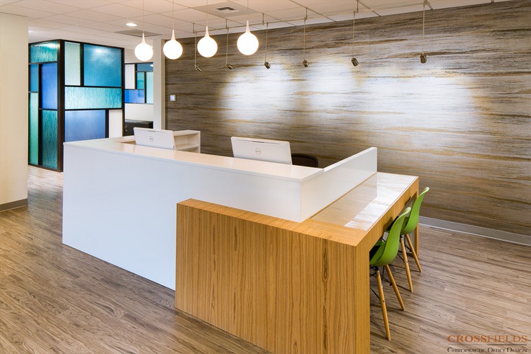
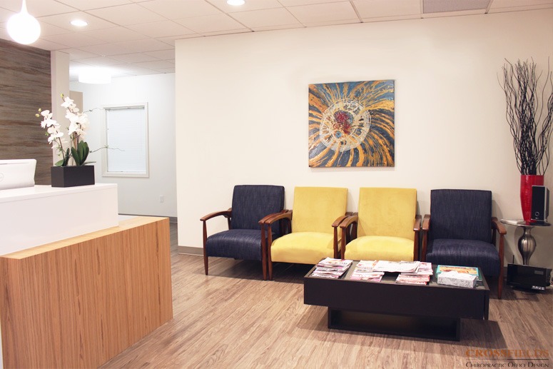
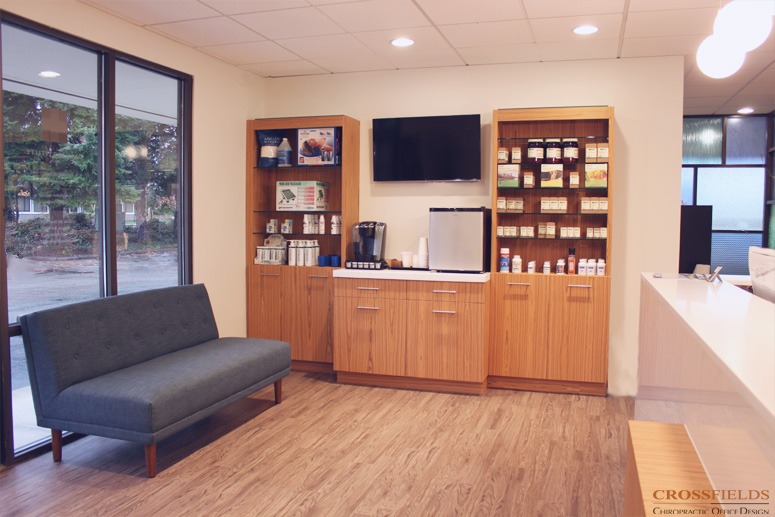
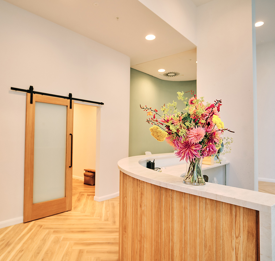
First, to achieve the high-scale feel, upon entering the space, you are greeted by a classic white and light wood reception desk against a textured metallic wall backdrop. Adding to the modern look, a custom, matching retail hospitality center flanks one side of the reception with inviting, comfortable seating on the other side.
The overall color scheme is off-white neutral paint, with warm light teak wood and warm medium brown- grey wood textured floors. These neutrals have been accented with energetic pops of strategically placed color in yellow fabrics and the dramatic blue acrylic wall.
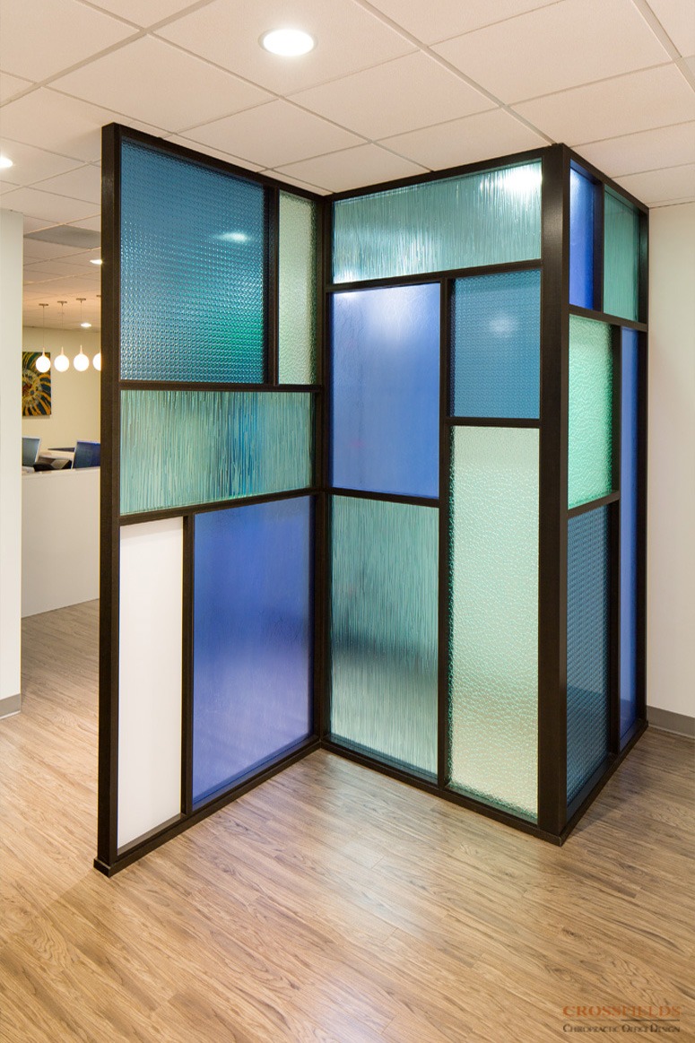
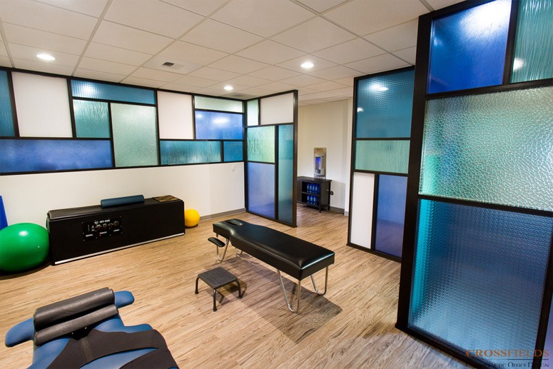
This dramatic wall was created first to functionally separate the quieter therapy area from the open therapy and adjusting spaces. Secondly, it accomplished the desire to have privacy but still allow a large amount of therapeutic light to flow through the space. Thirdly, the design became a statement and “WOW” factor, attracting the eye and achieving the desired modern atmosphere. The design used a product of recycled acrylic resin varying in textures and colors and arranged in an early-century modern style. The results were not only functional, but memorable. This wall was even photographed by the manufacture, Lumicore, for their product inspiration catalog.
The Polzin’s are in the process of adding another office, using CrossFields designs to continue achieving their space and brand goals.
SERVICES
Full Service Interior Design: Includes Space Planning and Schematic Design; Complete Architecture, Interiors, and Engineering Design; Construction Budget Review; Construction Administration; and Furnishings and Art Direction.
See What Our Clients Have Said
- All
- Chiropractic
- Integrative
- Neurology
- Rehab & PT
- wellness
Island Wellness
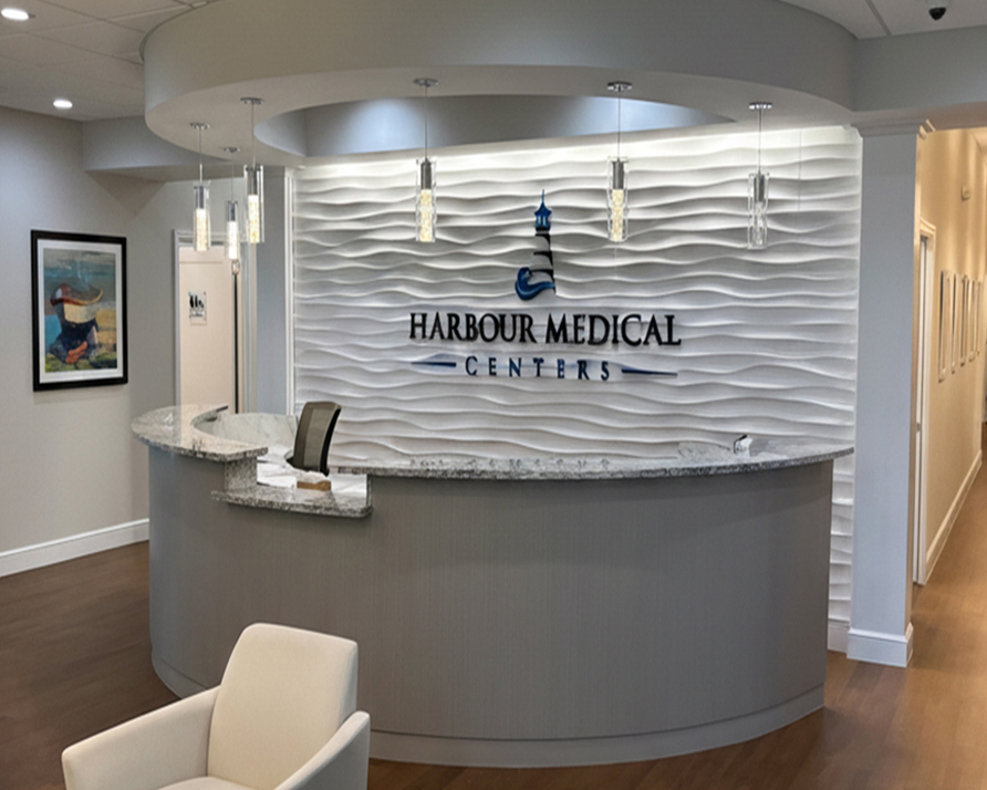
Harbour Medical Centers
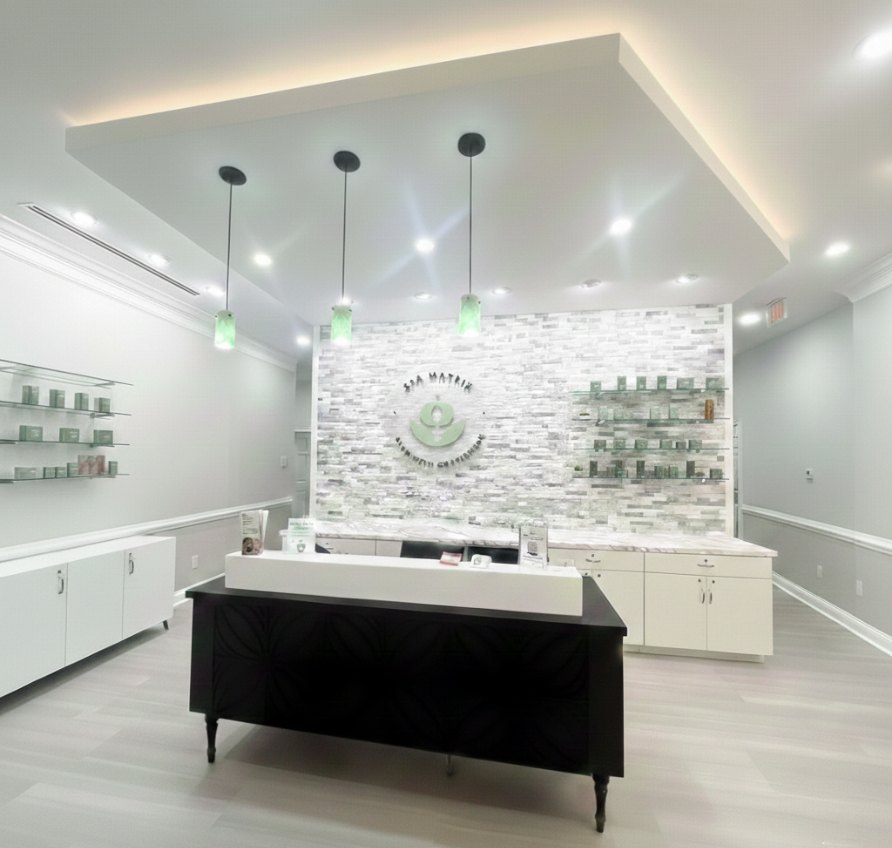
Spa Matrix
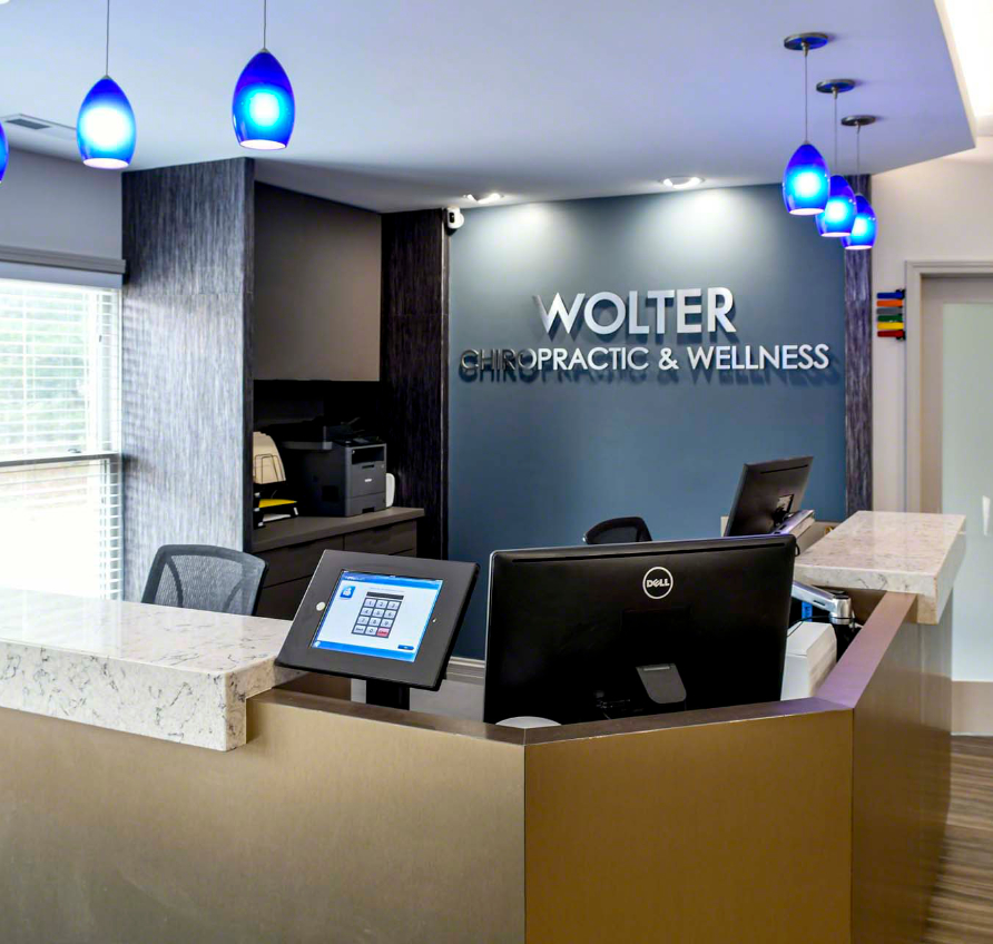
Wolter Chiropractic & Wellness
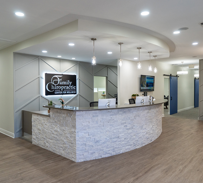
Family Chiropractic Center for Wellness
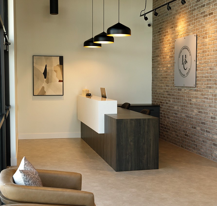
Hayes Chiropractic
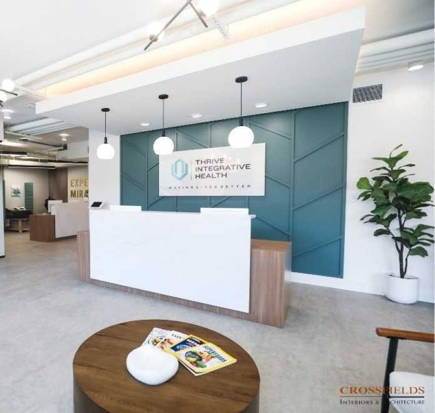
Thrive Integrative Health
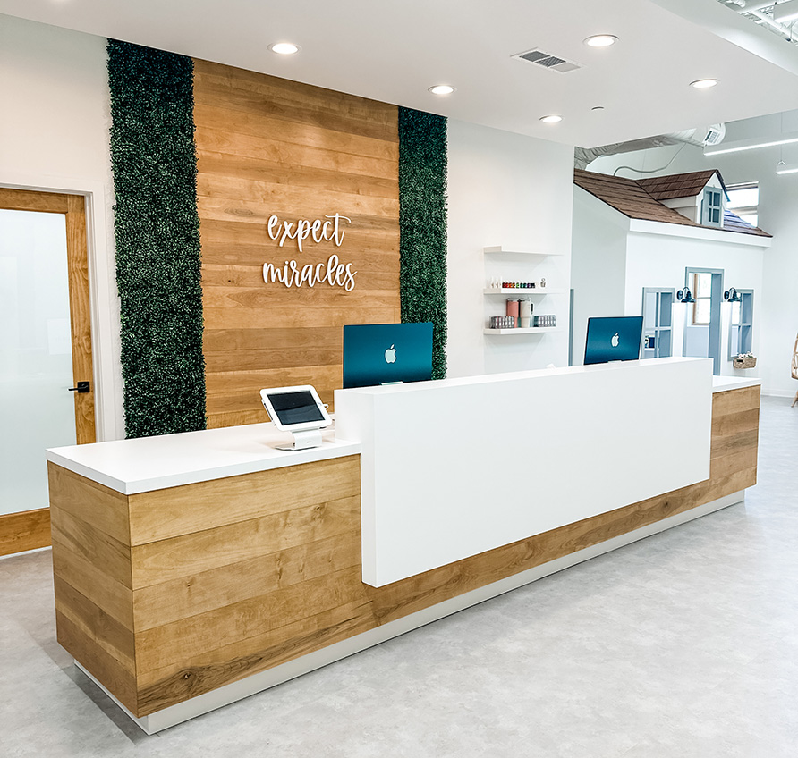
Cumming Family Chiropractic
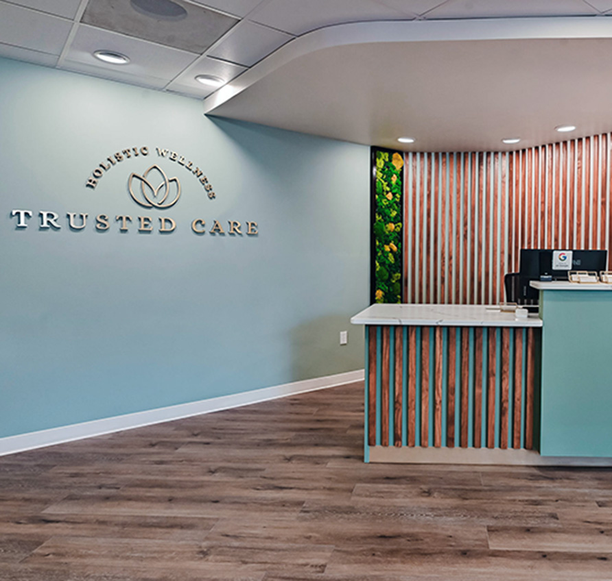
Trusted Care Holistic Wellness
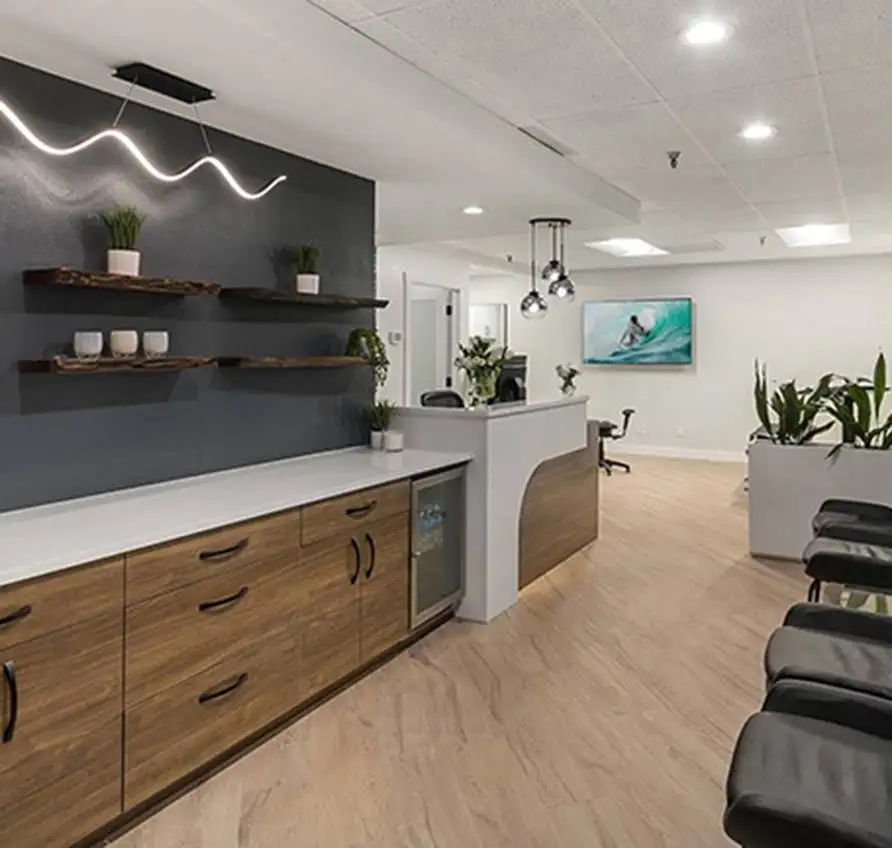
Lakeside Spine and Wellness
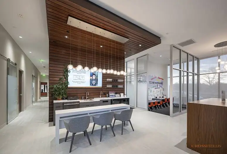
Chiropractic Lifestyle Studio
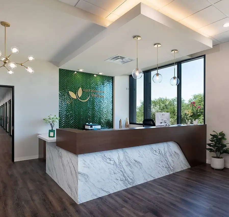
West University Wellness
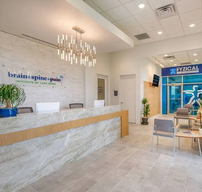
Brain + Spine + Pain Institute Of Lake Nona
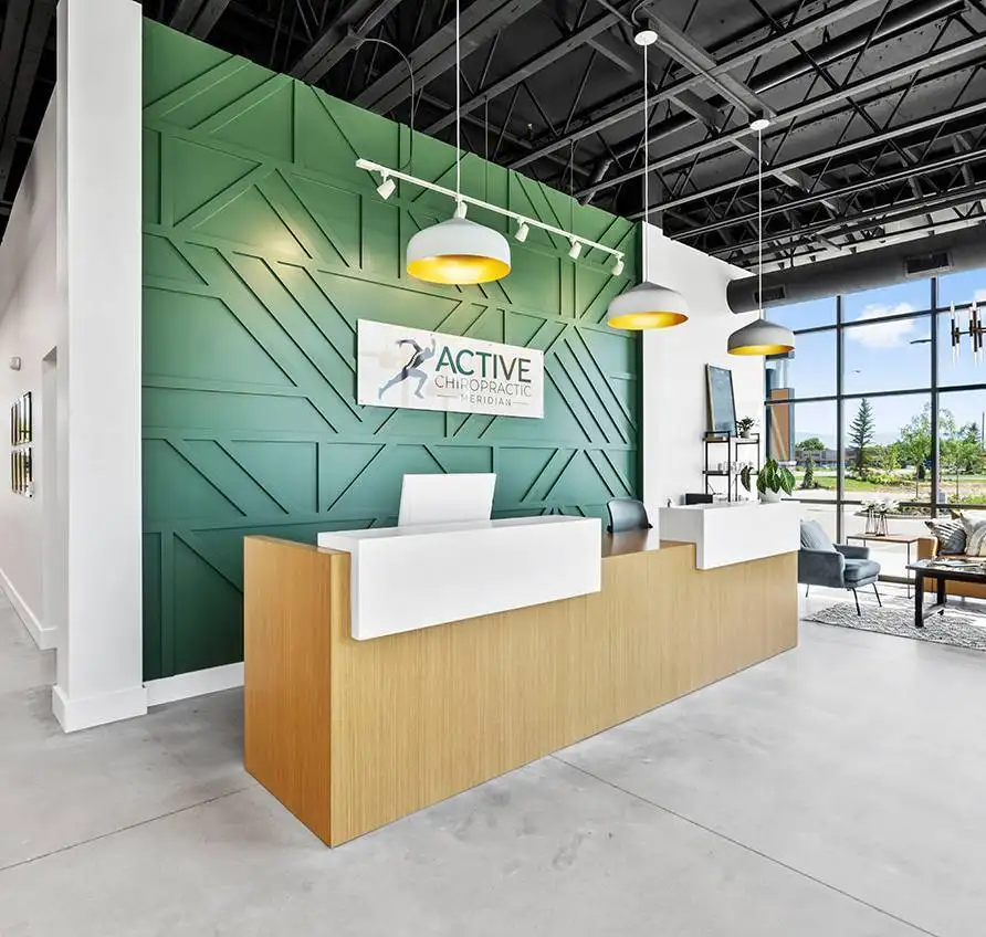
Active Chiropractic
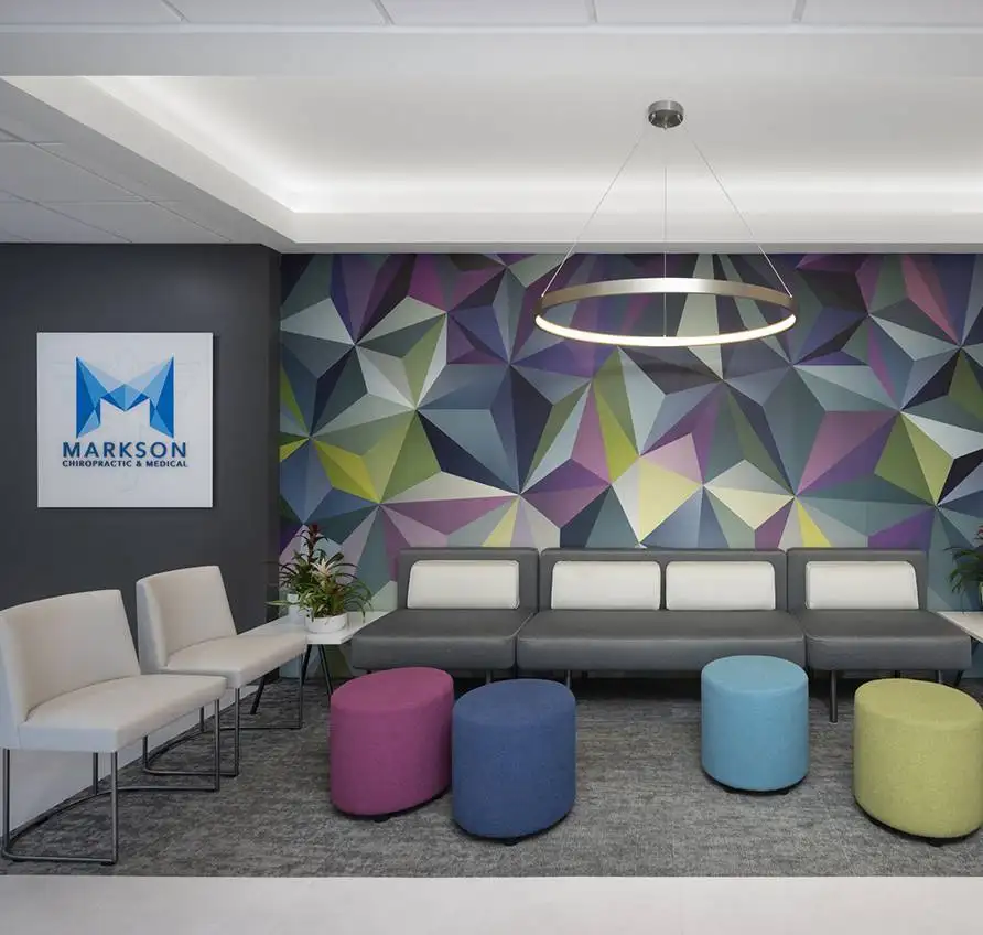
Markson Chiropractic & Wellness
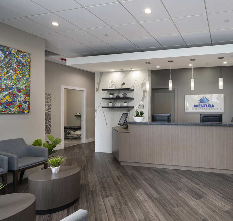
Aventura Wellness & Rehab Center
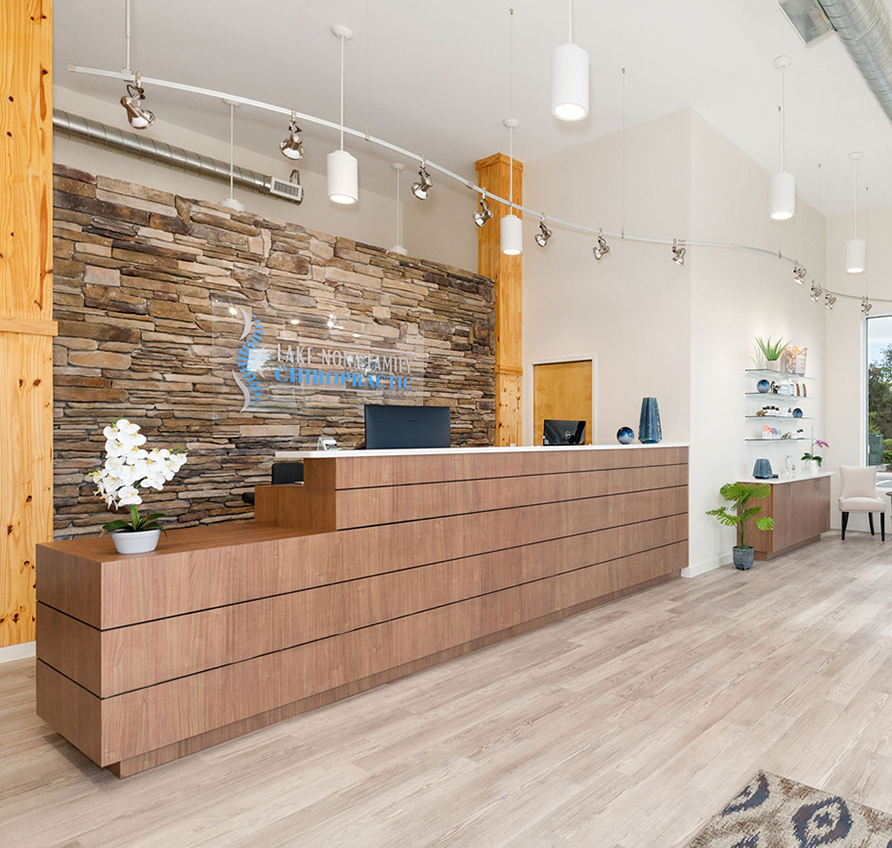
Lake Nona Chiropractic + Functional Health & Weight Loss
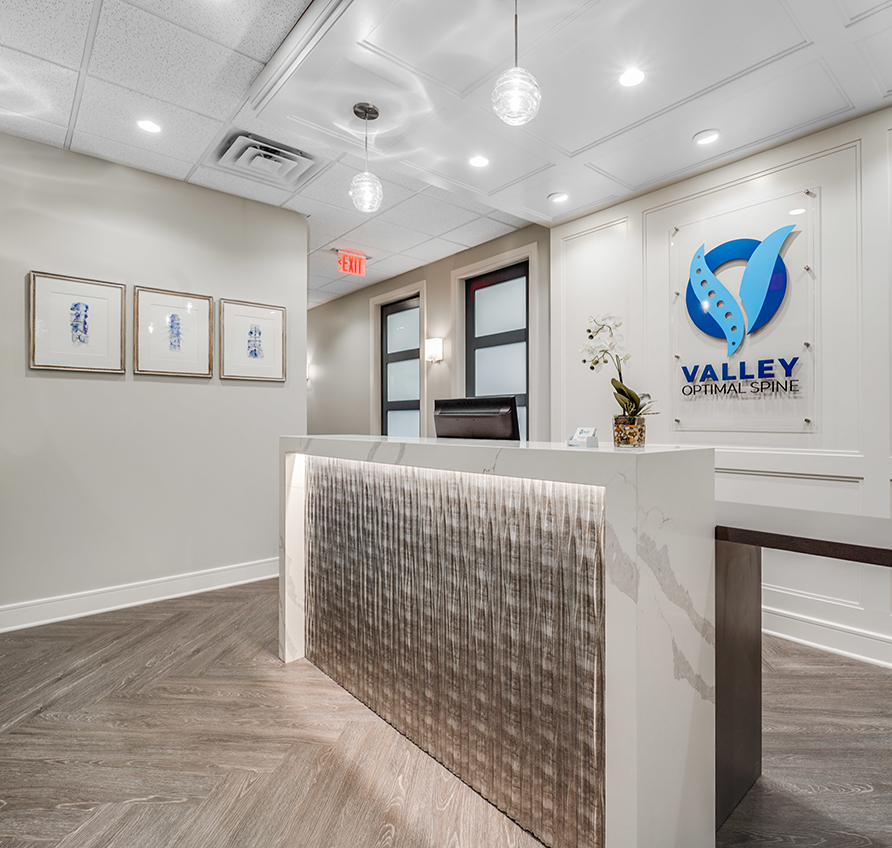
Valley Optimal Spine
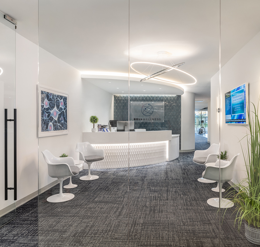
Bell Wellness
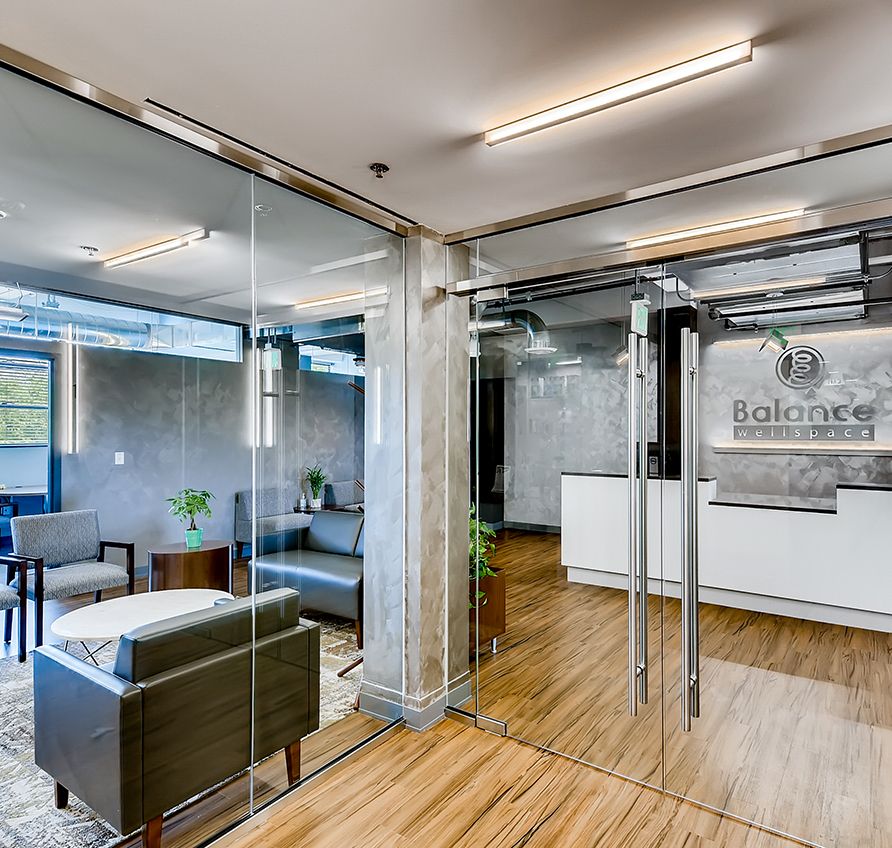
Balance Wellspace – Denver
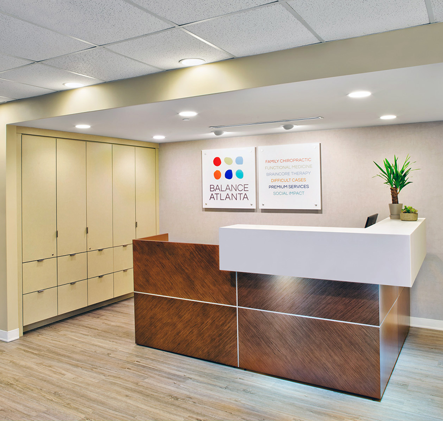
Balance Atlanta Family Chiropractic
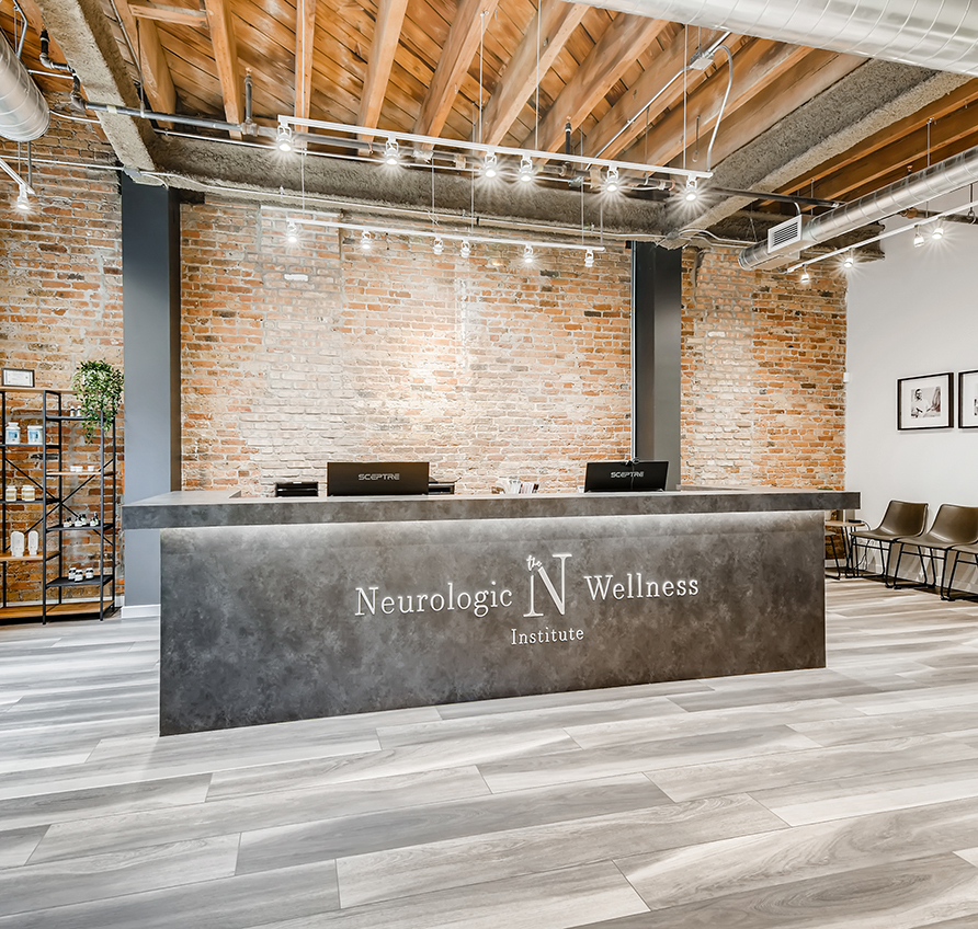
The Neurologic Wellness Institute – Chicago
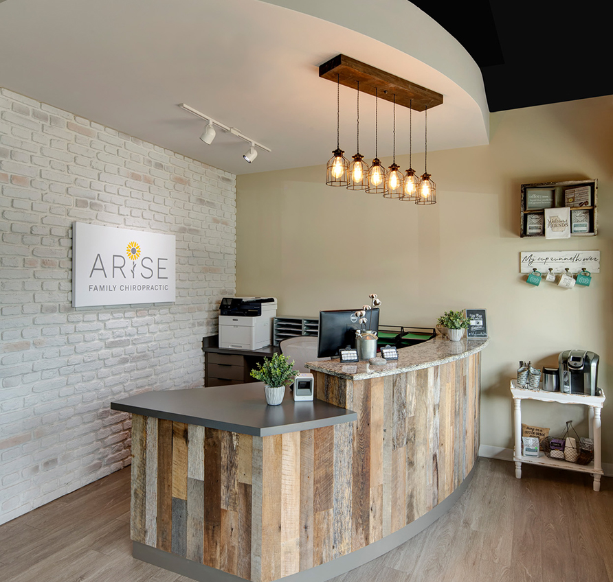
Arise Family Chiropractic
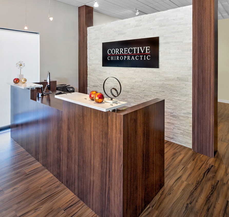
Corrective Chiropractic Woodstock
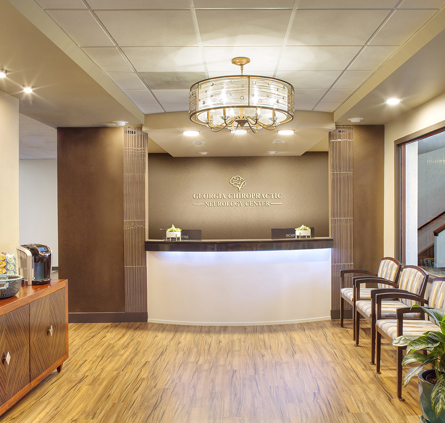
Georgia Chiropractic Neurology Center
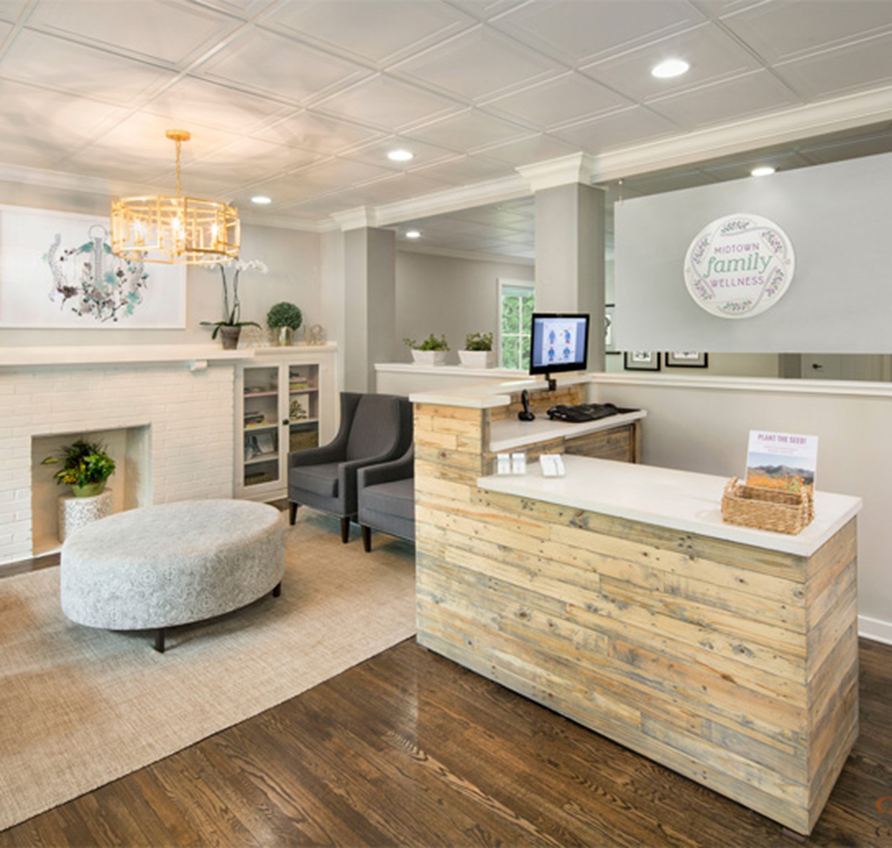
Midtown Family Wellness
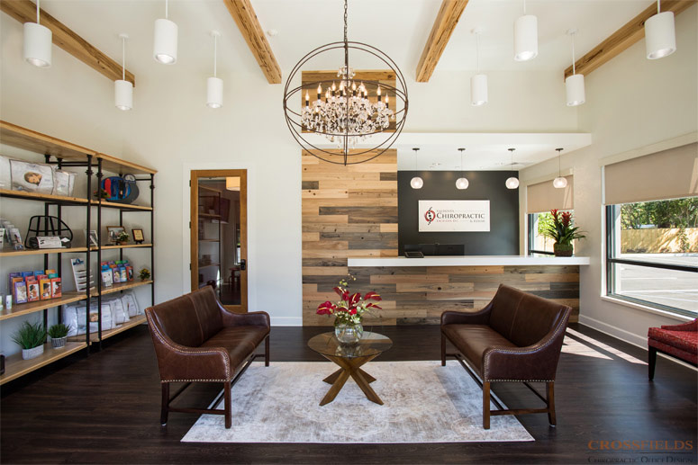
Valdosta Chiropractic
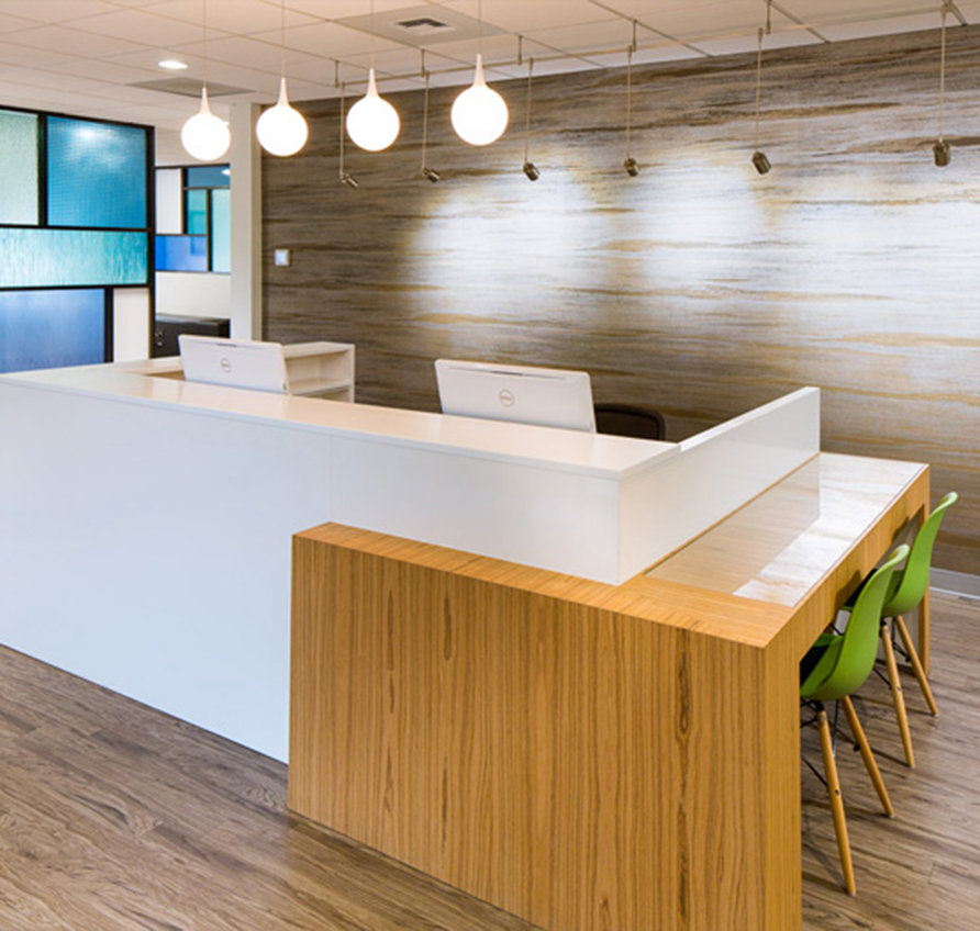
Bellevue Pain Institute
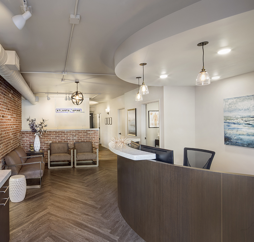
Atlanta Spine & Wellness
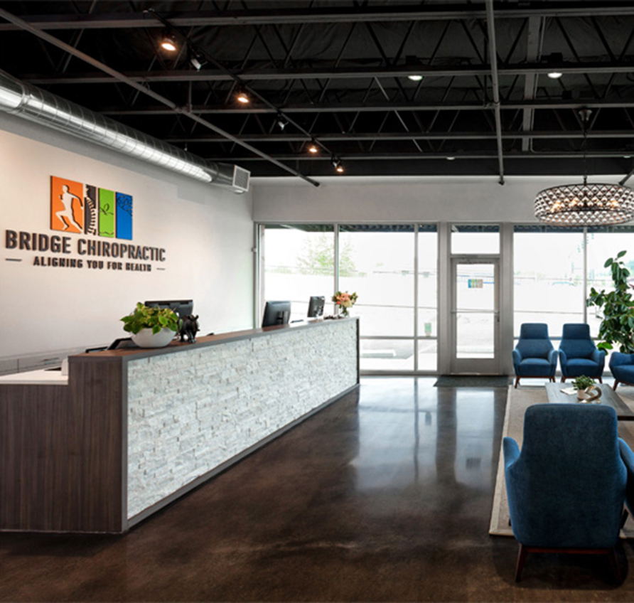
Bridge Chiropractic
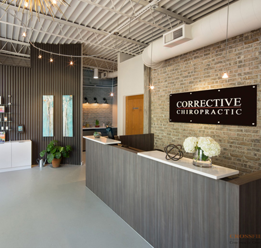
Corrective Chiropractic Decatur
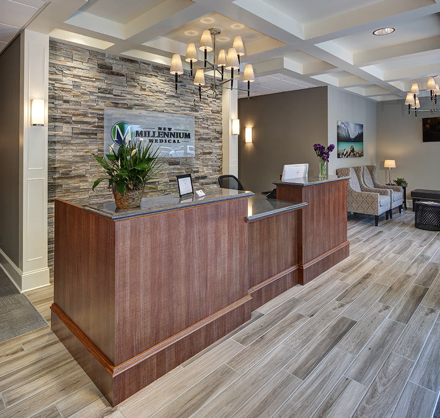
New Millennium Medical
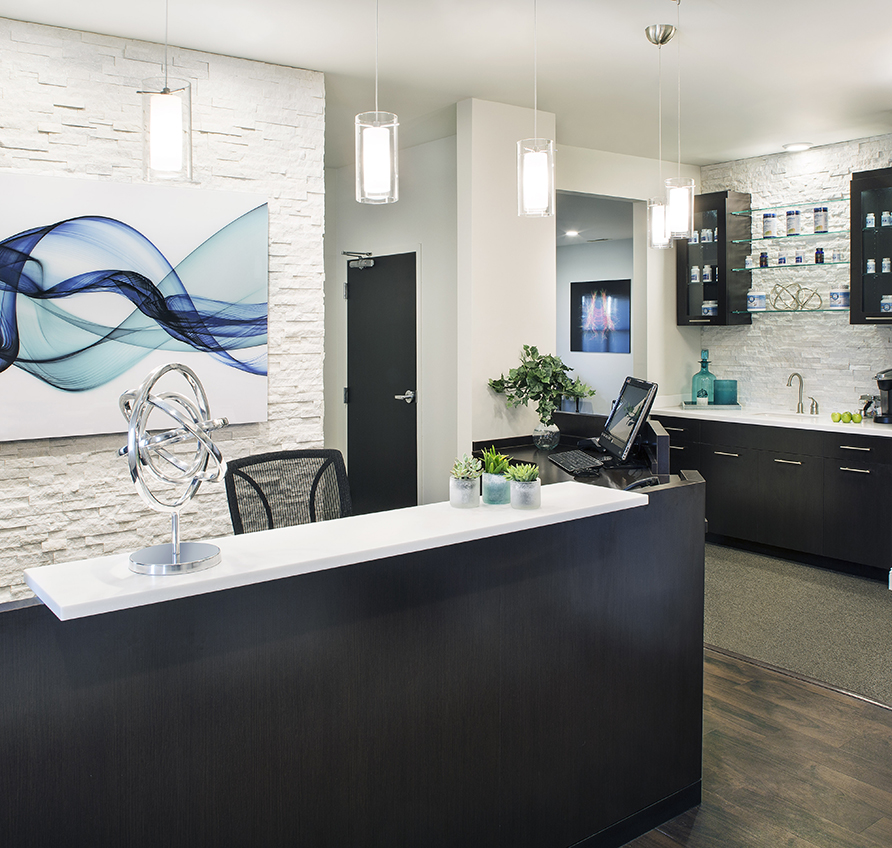
SpineCare
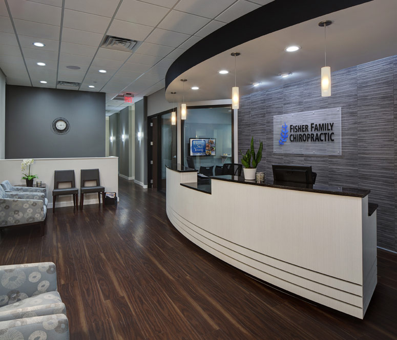
Fisher Family Chiropractic
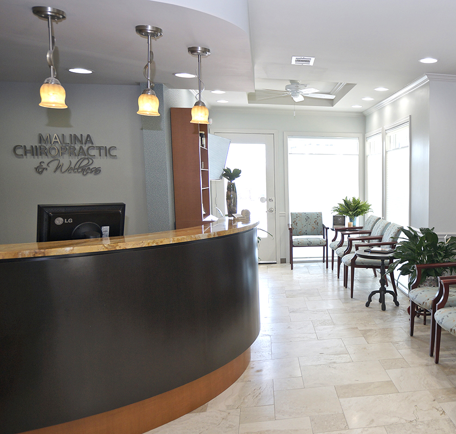
Malina Chiropractic & Wellness
Williamson County Chiropractic
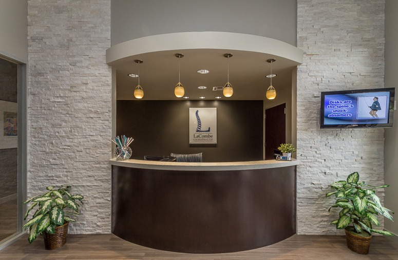
LaCombe Chiropractic
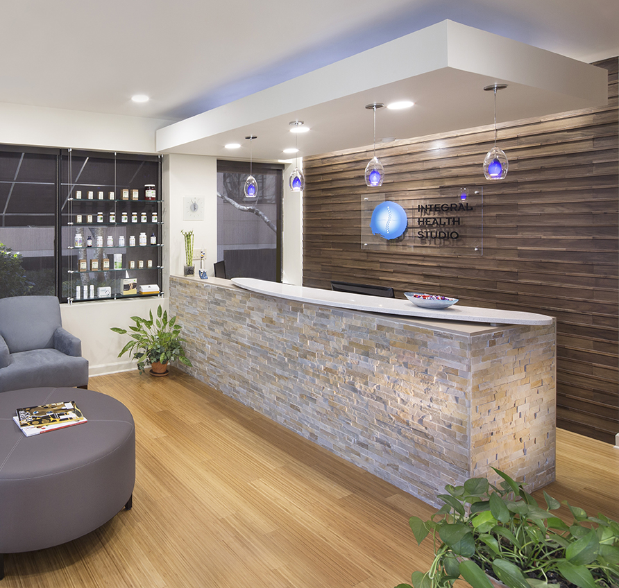
Integral Health Studio
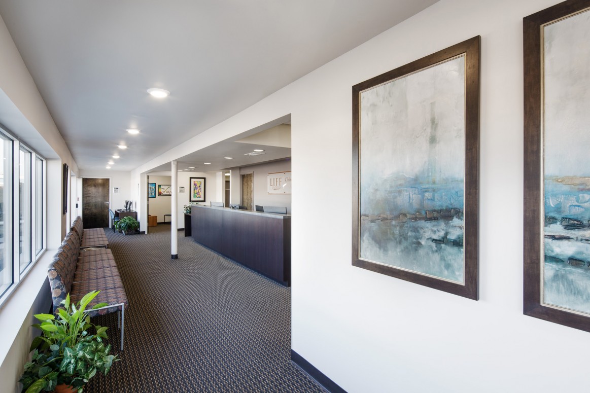
Chiropractic Community Outreach Center – Life University
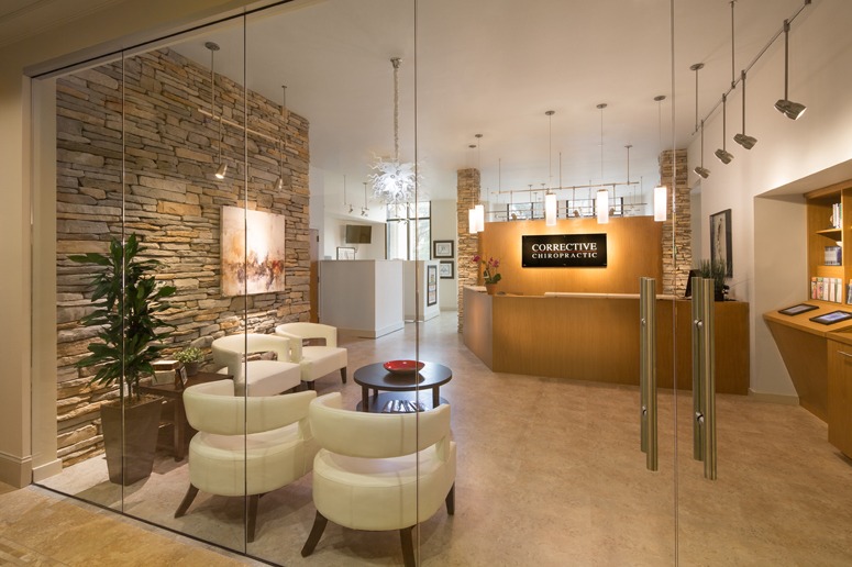
Corrective Chiropractic
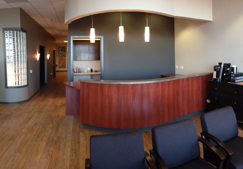
Wyoming Valley Spine & Nerve
Carrick Brain Center
Williams Library & Life Enrollment
