

Lake Nona Chiropractic + Functional Health & Weight Loss
Client: Dr. Frank Berzanskis
Location: Lake Nona (Orlando), FL
Type: Gray Box
Size: 4590 Net SF TOTAL, 3163 + 1427 Weight Loss
Year: 2021
Services: Corrective Chiropractic, Active Physical Therapy, Passive Therapy, Weight Loss, Massage, Nutrition
BUSINESS GOALS & CHALLENGE
Dr. Frank Berzanskis, Sr.’s, practice in the Lake Nona community of Orlando, Florida had outgrown its current space. He found a wonderful opportunity to purchase a new condo within a new medical office complex along Narcoossee Road just minutes away.
The 4590 net square foot space was triple his existing space, giving him the room he needed to grow for years to come. The space was within a series of building shells under construction when he came to CrossFields for assistance. He knew that he “wanted an expert” to help so he was “able to keep a focus on his practice.” His goals were to maximize the square footage and flow of this unrestricted “clean slate – gray box” he was starting with and to create a space that represented a high quality of care to the professional and family community he served.
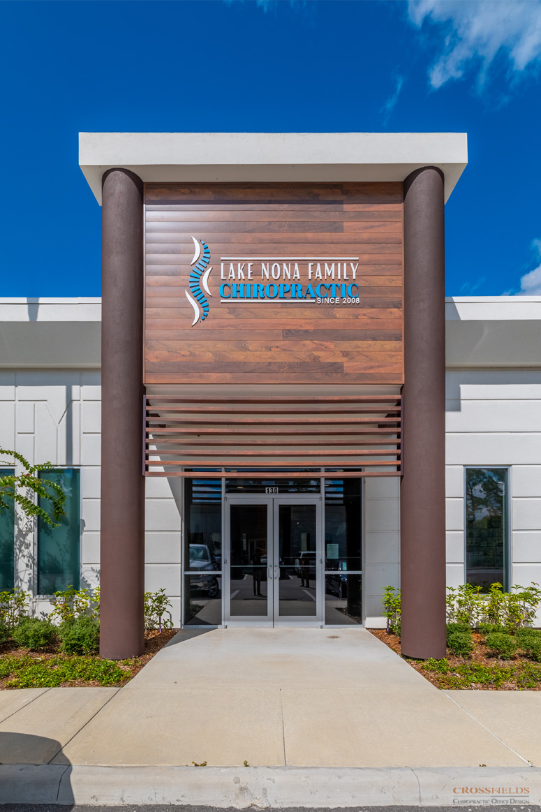
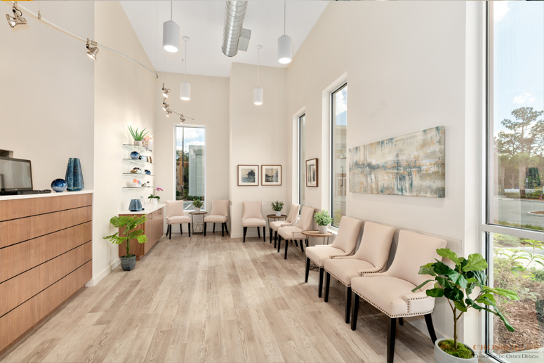
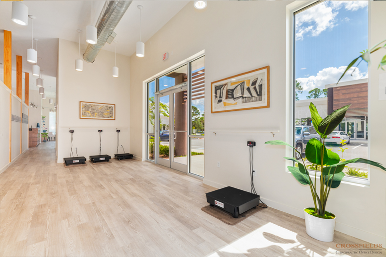
The contemporary designed building was a beautiful starting point. It was naturally full of lights with three glass entry points and tall windows along the south side with direct access to parking. Dr. Frank intended to use two-thirds of the building for his practice and lease the remaining third; however, during the final stages of designing the chiropractic suite an opportunity arose to incorporate a new Functional Health and Weight loss Clinic, and soon revisions to incorporate these new services within the whole building were undertaken.
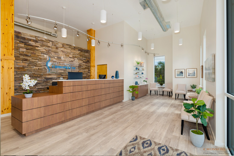
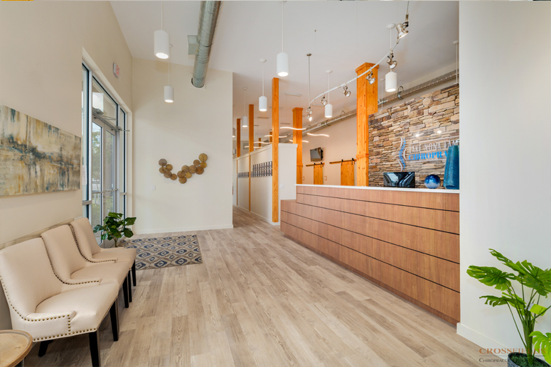
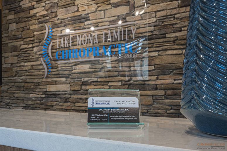
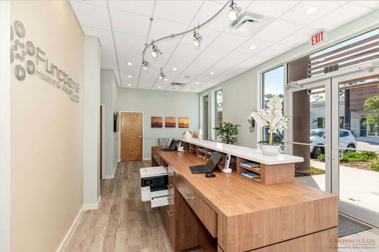
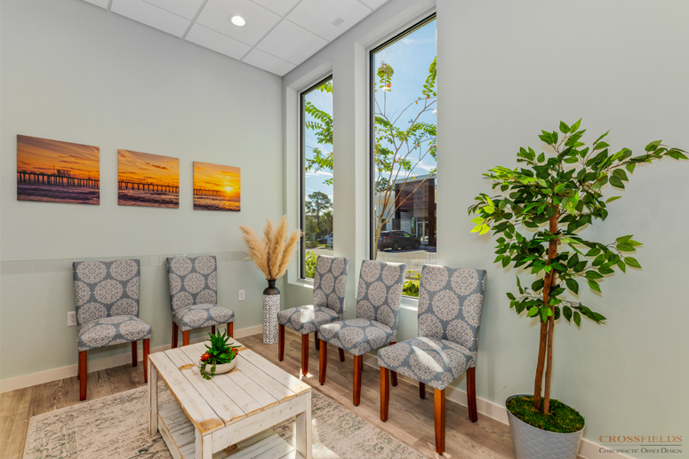
Dr. Frank’s vision for the Chiropractic suite was a contemporary interior that incorporated exposed ceiling elements, modern lighting, natural wood details and stacked stone. The desire was a bright, well-lit inviting space with an overall natural feeling and a neutral color palette that highlighted the different elements and brought in nature. The vision for the Functional Health and Weight loss Clinic was to play blend with the Chiropractic office yet create a quiet spa-like atmosphere that provided comfort and privacy.
SOLUTION
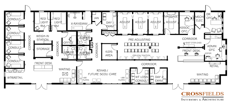
After working through multiple layout options, the Chiropractic suite entrance would be located on the far East end of the building with the most natural light and the Functional Health and Weight loss Clinic entrance located on the West end.
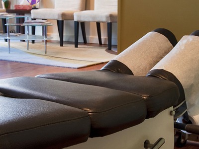
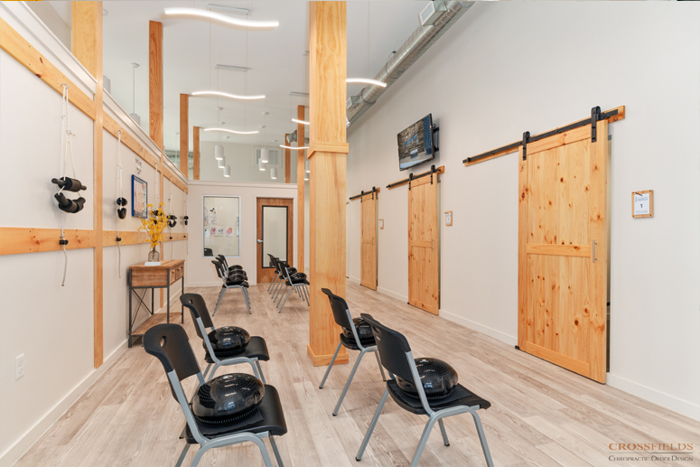
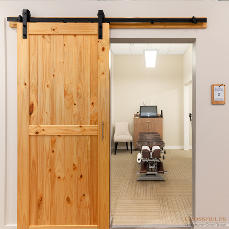
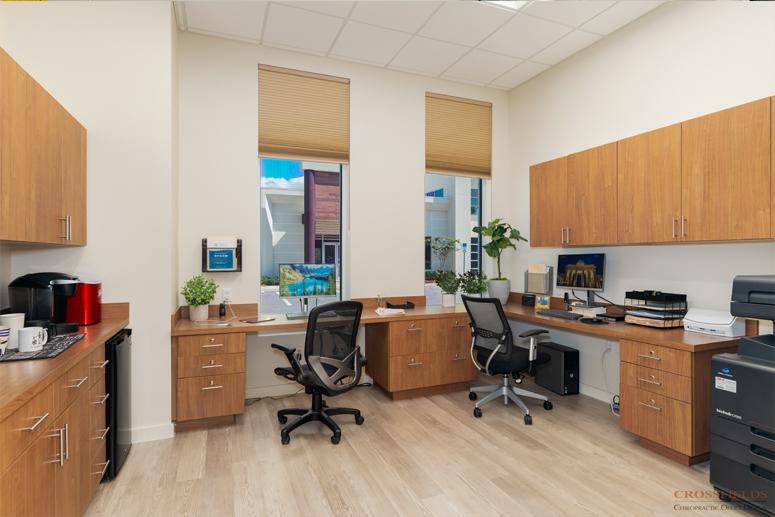
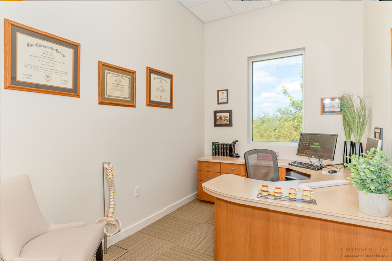
Upon entering the Chiropractic suite, the Front Desk is both in direct sight of the Waiting area with Retail to the far right and positioned with views into the main Pre-Adjusting area, Kids area and direct access to the Admin Office. Behind the Admin office, the Doctor’s office has access to the Adjusting Bays as well as a Massage room and a private room for Scoliosis Care. The Adjusting rooms are directly across from the Pre-Adjusting Bays for optimum patient flow between these spaces. The Adjusting rooms have open access at the back for doctor flow. A circulation space that flows around the Pre-Adjusting area allows patients to finish in the open Rehab taking in the natural light from the front windows.
The Day 1 Exam and X-ray are located to the back of the suite. As new patients are escorted to this location, they can tour the office. The Day 2 Consult room is located at the front of the space, along with a special Laser therapy room.
The overall color palette is a warm, bright neutral backdrop, highlighting natural textures of warm wood and stone… nothing too dark. Due to hurricane design and structural requirements, columns were necessary. We chose these to be exposed natural wood columns incorporated at the low walls to add the natural textures desired, as well as the Adjusting Bay barn doors were finished to match the wood columns. The exposed metal ductwork and suspended lighting added the industrial flair, contemporary details and clean lines desired blending with the exterior.
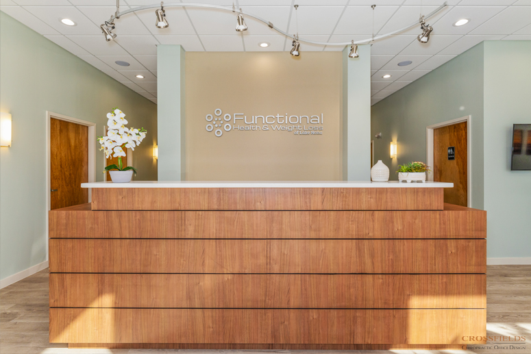
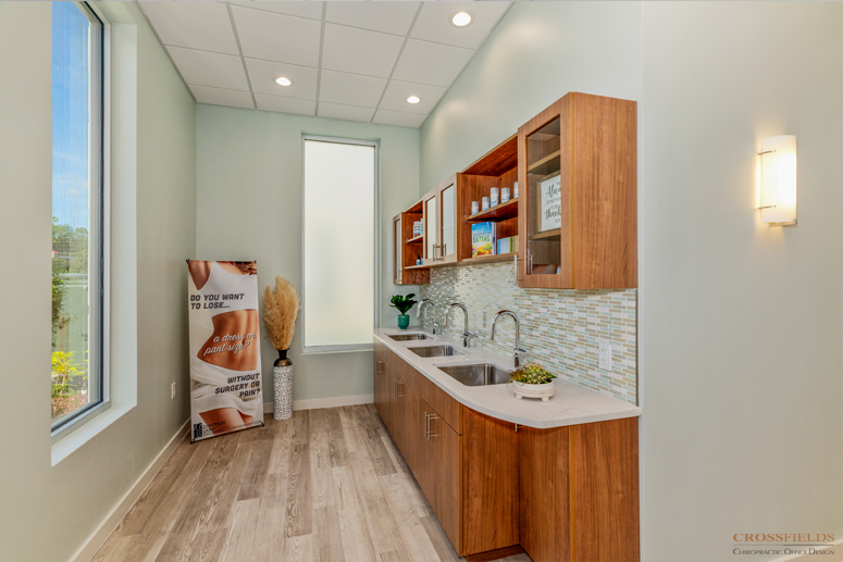
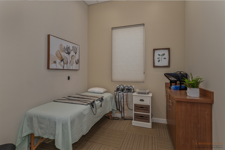
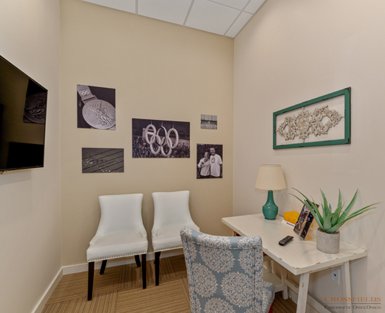
The Functional Health and Weight loss Clinic is accessible from the West exterior main entry as well as connected through the Open Rehab area of the Chiro Suite as well. The highlight of this Clinic is the Retail and Water Stations. There are three deep individual sinks for patients to access the special filtered water services. The Clinic was designed with flexibility in mind so the room sizes are similar and can easily adapt to future services. The main function of the rooms are Consulting and Redlight Therapy. Key design elements and the color palette of the Chiropractic office continues into this side, adding a soft spa blue-green wall color, and dropped ceiling with recessed cans for sound control and softening of the space.
The results are separate but cohesive businesses that function independently yet support each other in sharing patients. As Dr. Frank said, “Looks like we know what we are doing.” And “I know we are converting more.” This is the success he hoped for.
SERVICES
- Space Planning through Full Service Interior Architectural, Interior Design, Furnishings and Construction Administration for New Office Condo
TESTIMONIAL
“We’re glad we invested… to have efficiency of the space. To use every square foot is money that you’re spending, so you want to make sure it’s the most efficient. And that’s what we’ve been able to do with CrossFields.”
Dr. Frank Berzanskis Full Interview
See What Our Clients Have Said
- All
- Chiropractic
- Integrative
- Neurology
- Rehab & PT
- wellness
Island Wellness
Harbour Medical Centers
Spa Matrix
Wolter Chiropractic & Wellness
Family Chiropractic Center for Wellness
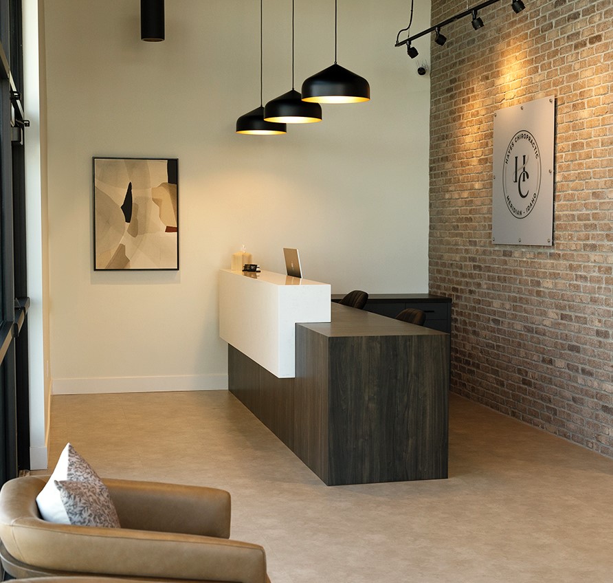
Hayes Chiropractic
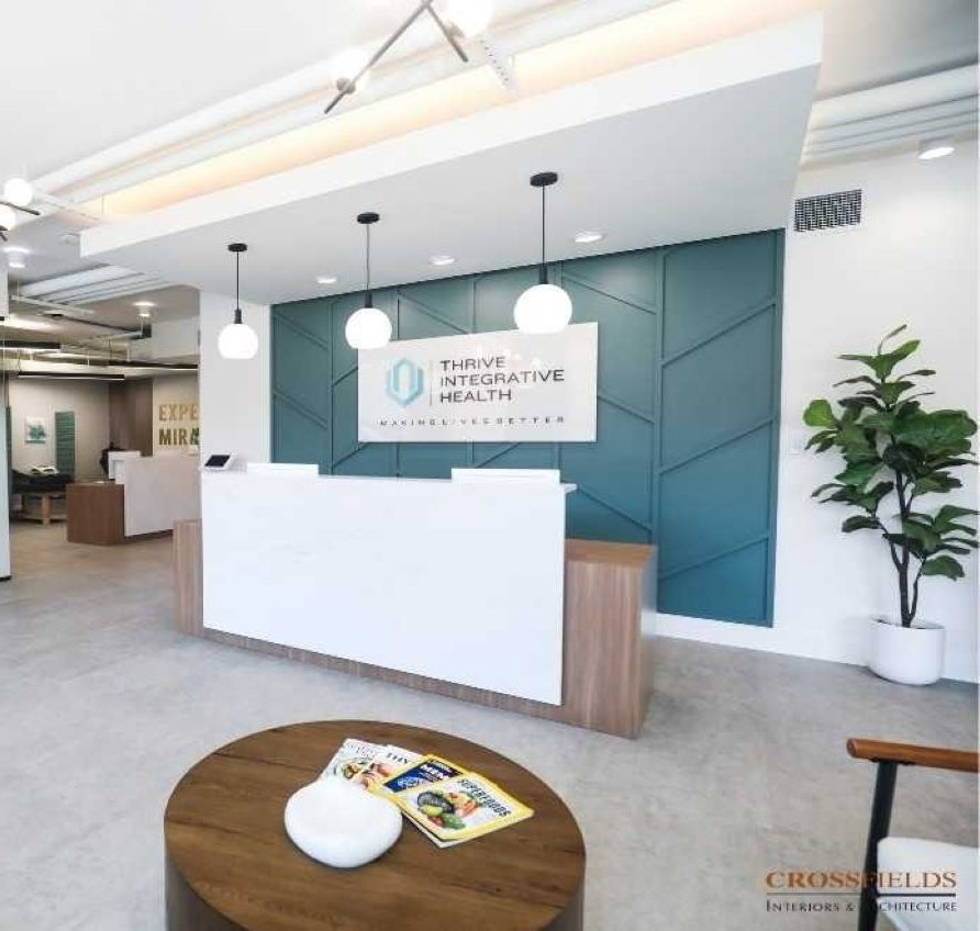
Thrive Integrative Health
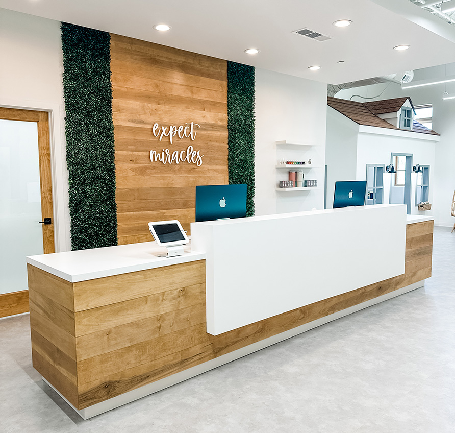
Cumming Family Chiropractic
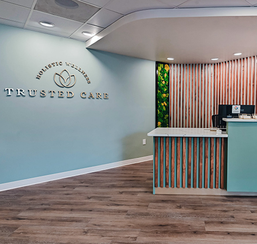
Trusted Care Holistic Wellness
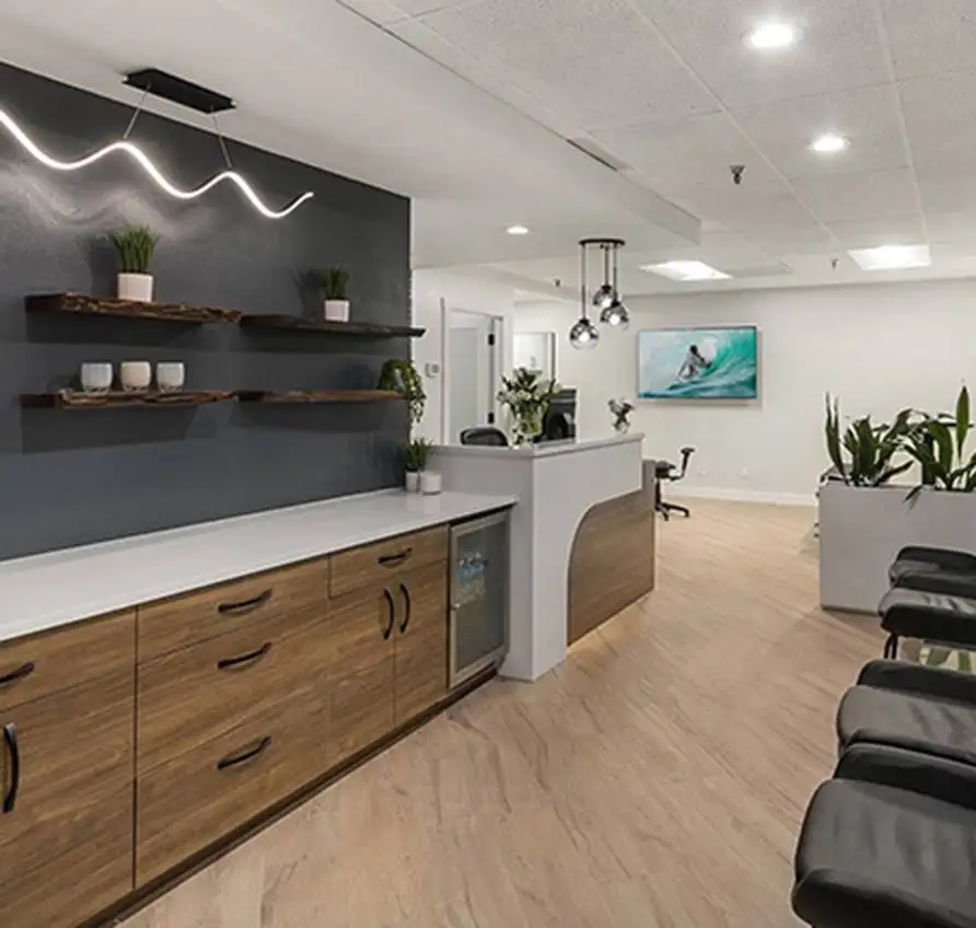
Lakeside Spine and Wellness
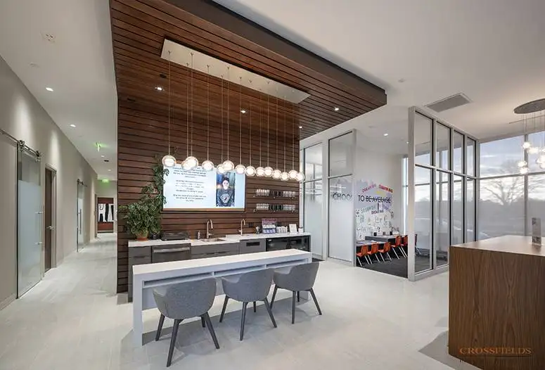
Chiropractic Lifestyle Studio
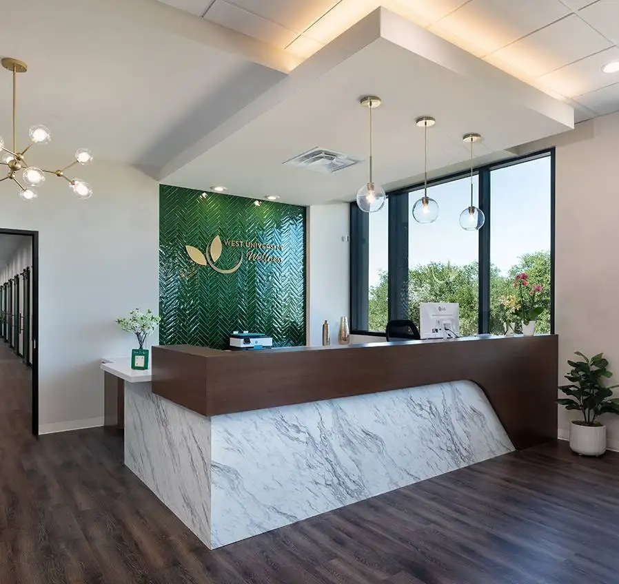
West University Wellness
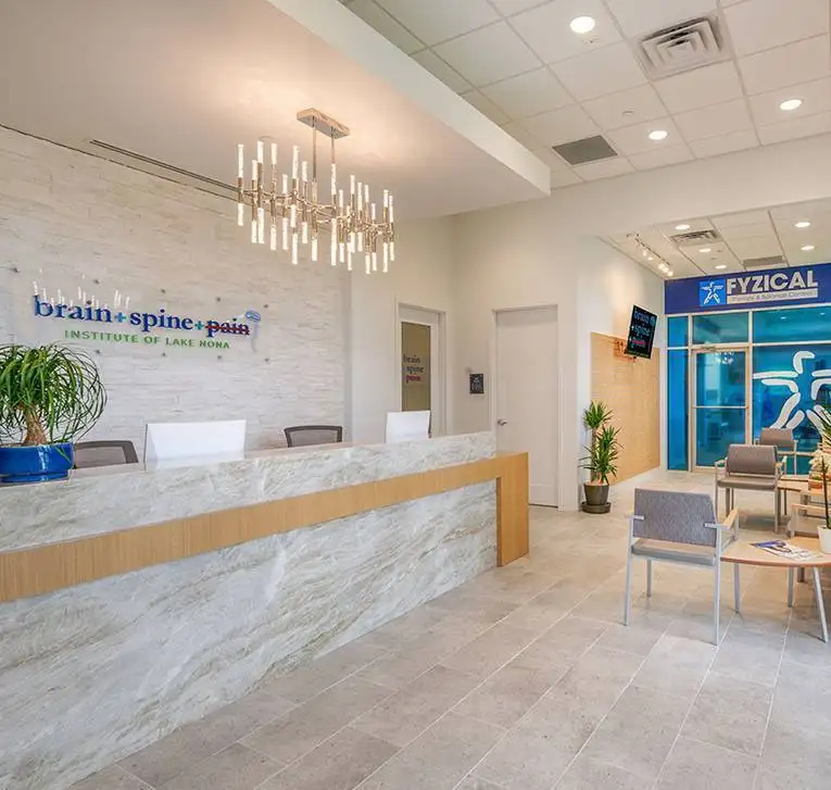
Brain + Spine + Pain Institute Of Lake Nona
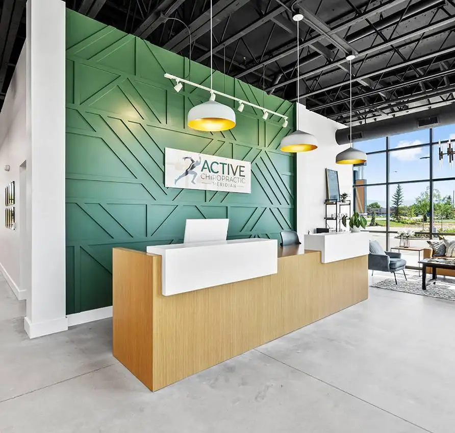
Active Chiropractic

Markson Chiropractic & Wellness
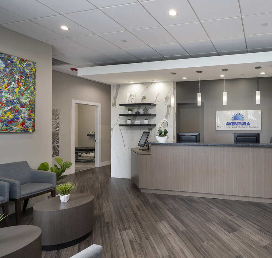
Aventura Wellness & Rehab Center
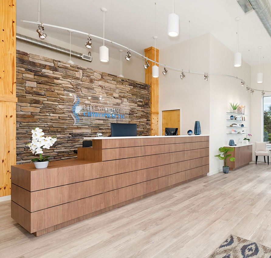
Lake Nona Chiropractic + Functional Health & Weight Loss
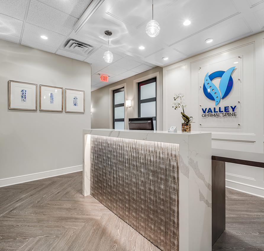
Valley Optimal Spine
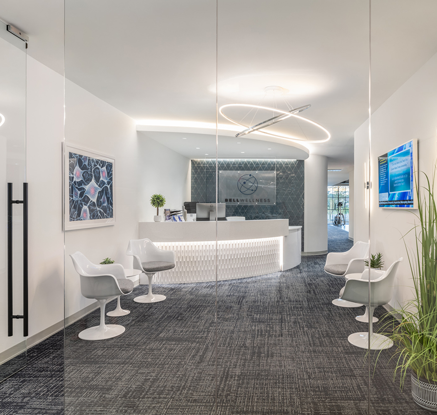
Bell Wellness
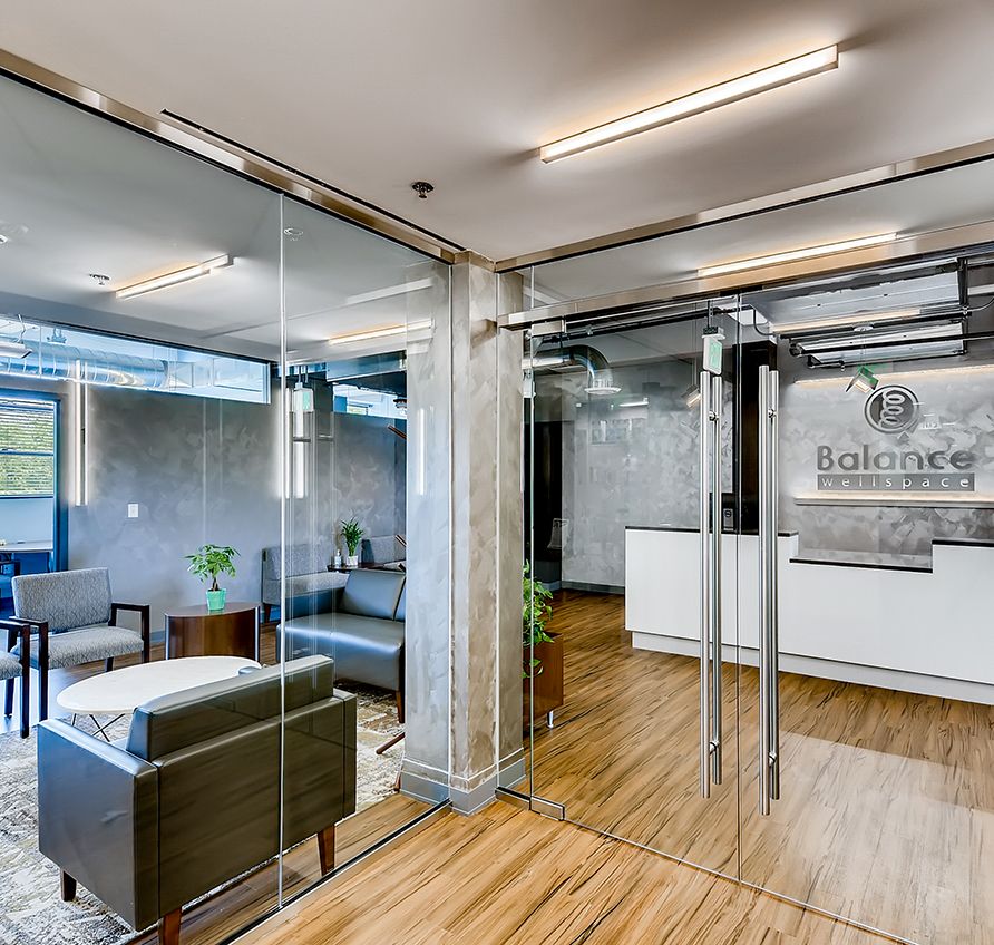
Balance Wellspace – Denver
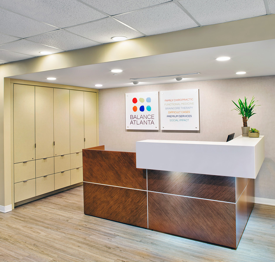
Balance Atlanta Family Chiropractic
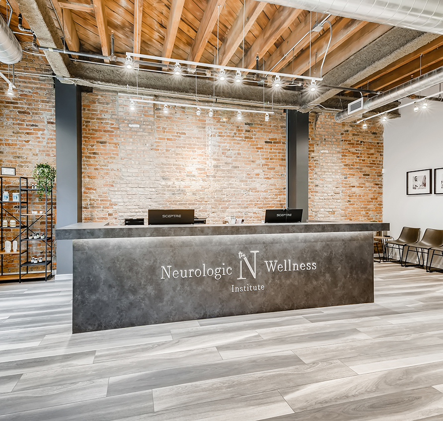
The Neurologic Wellness Institute – Chicago
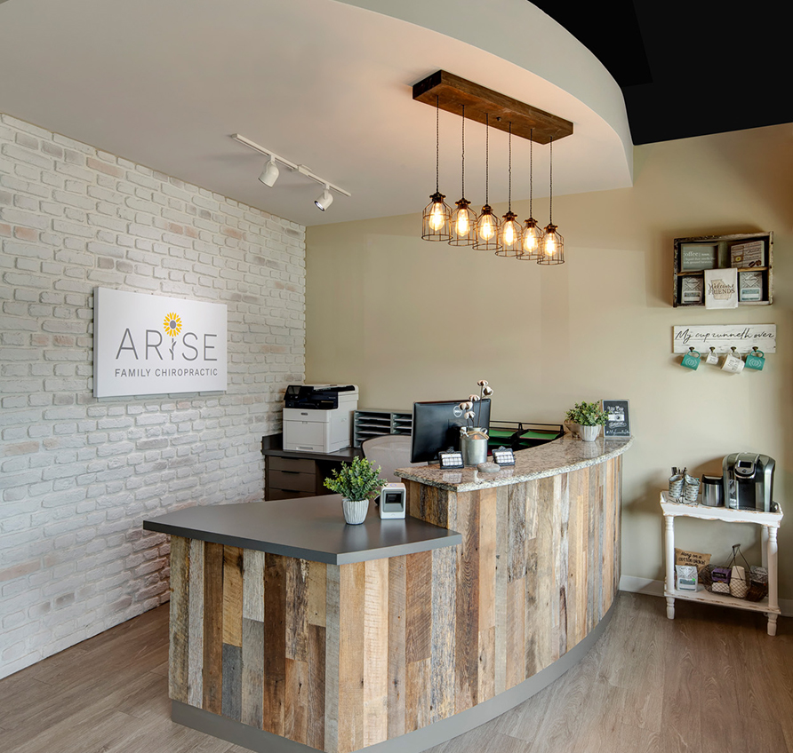
Arise Family Chiropractic
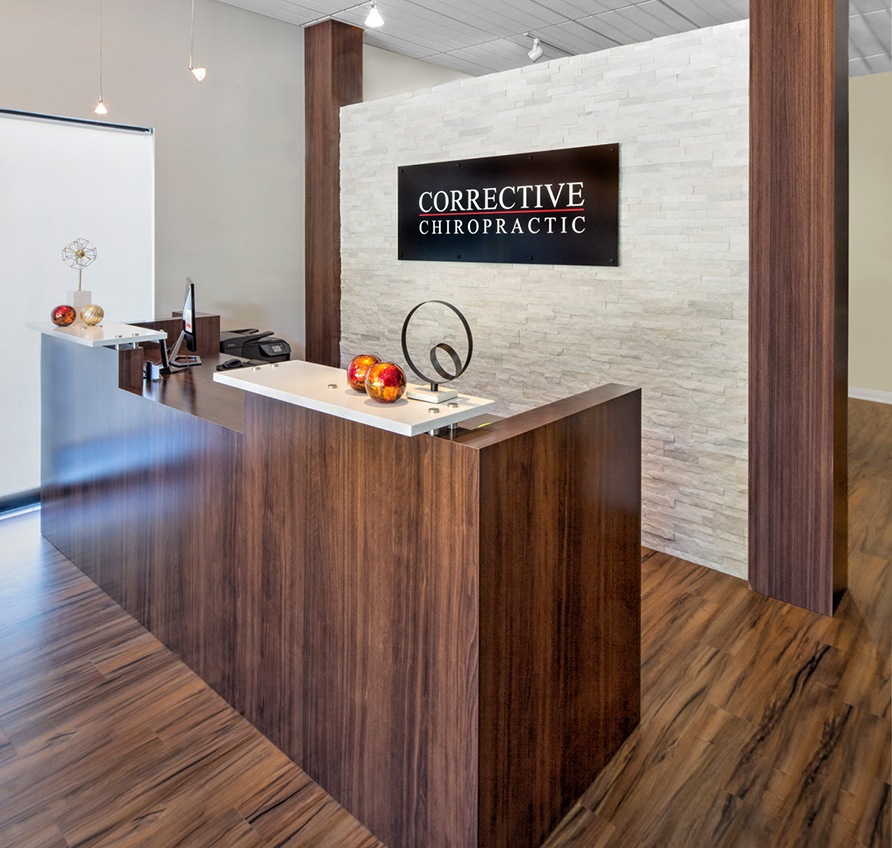
Corrective Chiropractic Woodstock
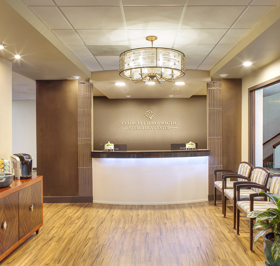
Georgia Chiropractic Neurology Center
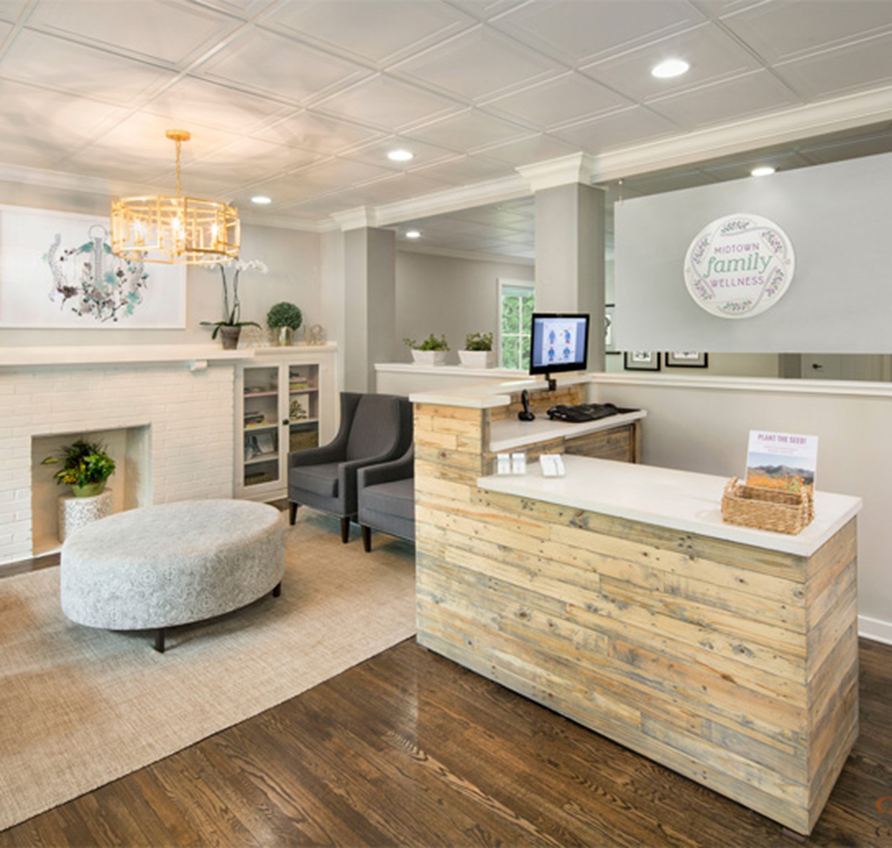
Midtown Family Wellness
Valdosta Chiropractic
Bellevue Pain Institute
Atlanta Spine & Wellness
Bridge Chiropractic
Corrective Chiropractic Decatur
New Millennium Medical
SpineCare
Fisher Family Chiropractic
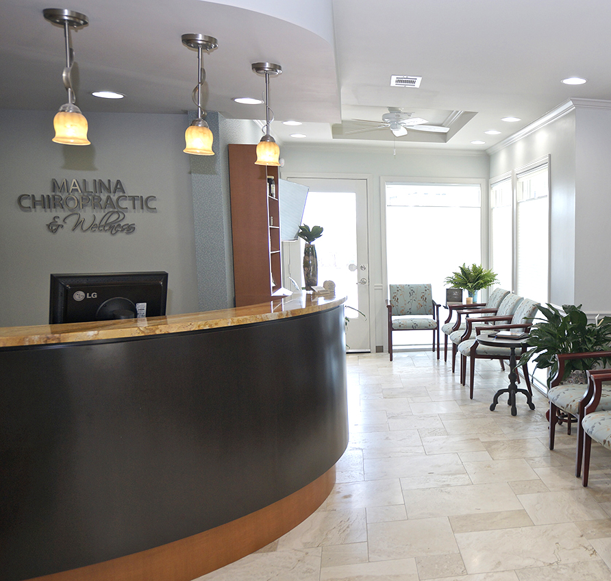
Malina Chiropractic & Wellness
Williamson County Chiropractic
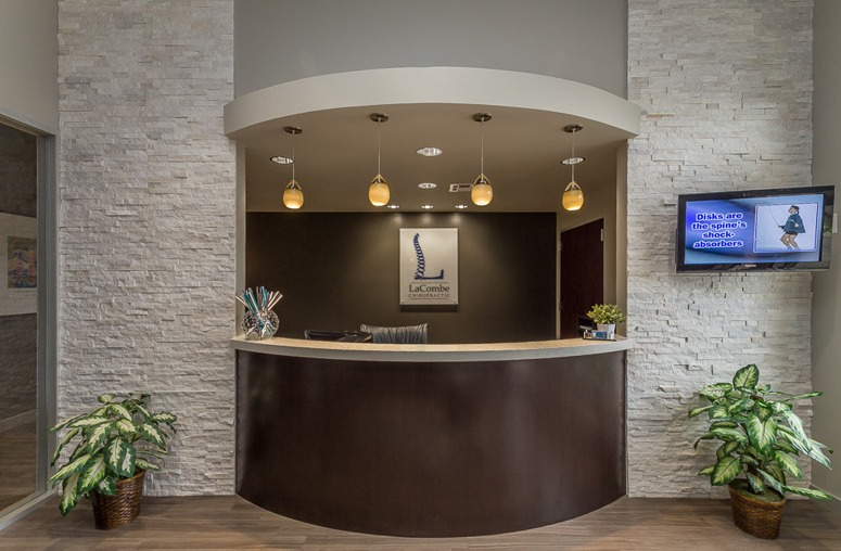
LaCombe Chiropractic
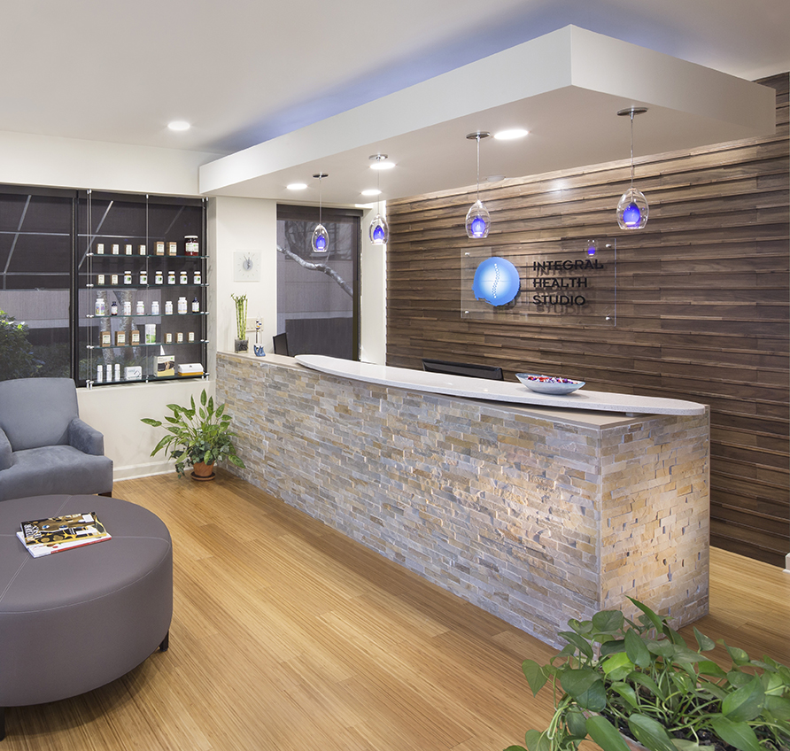
Integral Health Studio
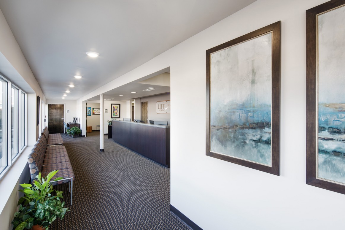
Chiropractic Community Outreach Center – Life University
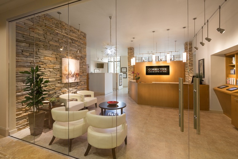
Corrective Chiropractic
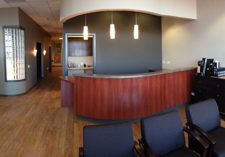
Wyoming Valley Spine & Nerve
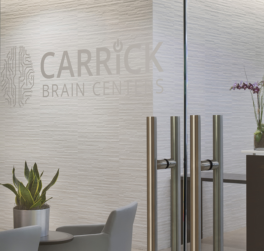
Carrick Brain Center
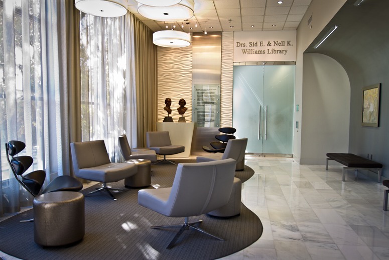
Williams Library & Life Enrollment
