Markson Chiropractic & Wellness
Client: Dr. Rick Markson
Location: Plantation (Ft. Lauderdale), FL
Type: White Box
Size: 5973 Net SF
Year: 2022
Services: Corrective Chiropractic, Regenerative Medicine, Active Physical Therapy, Passive Therapy, Functional Medicine
BUSINESS GOALS & CHALLENGE
Dr. Rick Markson, DC had been in practice in Plantation, Florida for 20+ years in 2700 square feet. The practice was currently seeing 800+ per week and had been “stuck with no place to grow”. His goal was to expand his square footage and service offerings to serve over 1000 patients a week, as a fully multidisciplinary practice so all the healthcare needs of the patient could be served completely under one roof.
A 6300 square feet office in the same complex and within blocks of his existing practice became available for purchase which would more than double his square footage so he could meet his goals.
The new location is an office condo built in 2002. It has the same exterior architectural details of Spanish Floridian as his existing office. The space is an end unit with three exterior sides, with the north side a common occupant demising wall. The entry door is under a covered porch on the east side, flanked in front by the parking lot. The south side is open green space shaded by large trees, while the west side has some green space, and the entry drive, yielding the most sunlight. This side also has two exterior doors.
The space was built out with 9’ dropped ceilings and a fire lid drywall ceiling above. The electrical panel and plumbing were located on the north side. The plan was to totally gut the interior, locate new plumbing close to existing, and not relocate the electrical panel too far.
Dr. Markson, seeing this as his last location before retiring, stated, “we have the opportunity to create something so unique and special and beautiful.” His key design vision goals for the new space “in his words”:
- Perfect Flow for the volume – comfort, no waiting time, efficient
- Perfect spaces for a true multidisciplinary experience
- Perfect wow factor that our patients are blown away.
SOLUTION
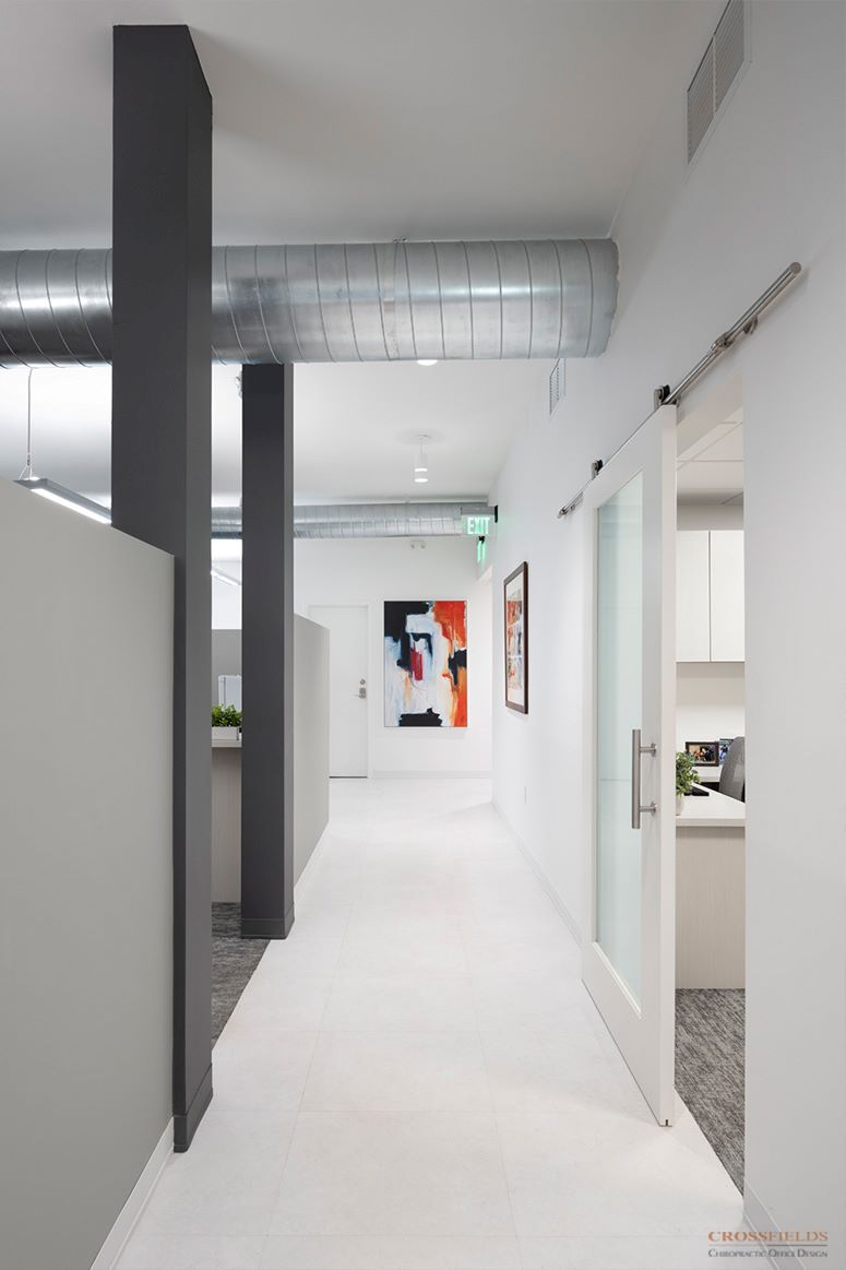
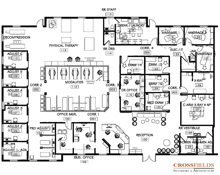
CrossFields began by determining the square footage needs to meet his goals and consulting through the priorities to fit in the available square footage. Working through a variety of space plans as a team, we finalized a plan that created the maximum flow, while creating entry impact, and emphasizing the openness and community of the practice by taking advantage of the natural healing light flowing through the space.
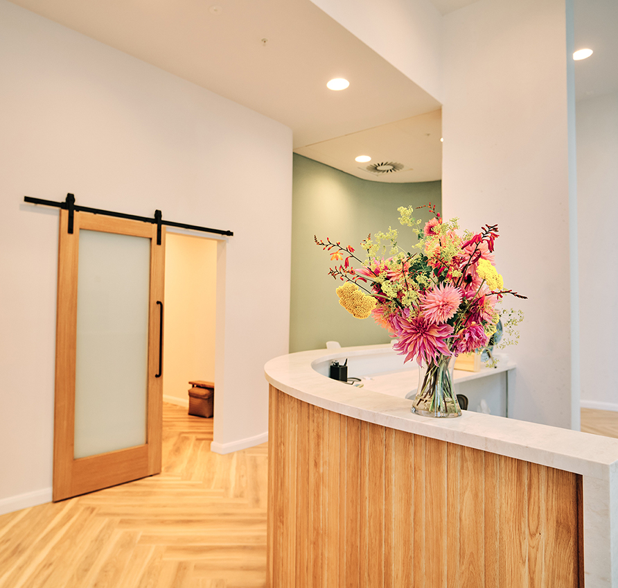
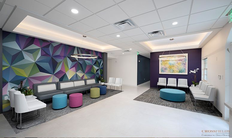
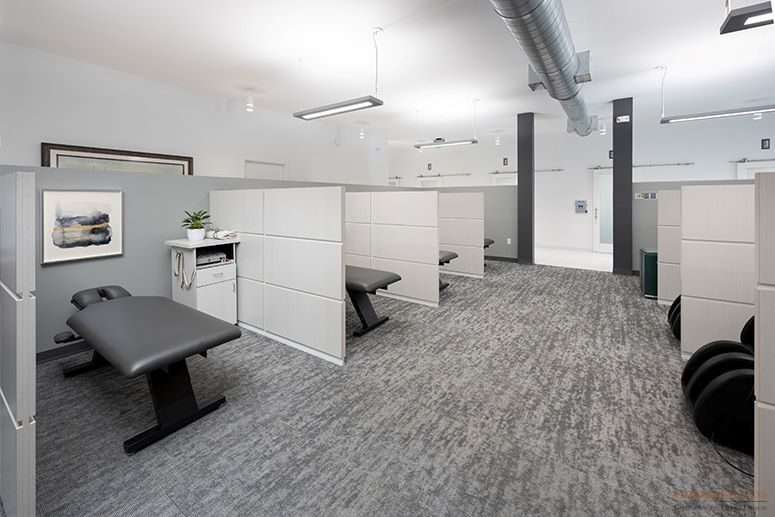
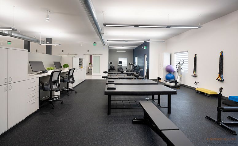
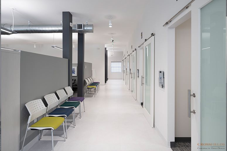
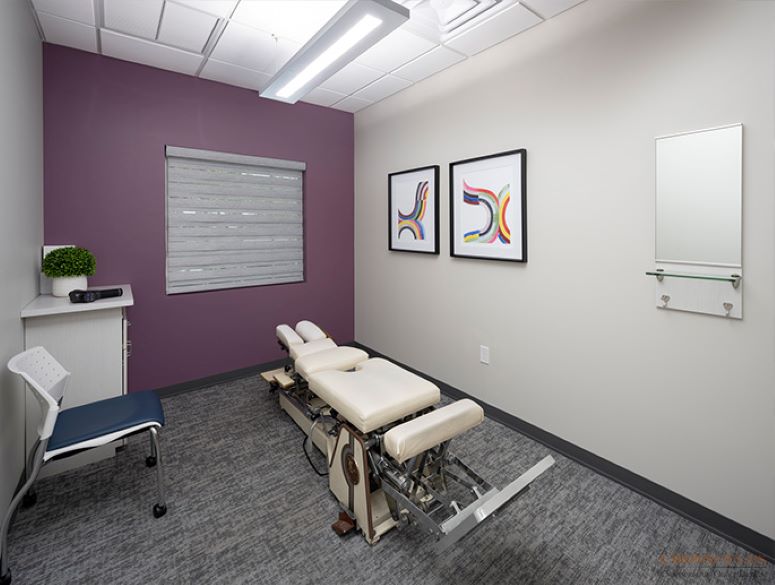
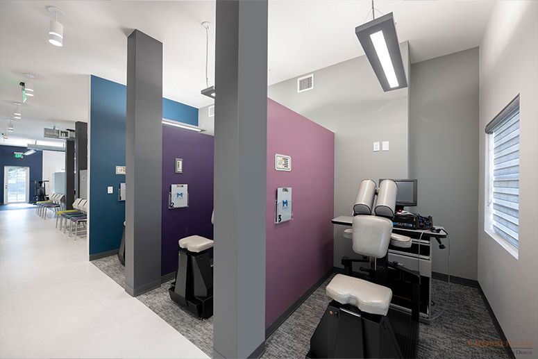
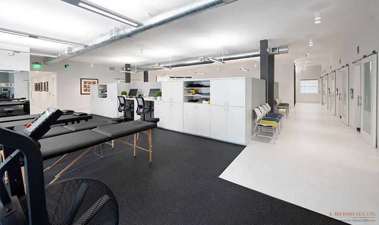
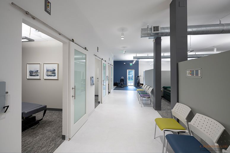
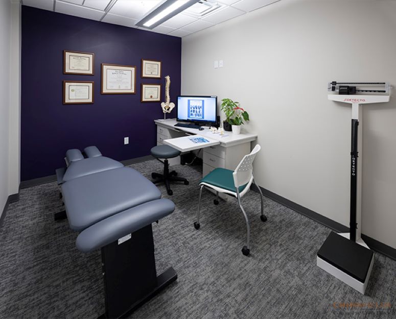
In the space plan we created, we located the busier side of the patient care to the left of the entry. We located the adjusting along the south window wall so that a glimpse of it can be seen from the lobby. The adjusting room doors are frosted glass modern barn doors aligned in rhythm to create unity as well as natural light flow. The open PT area on the west (back) wall and the chiropractic therapies with lowered walls are in the center. This allows natural light to flow into the space from the back to the front lobby reception. In the lobby and this entire open space, the ceiling was raised as high as possible up to the drywall fire lid ceiling with a touch of sophisticated industrial in hanging pendant lights and exposed HVAC ducts.
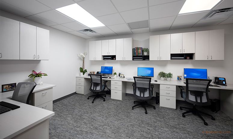
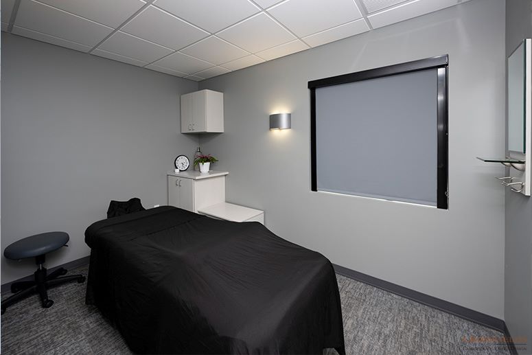
The clinical area of exam areas, x-rays and restrooms are on the north side with lowered acoustical ceilings, with the goal that this would be a quieter space. The massage was in the northwest corner. The breakroom/laundry has been located on the west wall allowing exterior door access for staff. And the doctor’s “den” was located in the center.
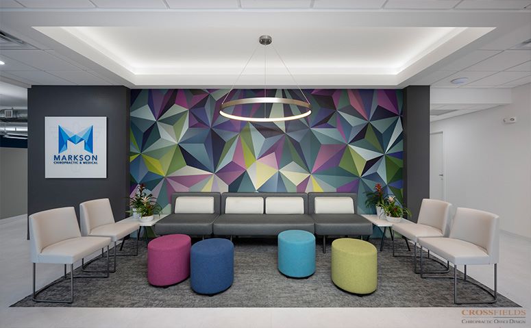
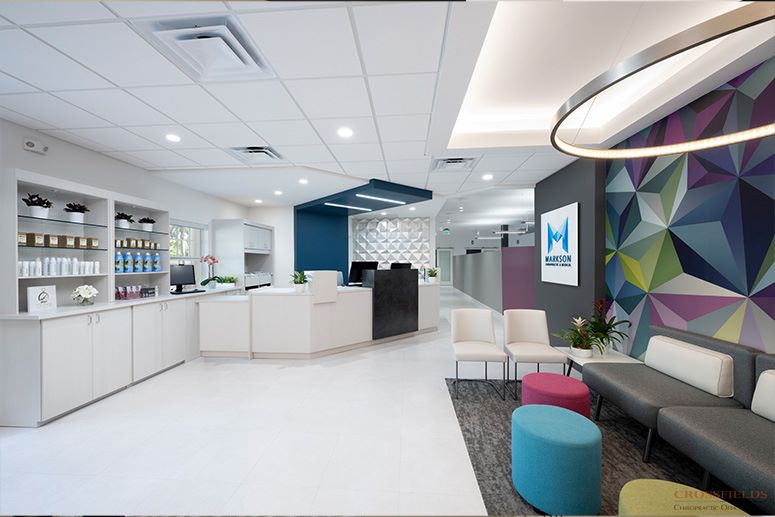
Upon entry, patients are greeted with a dramatic art mural on the large wall across from the door. The seating, a combination of larger and smaller upholstered pieces anchored by a warm rug and coved ceiling above, are grouped in front and to the right side, with whimsical ottoman seating for overflow. The front desk is immediately to the left with the business offices immediately behind. Retail is on front wall, close to control of front desk, while being a point of sale for patients.
The overall color palette is a natural white neutral backdrop mixed with light to dark charcoal for architectural emphasis. The bright colors of the entry mural became the pallet for the pops of deep rich color used as architectural and upholstery accents.
Overall – “What you will see is the end of about eight to nine months of work and I couldn’t be happier” Dr. Rick Markson
SERVICES PROVIDED
Full-Service and Complete Architectural Interior Design from Concept through Completion
TESTIMONIAL
“Just being open for 4 weeks, we are up about 12% in volume just from efficiency and added capacity and flow… The patients are certainly wowed…they are proud to be here. It’s about community.”
“CrossFields is interesting. It’s this combination between architecture, science, design, art – but understanding Chiropractic. Also understanding how Chiropractors are different and you didn’t try to squeeze us into one model.”
“I get to come and live my dream every day because of CrossFields”
– Dr. Rick Markson, DC, Markson Chiropractic
See What Our Clients Have Said
- All
- Chiropractic
- Integrative
- Neurology
- Rehab & PT
- wellness
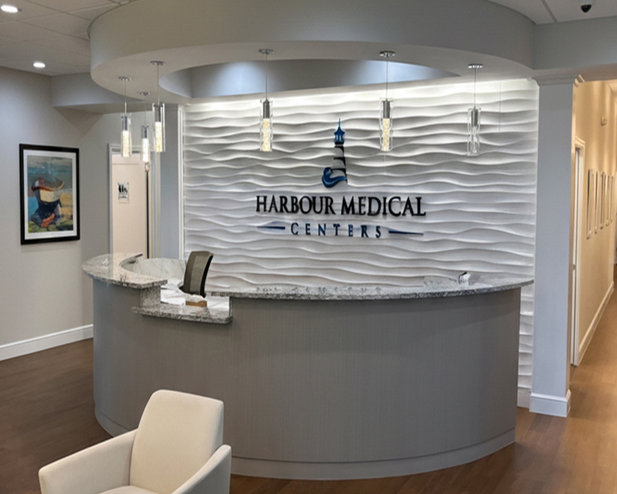
Harbour Medical Centers
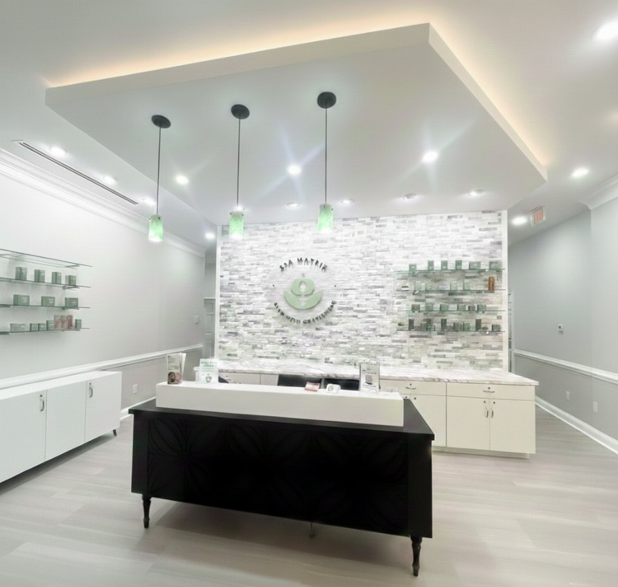
Spa Matrix
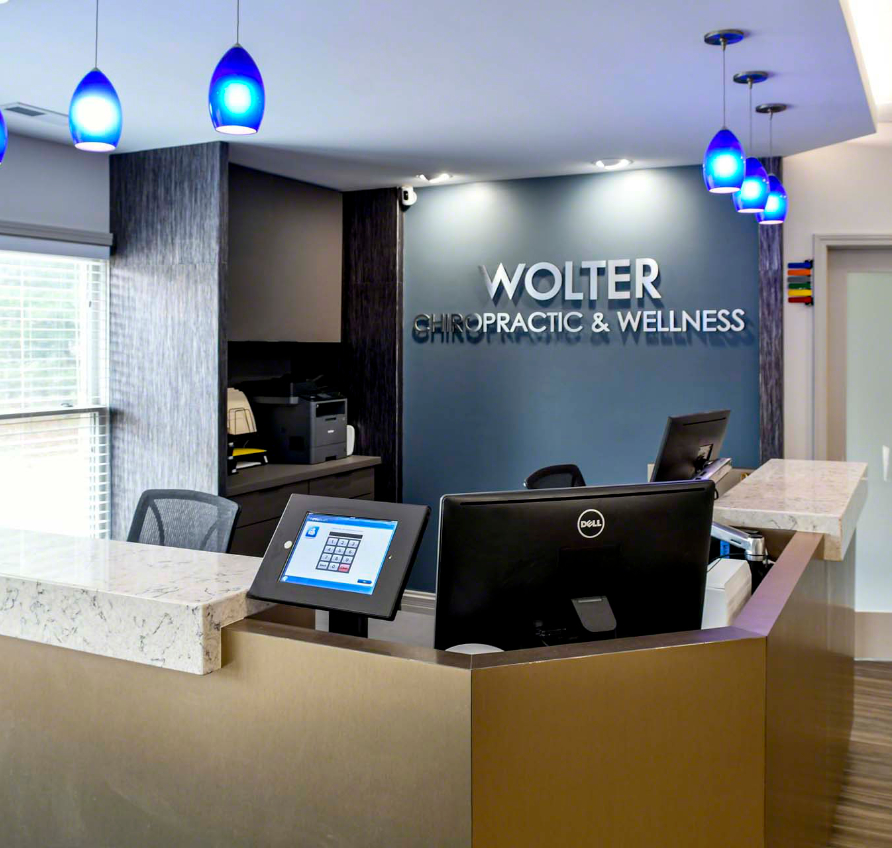
Wolter Chiropractic & Wellness
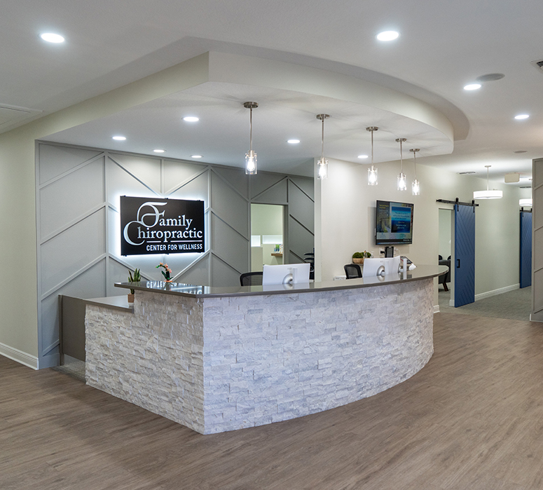
Family Chiropractic Center for Wellness
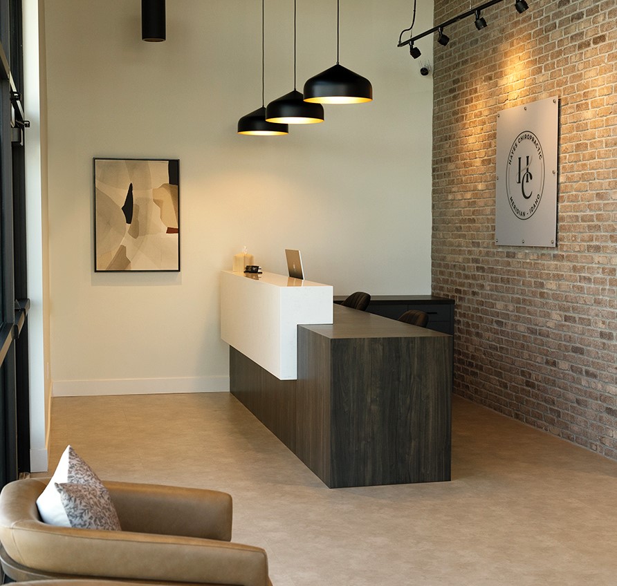
Hayes Chiropractic
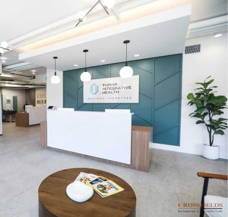
Thrive Integrative Health
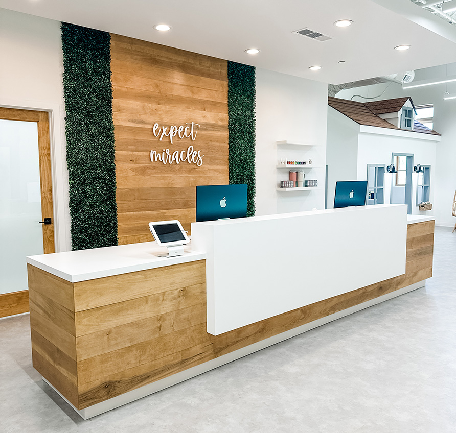
Cumming Family Chiropractic
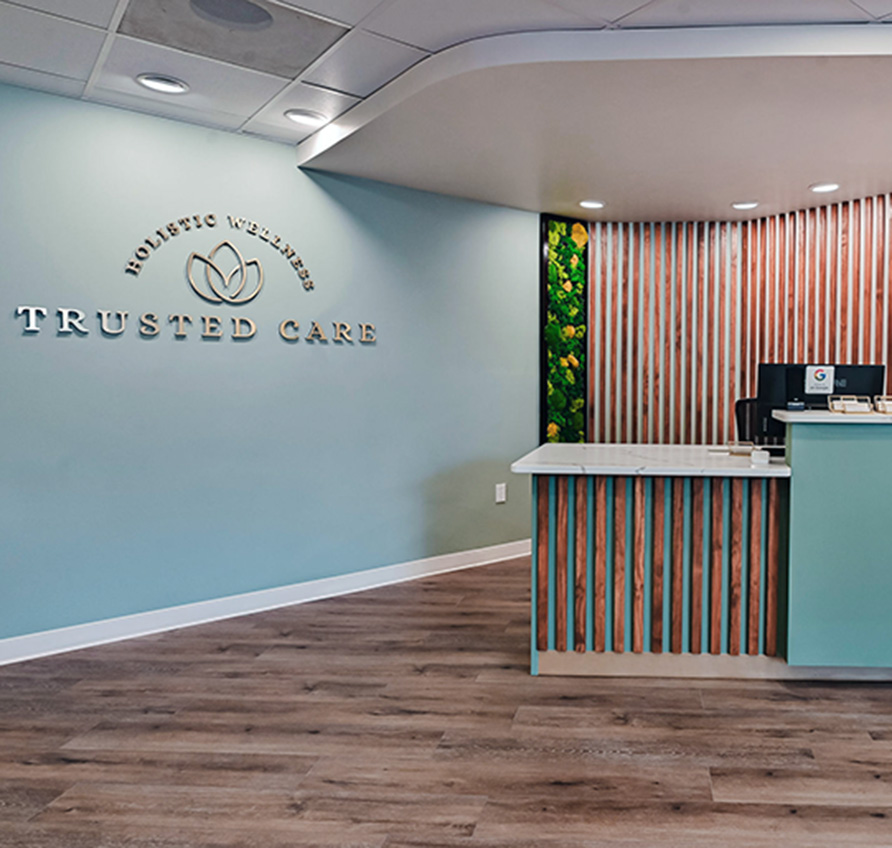
Trusted Care Holistic Wellness
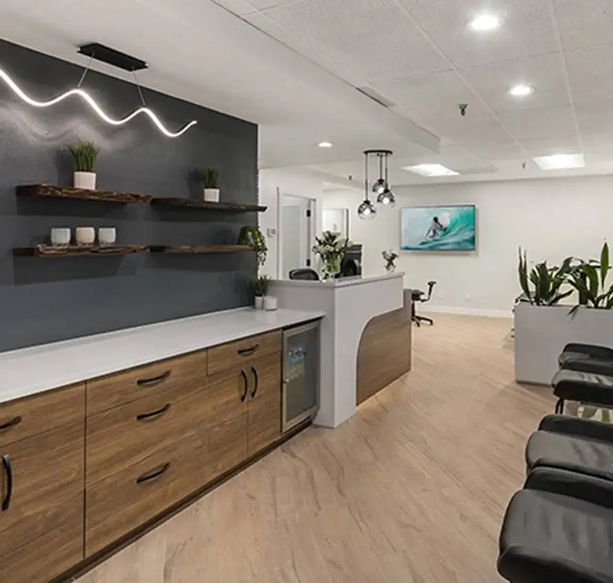
Lakeside Spine and Wellness
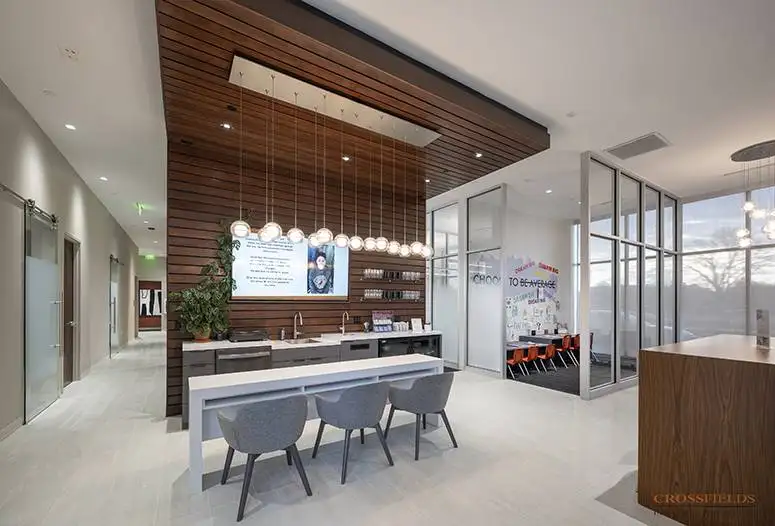
Chiropractic Lifestyle Studio
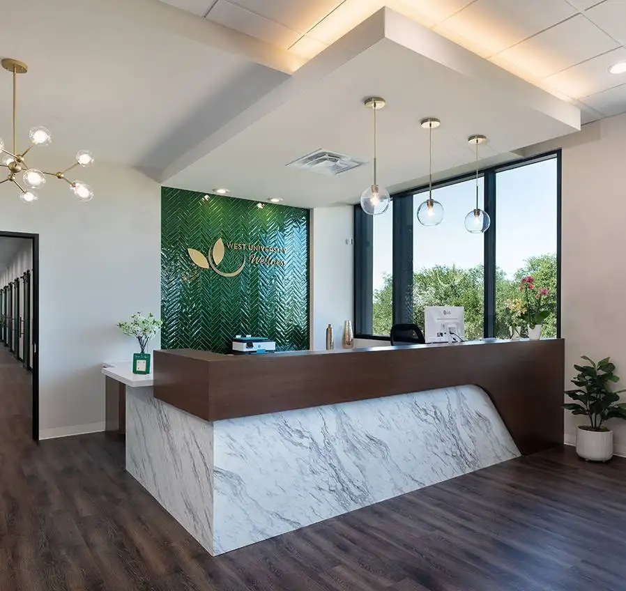
West University Wellness
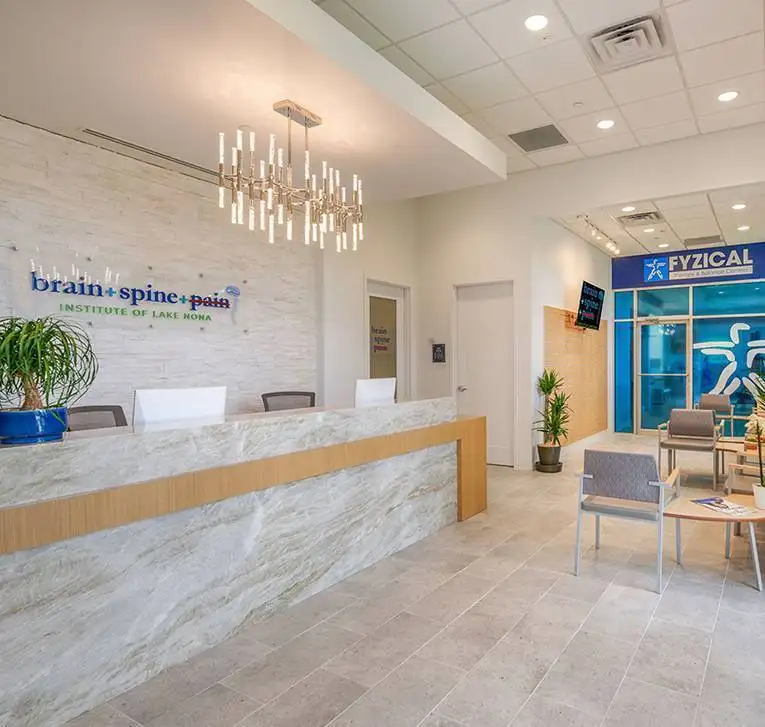
Brain + Spine + Pain Institute Of Lake Nona
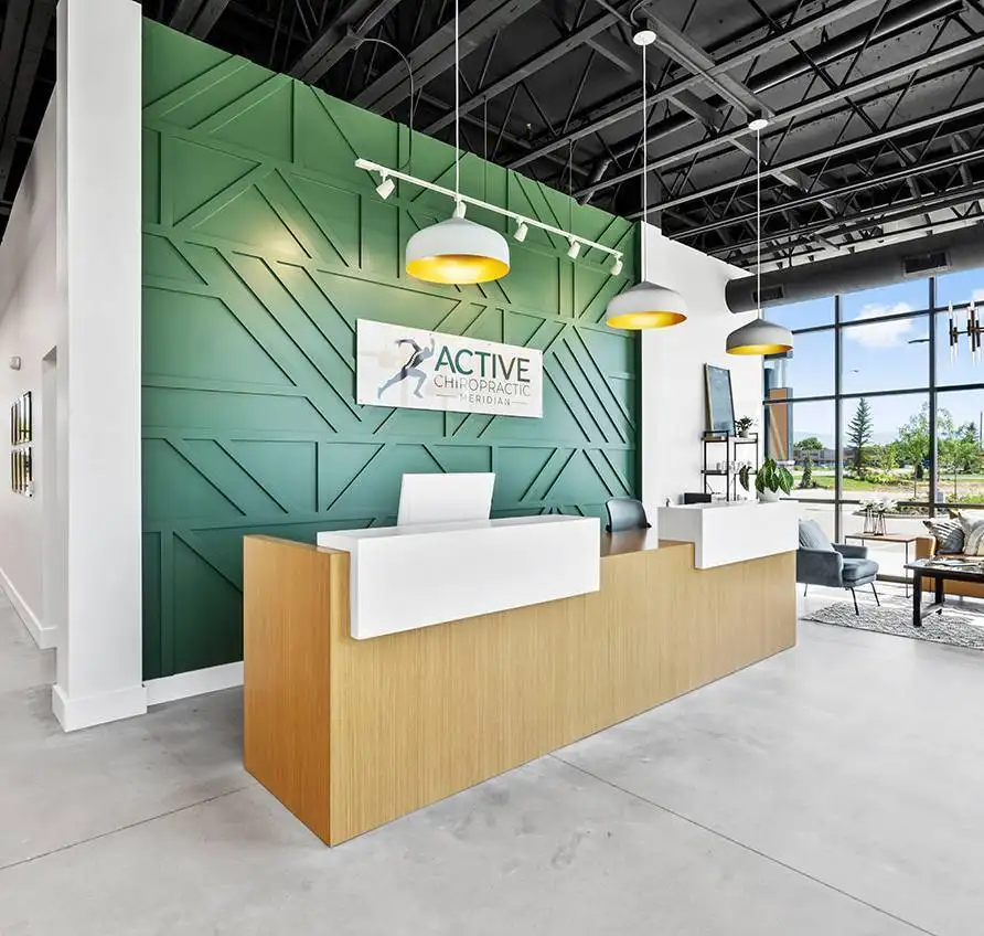
Active Chiropractic
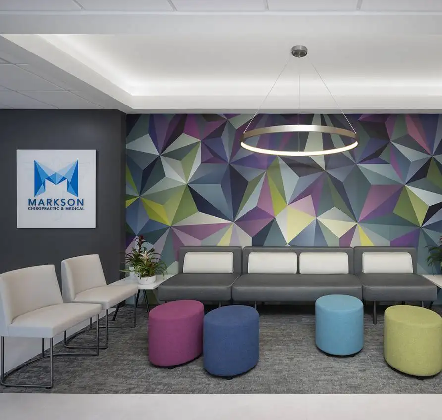
Markson Chiropractic & Wellness
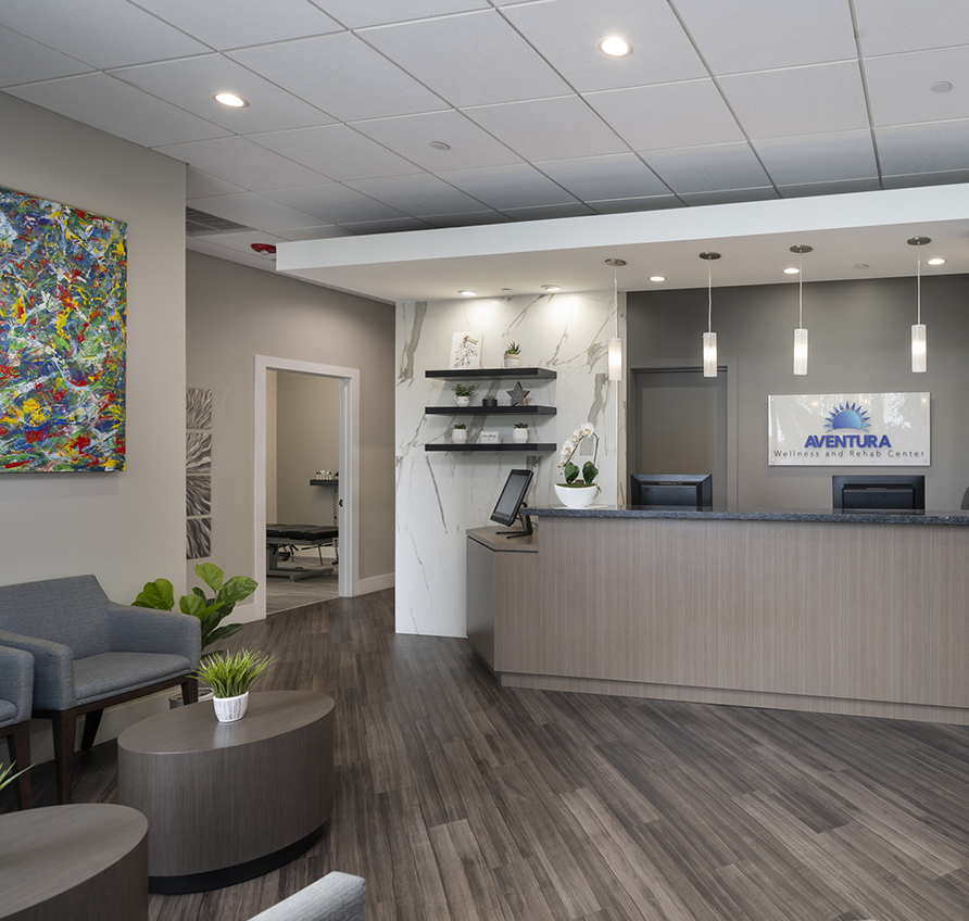
Aventura Wellness & Rehab Center
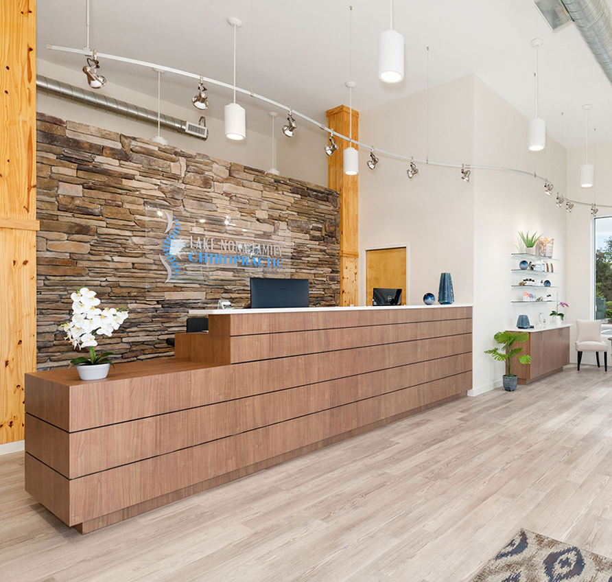
Lake Nona Chiropractic + Functional Health & Weight Loss
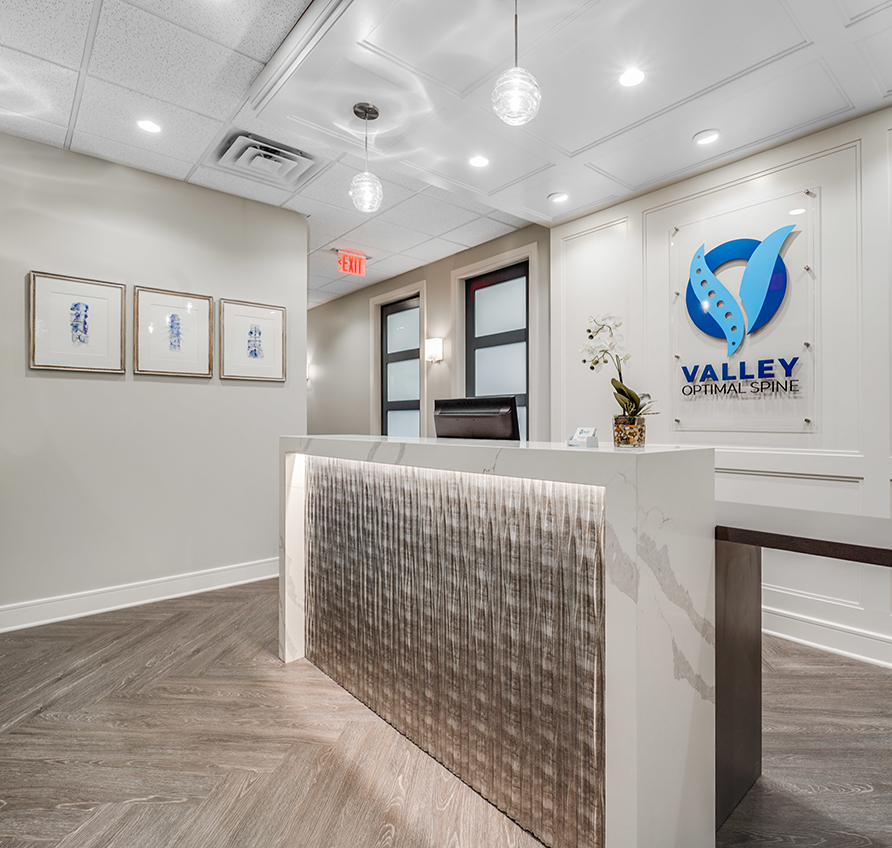
Valley Optimal Spine
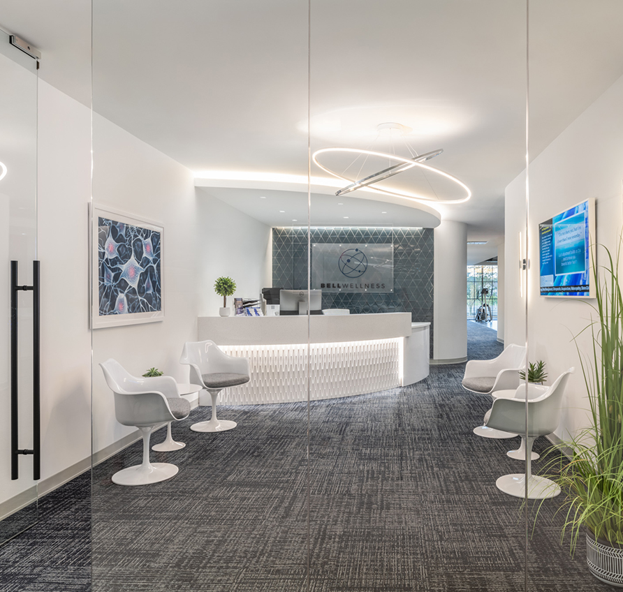
Bell Wellness
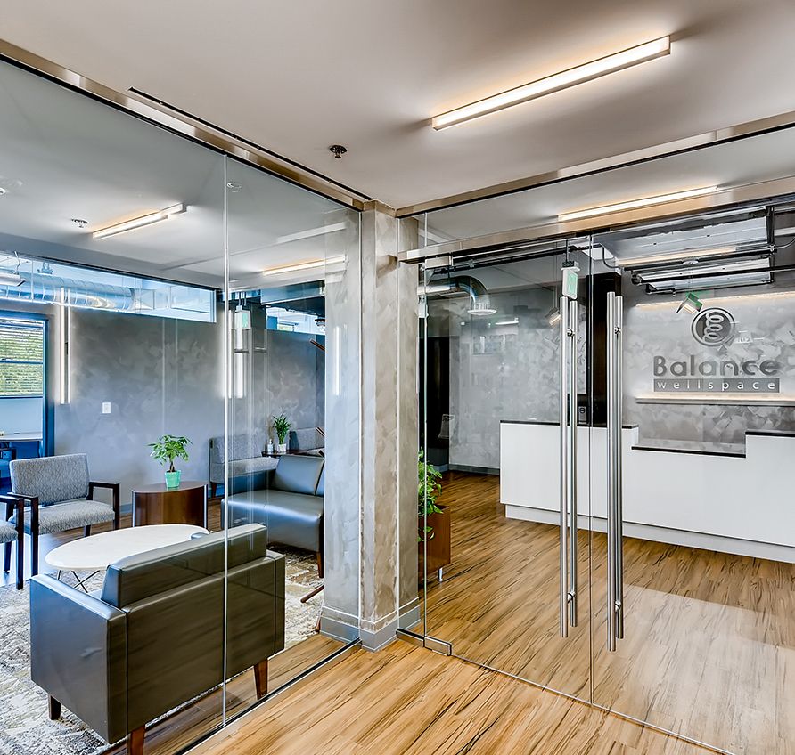
Balance Wellspace – Denver
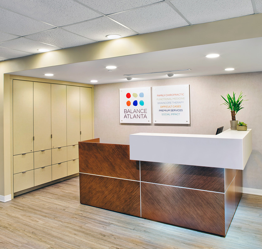
Balance Atlanta Family Chiropractic
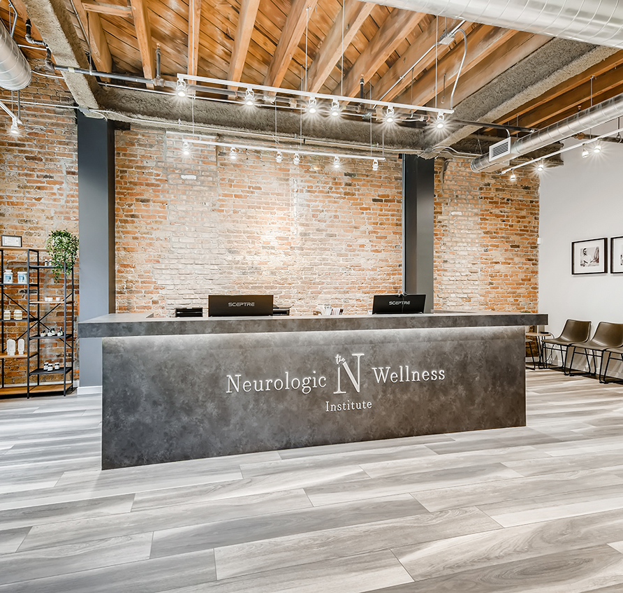
The Neurologic Wellness Institute – Chicago
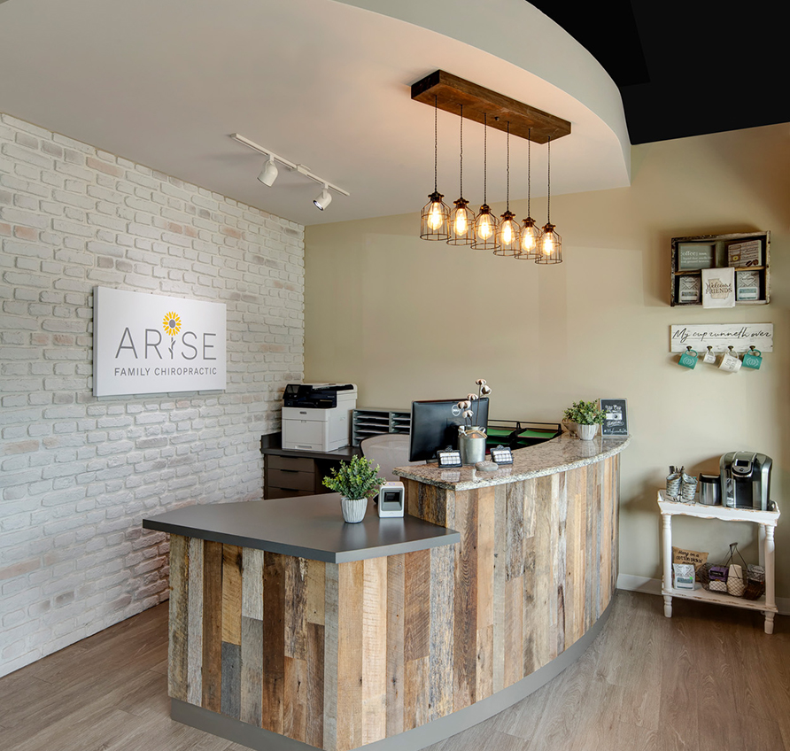
Arise Family Chiropractic
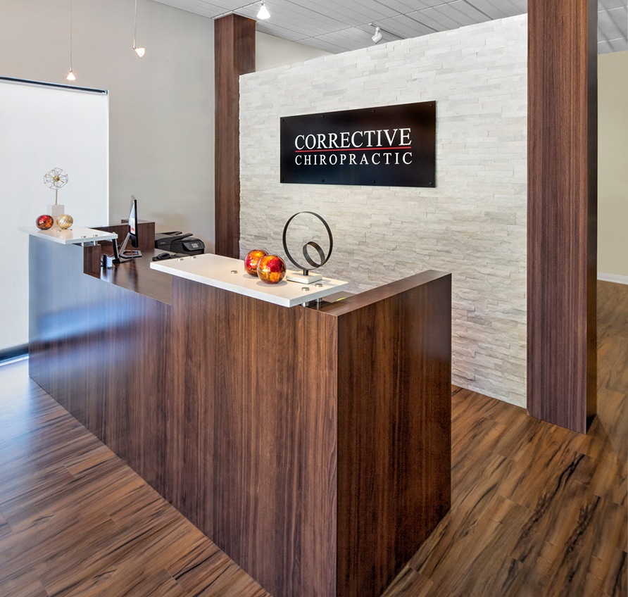
Corrective Chiropractic Woodstock
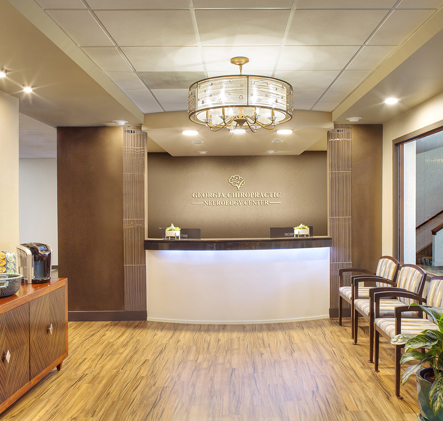
Georgia Chiropractic Neurology Center
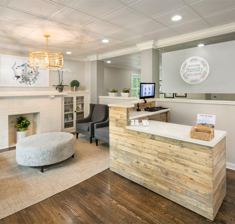
Midtown Family Wellness
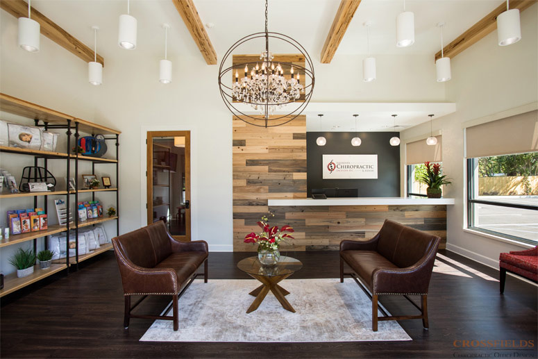
Valdosta Chiropractic
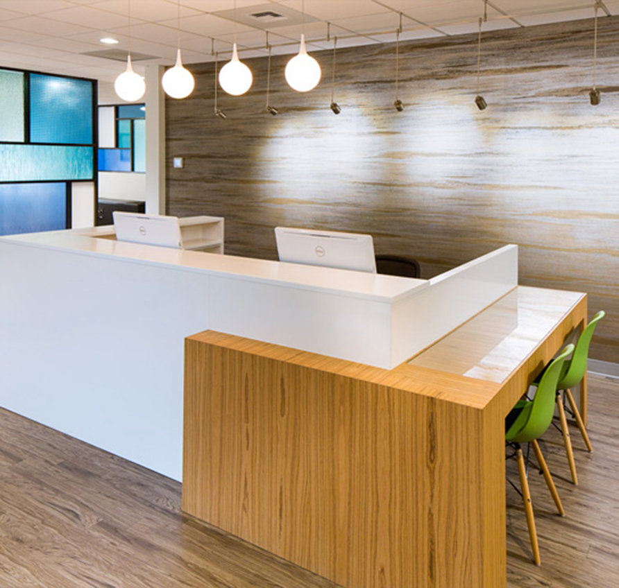
Bellevue Pain Institute
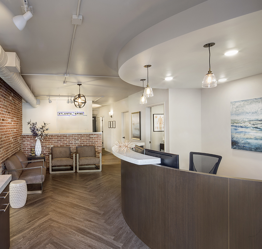
Atlanta Spine & Wellness
Bridge Chiropractic
Corrective Chiropractic Decatur
New Millennium Medical
SpineCare
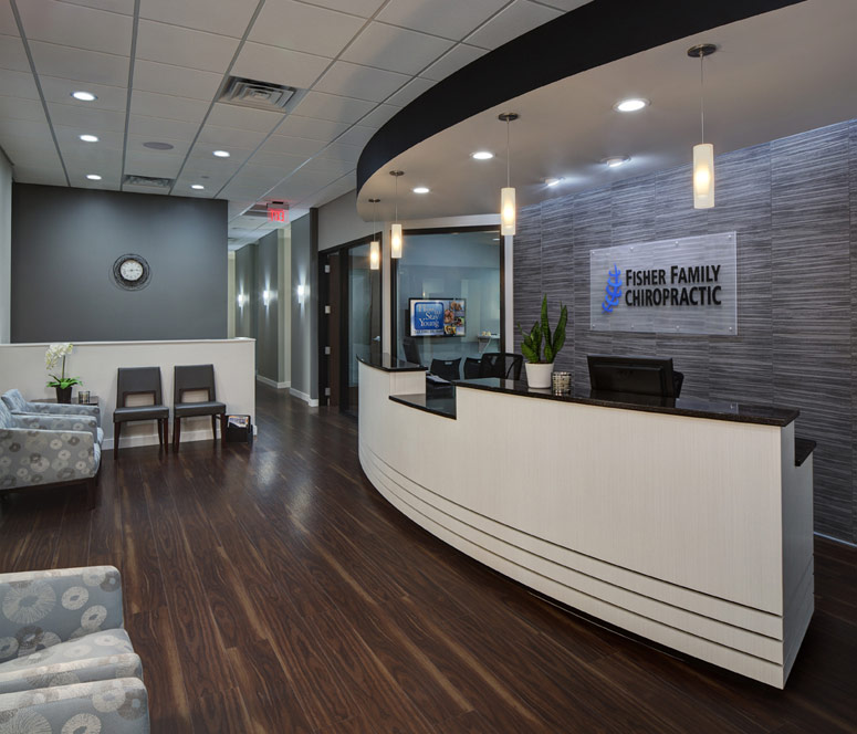
Fisher Family Chiropractic
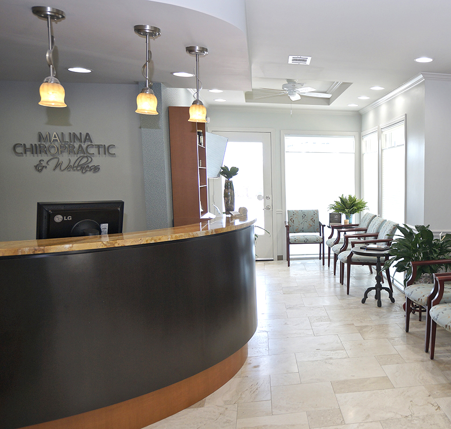
Malina Chiropractic & Wellness
Williamson County Chiropractic
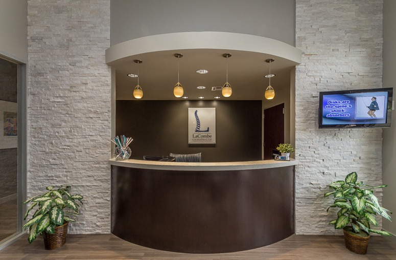
LaCombe Chiropractic
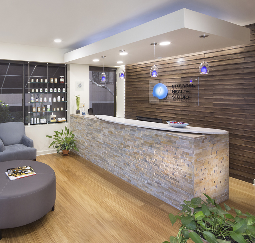
Integral Health Studio
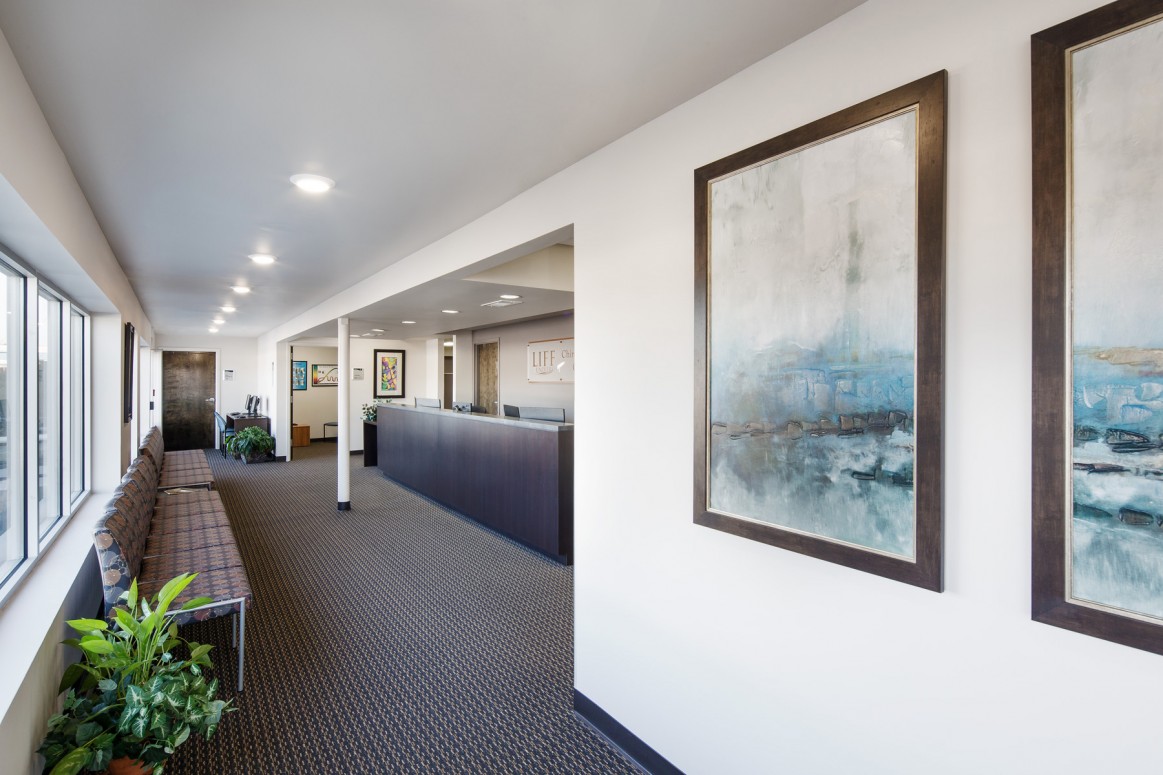
Chiropractic Community Outreach Center – Life University
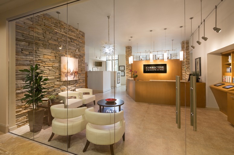
Corrective Chiropractic
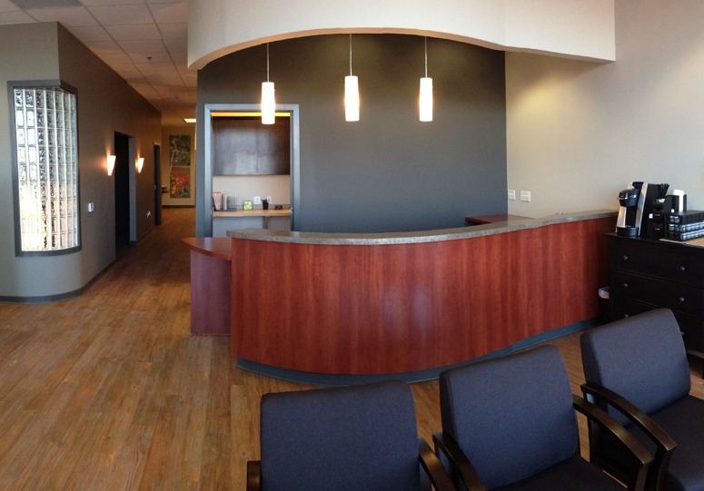
Wyoming Valley Spine & Nerve
Carrick Brain Center
Williams Library & Life Enrollment
Cohen Chiropractic
